I thought I’d make Friday Focus post titles a bit more descriptive from now on. The theme for this week, however, is a tricky one. It’s not about a common design element for the featured sites. I want to talk about techniques and choices made by the designers that can make or break things. These designs are almost there, but they need that one final tweak. I’m curious to find out if you agree or disagree with me.
Designs of the Week
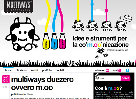
What a delightful site to look at! I love that the colors alternate for each datestamp, and that the black-and-white cartoony illustrations don’t look dull but absolutely cute. I have just two nits to pick.
First, I’m concerned that the header is a little heavy on animations. It’s a bit distracting after the second or third round. The upside is you can scroll down and it disappears from view.
Second, the logo looks out of place, which I’m not sure how you’re supposed to fix. Do you redesign your logo just to fit this current look of your website? Should you have chosen this look at all? Because it’s such a fun site, I’d miss it if it had to go!
I like how bright and lush this design is. And the interface effect is fresh, too. But here come the buts: I would avoid using lens flares—even if the whole “Sunday morning” concept seems approriate in this case—just because they’re overused.
Second, the vertical and horizontal scrolling does not make for a good user experience. The layout seems fit for only really big resolutions. If the designer can fit the content into the vertical height of an average screen, all will be forgiven!
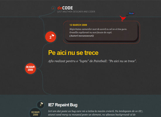
I really appreciate all the little design details here. It’s a very interesting layout that makes me want to stay and explore the site. It just feels like it needs more of a little something.
Maybe warmer hues, because even if there’s bright red and gold all over, the dark grays seem to dampen my mood looking at it. Maybe a bit more imagery, even though understandably you can control everything in a blog.
Social Media Weekly
Design – 50+ Cute and Adorable Monster Characters Illustration
How can monsters be so cute?
Programming – Image Rollover Borders That Do Not Change Layout
A nifty trick using the outline and negative margins for inner borders.


