Our featured sites today look like they were all hit by something disastrous. It’s an interesting trend perfect for the scary month of October. Welcome to this week’s Friday Focus!
Designs of the Week
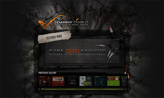
I like the level of detail on this site, especially the interface elements like the scrollbars and buttons. I also like how the destroyed surface seems to have streaks of light coming from it.
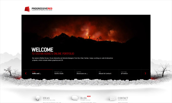
This is the only design that avoided that grim, dark gray color palette, and has a different sort of impact altogether. I love the concept of the main content area looking like it dropped to the ground. I also like that the rubble in the footer is also used in the blog section, though I wished it also showed up in the info page.
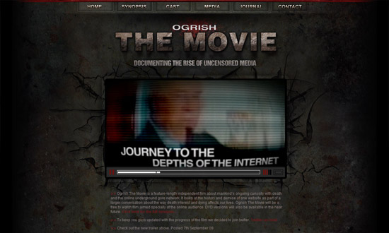
The typography and graphic treatment are imperfect, but this site still packs a punch.
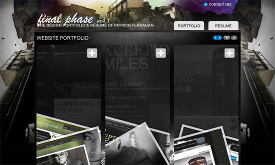
This site looks a bit chaotic if you ask me—even if chaos was the driving concept here—but it’s got an interesting way of presenting the designer’s work. The use of pink feels off for such a dark site, but I like the idea of using such a bright color to change things up.
Social Media Weekly
Design – Crucial Rules to Follow When Designing a Logo
Programming – Password (un)Masking
Information Architecture – Breaking Up Large Documents for the Web – Part 1 (Part 2) (Part 3)


