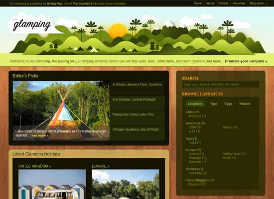
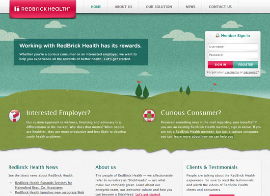
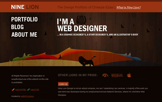
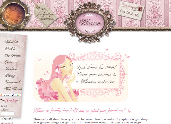
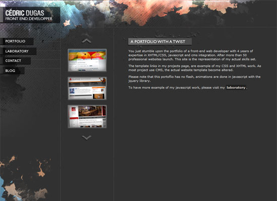
Rainbows are typically loud and attention-grabbing, but these sites have toned down the explosion of color to bring about a more modern look altogether.
Designs of the Week
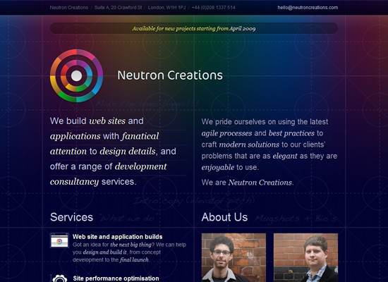
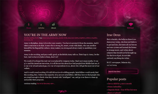
The background is like a blueprint with an interesting twist. I love the icons in the Services section—I want to see more of them! The color wheel-like logo is lovely too.
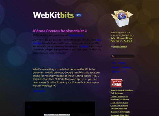
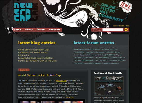
This site screams Apple UI, from the typeface to the pill-shaped interface elements, all with a very subtle gradient and etched text effect. I guess the only thing that bothers me are the color choices: why black for the ordinary text, and why bright blue and magenta for the headers and links.
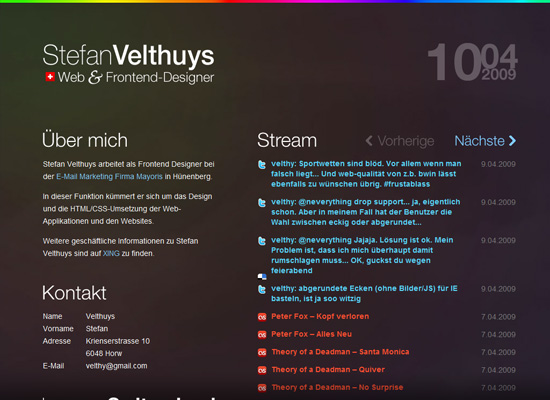
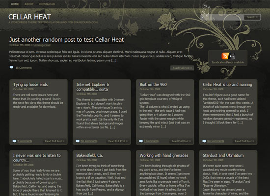
The rainbow background here is so subtle, one wouldn’t mind having two strips of brighter rainbow gradients on the top and bottom parts. I like the transparent fixed footer, which is just text. But I’m also oddly drawn to the datestamp on the top right corner—it’s just well-designed.
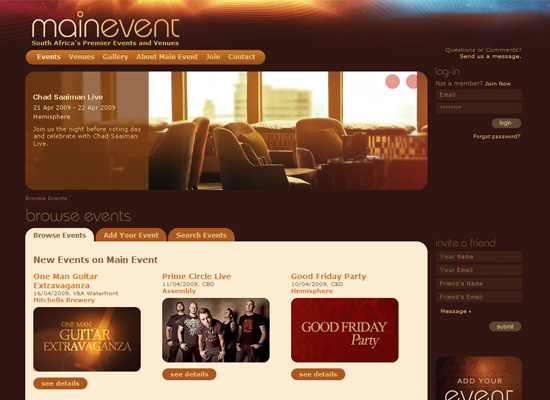
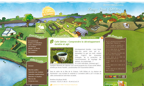
Hip and clubby sites tend to use rainbows and glitter and funky lines, but here I’m glad it’s more of an accent than a trademark look. I love the use of brown. Even the rounded corners, which doesn’t feel like a fad, but a nice touch that somehow adds some funk.
Social Media Weekly
Design – White Space: How to Get it ‘Right’
Examples and practice make perfect.
Design – Top 7 Icon Search Engines
Because image search, let alone icon search, is tricky enough.
Programming – The four stages of programming competence
Which stage are you?
