No color in the spectrum is left unturned this week on Friday Focus. It’s all rainbows here—but no unicorns though!
Designs of the Week
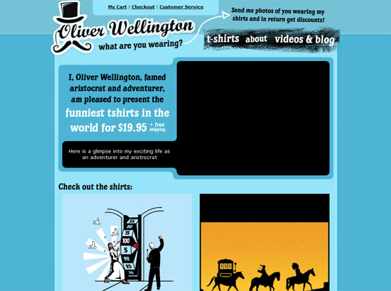
Technically, this site is dominated by warm, orangey hues, but it’s colorful nonetheless. And the Design literally has rainbows in it! More importantly, it’s bold and inspiring. Best tip we can get here is to be unfraid to use black to add focus and contrast.
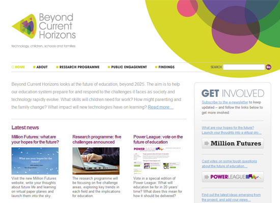
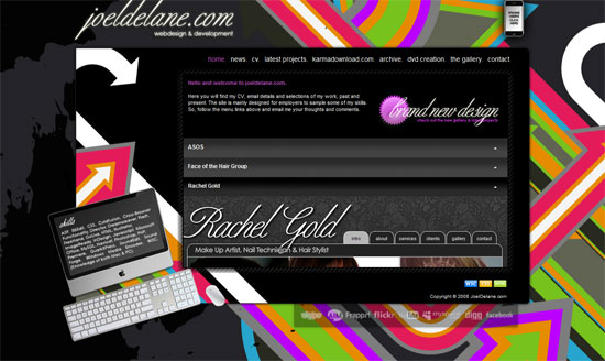
Since this site calls for a more formal look, the colorful graphics were isolated into a corner so as not to distract. If you look closer the circles look like the bottom of the cone of site logo! The 3D-going-2D is a neat twist.
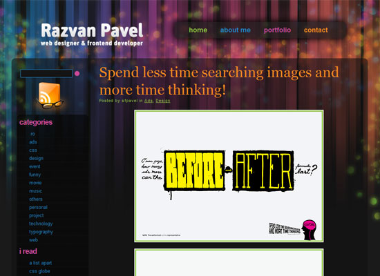
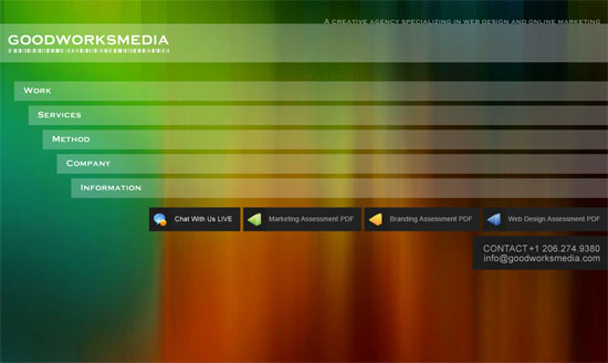
Here’s a darker design that still plays with the spectrum from end to end. Not to mention some transparency. I’m slightly disappointed that the background graphics fade out as you scroll down, but it’s probably for readability’s sake.
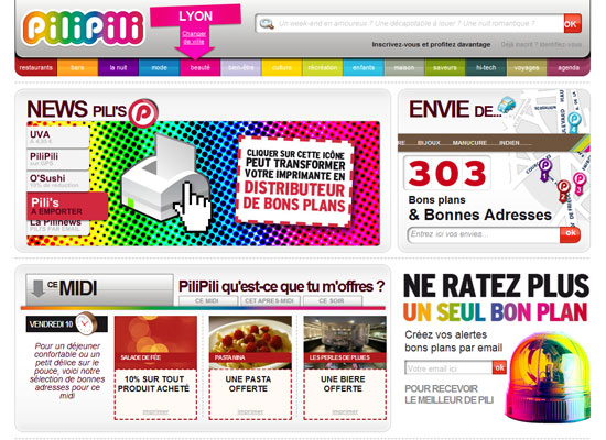
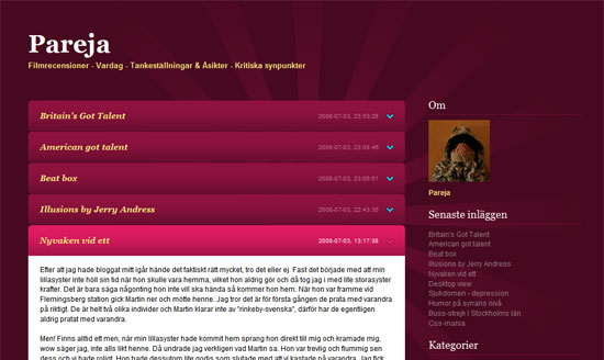
Since this site is so big, what better way to represent the different sections than with various colors? Strictly speaking it’s not a very good idea and it should be supported by something more effective, like icons, but I really like the areas where the rainbow effect is applied. It doesn’t even look overwhelming, color-wise. And I just love the footer navigation graphic.
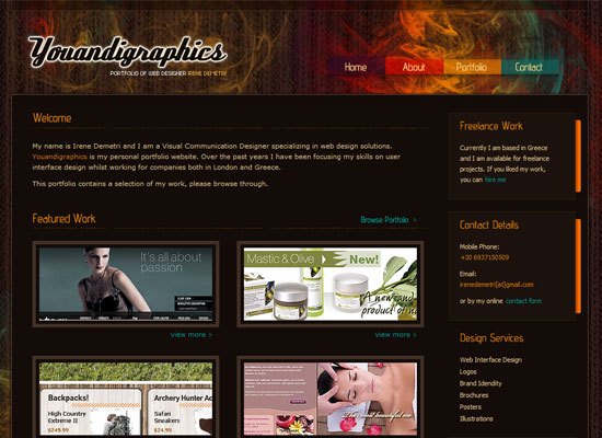
If you’re going for a rainbow pallette, you don’t have to use every single color for everything. In this site you can see the text use two shades of yellow, while the links use blue. Again, we have transparency here. Finally, the combination of wispy fractals and a crocheted background texture is not something you see everyday, but it looks wonderful!
Social Media Weekly
Design – Color & Design In Politics: Obama
The unofficial design-centric campaigns for US presidential nominee Barack Obama is nothing short of inspiring. This is just one of the articles that compiles them.
Programming – Forget Flexibility, Design for Now!
An article that discusses how designing for flexibility can hold us back.
