This week on Friday Focus we’re featuring a specific type of texture being used in websites: denim. Is it the new wood pattern? Let’s find out.
Designs of the Week
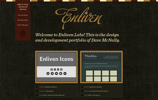
I like that the texture used isn’t the typical blue fabric, which also means you aren’t limited by the color palette for the design. You see color swatches at the top, a fixed red ribbon background, and a huge call to action button once you get to the bottom of the page. Also, in the quest for integrating social icons into a design, we come across another technique: there’s a dark silhouette of the Twitter bird, which “lights up” into full color when you hover.
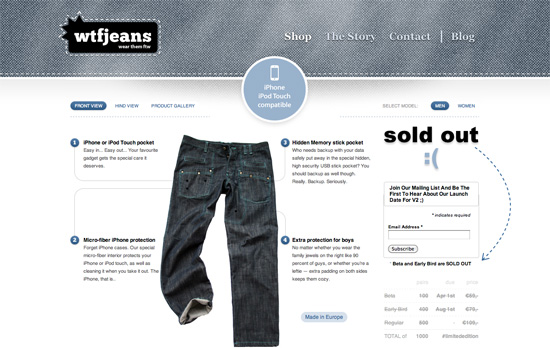
The jean texture looks interesting but seems to be fighting with the navigation text. I think it’s good that the figure text is actual text, and not merged with the rest of the pants diagram. The “Made In Europe” text looks a little out of place, and could have been styled more like a badge than a button. What I really like is the textured circular backgrounds in the four bottom links—not mind-blowingly stunning but a nice touch.
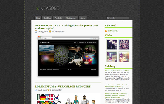
I love the stitched look especially on the logo. It’s a simple design, based on an existing theme in fact (as noted in the footer credits), but the idea of using two “layers” in the background, bounded by a vertical border on either side, is something I don’t see everyday.
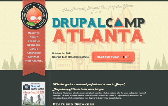
This site ties many different elements together to create a lovely design: vintage typography, tickets that look like tickets, folded tabs, and even orange-dyed denim shaped as ribbons! However, the orange on dark gray, combined with the Harlow font, is a little taxing on the eyes.
Social Media Weekly
Typography – The 10 best fonts from the Google Webfonts Directory
With Google’s Webfonts list growing, it’s nice to know which are the highly recommended fonts on there.
CSS, Design – Use Google+ to improve your UI
See how they did it! There’s also an Apple OS X version of the guide.
CSS – Why Browsers Read Selectors Right to Left
Understanding how things work always helps people get better.
Business – The Dark Art of Pricing
Jessica Hische lists her experiences in the dirty job of pricing your work.
