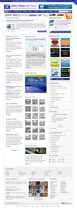
John Chow released a new version of his site on September 10th, sporting a more controlled, almost corporate look compared top the previous version. The new John Chow dot Com is the third version, and was designed by Unique Blog Designs. In many ways, it is a better theme, but there are, of course, some things I’d like to comment on.
Just like when TechCrunch redesigned, John Chow’s readers have voiced a lot of comments, 227 of them as I’m writing this. Nothing gets the readership involved like a brand new design!
The Good

- I like the fact that they got rid of the car in the header. Nice balance between logo and the 468×60 pixel ad as well.
- The logos for ad and affiliate networks that John pushes aren’t obtrusive, thanks to being in grayscale until you hover them. This is nicely done, since they should be annoying just because of their placement under the main menu.
- The RSS and subscription functionality in the top right column blends nicely.
- Good spacing in the ad segment, under Blog Sponsor.
- The Featured Video box works nicely together with the ad below, and the recent photos, and the about box.
- I like the navigation links below the entire site, even though it is a bit illogical to have them below the copyright type.
The Bad
- The JC logo is bland and boring.
- The site lacks color, it is basically just white, light grey, and a very tuned down blue, which makes it look corporate and stale.
- The Recent Photos block is pretty nice, but it needs to be better aligned with the width of the column, now it is 20 pixels less wide than the other elements in the middle column on the front page. If the plugin used won’t solve it for you, then put it in a box or something.
- The categories part of the footer is decent enough, but the rest of it is a bit messy. I’d also do the copyright text in a different color, font, or whatever, to cleanly part it from the content in the footer.
- The about page isn’t optimized for the design at all, sporting too little content to fit with the right column, and a photo that is too small. Same goes for the contact page, really.
The What Now?
- Contextual keyword ads in posts are one thing, but why are they in the featured articles slide?! Same goes for the listings of blog posts on the front page. Really, that’s too much.

Final Thoughts
I can’t say that I’m thrilled about the new John Chow design. My main issue with it is that it feels like a corporate website rather than something from “a Dot Com Mogul”. At the same time, there are some really good layout decisions here, and I especially like the way the header manages to not feel littered with ads.
One other color to work against the stale look would do a lot to lift this design.
What do you think about the new John Chow dot Com redesign?

