Remember the Break Your Design Mold post? If you haven’t read it, please do, it’s all about trying to evolve as a designer.
I decided to take my own advice on a client project that suited it, and made something dark. People used to my design know I like it light and sober, so making something dark was a way for me to challenge myself. I think the last real dark design I did was back in 1998…
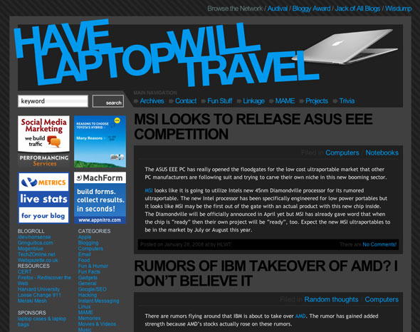
Anyway, Have Laptop Will Travel (a Splashpress site by the way) is the result, and while the implementation in my design have changed it in some ways, you still get the general feel.
Below is a screenshot, it might look differently now since they’re fiddling to make room for an ad campaign:

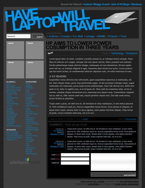
Here’s a picture from my Photoshop mockup:

What do you think? Did I break my design mold? In some ways, sure, but not in all of them of course. I could, I guess, but since this is client work there was things to consider, paths to take, and the actual site’s history to think of.
Still, I did do something that I normally wouldn’t, and I did it without compromising the client work.
Have you broken your design mold yet?
