Just thought I’d put up a quick note before everyone else starts posting about it. The latest beta build of WordPress 2.3 is now available for download. Everything I’ve tested so far with 2.3 has been working superbly, and I’m really excited to see 2.3 go final and get it in use here on Devlounge. The first release candidate is due out next Monday (continuing with their new released every Monday pattern that’s been going on over the last few weeks), so we sure to watch for it. You can grab the beta here if you are interested.
And The Tweaks Continue
Round two of the homepage updates have now been completed. You’ll notice that the homepage sidebar is now a little bit more populated than before. Header images have been added for each section, to give some visual identification to each section. You’ll now find the four latest news briefs and side notes in the sidebar as well. Lots to click on, but it is all leading on into the site. That’s good, right?
Refreshed Homepage Now Up
If you’re looking for something to go good with your Sunday breakfast, stop by Devlounge and have a look at the updated homepage. As promised, it was time to trash all of the extra stuff and put more focus on our articles. I still have some things to add (just a few more things to the sidebar on the right), and I’m still trying to determine the best amount of articles to have on the front page (more or less than right now…what do you think?). Let me know what you think of the change.
Saturday Slice (FF #43)
Late edition Friday Focus this week, and of course, it is all my fault. Please forgive me for a rare “Saturday” edition of the focus. Yesterday was my first day back at school, and after the seemingly forever when-the-hell-is-this-going-to-end day was over, I was out the rest of the night until early this morning. So no surprise I didn’t do any writing. The irony about the whole thing was all week I planned on writing about how helpful scheduling posts can be when a situation like this arises (like I knew it would), but I never even got a chance to write that one. Watch for it next week sometime. Anyways, enough talk. It’s Saturday Slice.
Sites of the Week
Kicking things off this week is Mobile Web Design, the store front page for Cameron Moll’s book on that exact topic. It was designed by 31Three. My favorite little feature is how you can actually use the More and Back buttons to look at some screenshots.
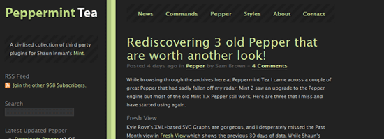
Next up is Peppermint Tea. The “official” repository for Mint Peppers. The design was recently updated, and has a much more “dark mint” appearance to it.
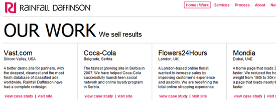
Rounding out this weeks Friday Saturday Focus is Rainfall Daffinson. A grid based portfolio layout, similar to Particles gives way to a nice collection of design work. Check them out.
Digg / Design Float Weekly
Design – Ultimate Web Development Cheat Sheets
Large collection of development “cheat sheets” in categories such as Javascript, CSS, Xhtml/Html, and Ajax.
Programming – Ruby on Rails vs PHP
The only top item in Programming for the last seven days. So here it is, a RoR vs PHP commercial.
Some Changes in Store
We are nearing the 300k unique visitor mark. Once we hit it, there will be some new and improved things in store for us here at Devlounge. The more people that come here, the faster we launch some of the new stuff and updates. I’ve been testing some of this stuff on the newest WordPress [beta] version, 2.3, and the site has been functioning just fine, which is only good news as we get ready to make some changes. Watch for them soon!
Have you advertised with us?
Without trying to sound too selfish, I thought I’d like to point out that we have a bunch of open slots right now for your advertising pleasure. This include 1 homepage slot and 2 sidebar slots. Be sure to visit our advertising page if you are interested.
That is it for this weekend. Enjoy it everyone!
Friday Focus #42
Issue number 42. Exactly 10 weeks to go until we hit a year. Enjoy the weekend everyone!
Sites of the Week
Leading off this weeks top three is Kineda. How many times are we going to feature this place? I believe this is the third time Kineda has made the list, but every redesign looks cleaner and cleaner. I wish the Devlounge homepage was arranged like this, as I think it is very effective and helps tremendously with exposing a lot more content to the visitor. It gives me ideas, but as I said, I’m not redesigning this anymore – I’ve done enough of that already.
Next up is Challies. Another refreshingly clean magazine / portal style layout featuring lots of blues. Three columns and fairly polished up.
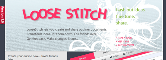
Wrapping up this week is Loose Stitch, an outlining app. It looks like the application interface itself is pretty clean, so I think I’ll be taking a look at this some time over the coming days.
Design Float / Digg Weekly
Design – A CSS Styled Table Version 2
Another great tutorial from Veerle. Nice and detailed, and comes with a clean final result (of course).
Programming – Image Browser Controls
Another tutorial, this time from Pup Image on the common right / left arrow controls found on a lot of images theres day when shown as a gallery / slide show.
Other News
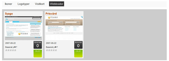
Earlier this week I released Particles, our newest WordPress theme. As I mentioned, its lightweighty-ness (not really a word) makes it a great theme to build upon. If you didn’t believe me, check out this screenshot from a blog we’ve been watching via our refer logs that has been building off of the Particles theme to make a web gallery. Obviously, it is still a work in progress, but it’s only been a few days.
