Another Friday Focus coming your way this week. The first one of 2008, and what I think to be one of the first not done by AJ, as he is a busy man, so I figured I would try to fill his shoes when it comes to the focus for a while.
Things will mostly be staying the same, but I will of course be choosing the designs that really amazed me, as well as the top stories on Digg’s programming and design sections that caught my eye.
This week, I have three designs, one design article found via Digg, and one freelance article found via Digg.
I hope you all enjoy my picks.
Designs of the Week
Oddly enough, all of my picks this week for designs are from Web Design firms from various locations around the world.
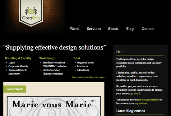
The first one is from GregOne from Belgium. I love how dark the overall design is, but to make it easier to read sections with a black background, he pumped up the font size, and in the content area I love the green tab he used as the background for titles. I find the serif font used for most of the white text content a bit difficult to read, but overall, I really enjoy this design.
Next, I have South Creative from Australia. This design caught my eye because of the use of the creamy colours of the content topped off with a much darker header, and a brightly coloured logo. The design itself is fairly simple looking, but I found it to be very effective.
My third choice this week is FortySeven Media from the USA. Again a very distinct difference between the header and content areas, this time going for a lighter header and a much darker body. I haven’t seen much green focused web designs lately, and so walking through the normal black, blue, orange, and more blue, I really enjoyed this design. A very nice palette of colours used as part of a very interesting style.
Digg Weekly
Design – 26 Things to Do When Business is Slow and in Downtime Mode
There is no doubt on my mind that we are going into a recession, and it is the perfect time for all freelancers to find some extra work, get important tasks completed, and save a little extra money.
Design – Creating A Fantastic Fantasy Night Sky In Photoshop
I am usually not a fan of photoshop tutorials, but this one is really fun to do. With all kinds of interesting effects taken into account, this tutorial could be used as a basis to create all sorts of cool poster worthy designs.
 It is with great pleasure that I start the second year of Friday Focus, the weekly run down of cool things worth checking out before you kick back and relax for the weekend. There is no better way to start your weekend then to be reading the focus every Friday. Enjoy the weekend everyone.