This week’s Friday Focus features highly detailed and highly elegant creations that just capture the imagination. Enjoy!
Designs of the Week
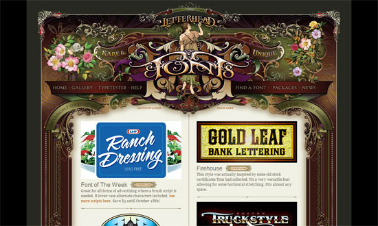
Just about everything on this page will blow you away, including the typographic artwork found in the content.
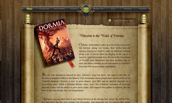
I love the glows and the fly-out torn paper menus. I think the text within the scroll could use a bit more tweaking though, especially with custom font replacement techniques rampant today.
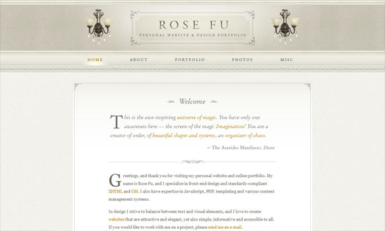
I love all the elements that come together to make this cozy, Victorian-inspired space. The subtle glow that appears when you hover on the menu links makes me wish it happened to the lamps in the header too!
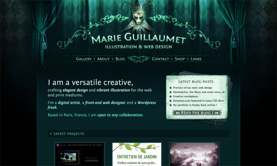
Love the curtains, the lighting, and the custom fonts in here.
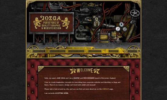
This one’s more gritty since it’s got a steampunk theme, but still a great example of higly detailed design. So many textures in this one too.
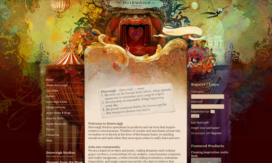
So whimsical! This feels like a mural with several parts that came to life. Check out the four other sections of the site for more brilliant versions of the header.
Social Media Weekly
Design – 7 Key Principles That Make A Web Design Look Good
User Experience – Powers of 10: Time Scales in User Experience
