• Home
  • About
  • Contact
  • Advertise

Devlounge

Design, Develop, and Grow

ateşli sevgilisi fantezisini yaşamak istediğini söyler porno ona arkadaşları varken onunla gizli saklı seks yapmak istediğini sikiş söyleyen kız hafta sonu için gelen arkadaşının görmediği bir sikiş açıdan sakso çekmeye başlayınca adamın yarağını bu altyazılı porno şekilde indiremez ve açık şekilde salonda sikişimeye sex izle başladıklarında misafir kızı da bu sekslerine rokettube konuk ederler seks yapacağını düşünmeyerek onun sex izle oyun oynadığını zanneder sabah olur ve herkes uyanır hd porno bu sırada yanında şişme mankenini de getiren sapık erotik hikayeler genç sınav haftası ders çalışan genç adam üvey annesinin sikiş eve gelmesiyle hayatının şokunu yaşar

  • Home
  • Code
  • Design
  • Design Focus
  • Interviews
  • Publishing
  • Strategy
  • Webapps
  • Extras

Welcome to the New Devlounge

June 9, 2008 By Thord Daniel Hedengren

Welcome to the new version of Devlounge. I have revamped the design to make things easier for the people involved in running this site. The previous version, being a nice piece of work for sure (I doubt Splashpress would’ve bought it otherwise!), had been around for a while, and it’s always good to redefine oneself every now and then.

So here we are, with a new version of Devlounge, for all the right reasons, I hope.

More importantly, it was necessary for us to redesign so that Devlounge would fit better in the Splashpress network (which isn’t fully integrated yet), as well as find its new voice. You have probably noticed that we have experimented a bit with various types of content during the past month or so, and spoken directly to some of you to make sure that we’re reading things right. It’s always hard to butt in as the poor bloke in charge of a recently acquired site, especially when you haven’t bought it yourself.

So here we are, with a new version of Devlounge, for all the right reasons, I hope.

So What’s New?

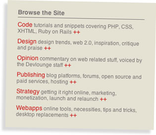
Besides a visual overhaul, still pretty true to the Devlounge look and feel I’d say, the big news is the way the content is categorized. In the backend, a lot of old things and choices still lingered, which is fairly common for sites in constant evolution actually. The key is to focus it so that you can have actual use of things like categories, tags and so on. It’s only natural that things are piling up, so this week will involve me re-categorizing a lot of content to fit our main categories. These have been described earlier, in the sneak peak post, but here they are again:

  • Code focusing on PHP, CSS, XHTML and similar, tutorials and snippets
  • Design on trends, web 2.0, inspiration, critique and praise
  • Opinion being commentary on the web from the staff, will probably delay this one for focusing reasons
  • Publishing blog platforms, forum systems, open source applications as well as paid ones, things you need to publish a website, basically
  • Strategy for launch and relaunch, monetization and SEO, things to help you succeed
  • Webapps is about online tools, necessities, desktop replacements, cool apps, things like that

The reason is of course to make it easier for the readers to find what they’re looking for. I have chosen to put the menu to the right, in favor of the descriptive type, otherwise I’m a fan of horizontal menus.

So category listings with relevant content will be coming along during the week, as will a dedicated archive page, an author archives at that.

The front page is new as well. It’s not the version I showed in a concept mockup way back, but a more straight forward one, displaying the latest articles straight up, but having space for more visual pushes at the top. I expect to tweak this a bit, to find the way to manage it and use it. It’ll be one of those elements where you have to find your way.

What About the Content, People?!

Yes, I’m getting to that. The whole purpose with a redesign is to elevate the content, and I’ve had the feeling that we needed to do that all along. There’s a lot of cool features planned, including my promised ones on bbPress, and I’ve got some promising writers on the way in as well. The idea is to up the publishing schedule, and offer a solid mix of articles and posts in the topics described above.

The whole purpose with a redesign is to elevate the content

I’m also hoping to be able to look through and update the WordPress themes offered here on Devlounge, with better support. Still working on how to solve that.

And yes, the previous Devlounge design will be released for free! Just don’t expect it right away, there’s probably a lot of hacking and customization to do to get it download-worthy. After all, it was made for Devlounge, and not general use.

We’ll offer more downloadable content as well, as we get back into our groove. Expect cool stuff coming out of the article series planned for this Summer… Tease, tease indeed!

This Week Might Be Rocky

Finally, I’d like to warn you all that this week might be rocky, as I take the time to manage the content as well as clean up a few things. I wanted to get this version out in the open, for feedback (the comments are wide open for you!) and reflection. The idea is to make Devlounge great, and that will take some effort for sure.

Expect a follow-up post on the progress late this week, or (probably) early the next.

The Devlounge Redesign: Sneak Peak #1

May 27, 2008 By Thord Daniel Hedengren

It’s been a bit quiet on the Devlounge redesign front for some time now. Juggling a lot of project can do that to a man. However, things are rolling again, so expect a relaunch soon enough. No, I won’t make an estimate yet, those always break anyway, right? Maybe I shouldn’t have said that…

I will, however, give a sneak peak as to what you can expect from Devlounge once the redesign is rolled out. I’m talking about the new categorization of our content.

Brand New Categories

Screenshot from next DevloungeToday’s categories doesn’t really work well with how Devlounge have evolved. I’m sure the plan behind the current layout is both cunning and brilliant, but things change over time, no matter how well you plan them. A good and logical categorization of content for such an editorial site as Devlounge is crucial. I repeat: it’s crucial!

That’s why these will be our new main categories, replacing the old ones.

  • Code focusing on PHP, CSS, XHTML and similar, tutorials and snippets
  • Design on trends, web 2.0, inspiration, critique and praise
  • Opinion being commentary on the web from the staff, will probably delay this one for focusing reasons
  • Publishing blog platforms, forum systems, open source applications as well as paid ones, things you need to publish a website, basically
  • Strategy for launch and relaunch, monetization and SEO, things to help you succeed
  • Webapps is about online tools, necessities, desktop replacements, cool apps, things like that

There might or there might not be room for sub-categories. With tags, I personally think that pinpointing a post’s topic is better left to the tags, the fewer categories you can get away with, the better.

I’d say that the categories Code and Design are the most important ones, the primaries, with Publishing being secondary, and the rest being less frequent on the site. How does that sound to you? Let me know in the comments.

The Next Devlounge Design: Mockup #3

April 7, 2008 By Thord Daniel Hedengren

I’ve been a bit busy the last week, which is why this mockup have been somewhat delayed. Among other things, I’ve moved to a new house, with lots and lots of weird things happening. Ghosts? Who knows…

Seriously, it’s time to crank up the pace a bit. I’ve tried the previous mockup design on numerous contacts, friends, and designers this past week, and there’s a consensus that it is good. So I’m moving onwards with it. That doesn’t mean that it is a final design, it’s still just a mockup, but this is the basic style we’ll be going with.

First Single Post Mockup

So with the front page somewhat specified, here’s the first front page mockup design. It is lacking comments at the moment, and I’m not happy with the box below the post either, it needs some flare and overall TLC. I haven’t touched the sidebar at all, see below.

Anyway, here’s the mockup.

Single Post Mockup #1

Thoughts On The Sidebar

Today’s Devlounge is using the sidebar on single posts to promote the blogger with a short author bio, a picture, and for pushing for RSS signups. While I like the author bio box and all, I’m not a great fan of this, since it can confuse the users. If you’re used to find certain things in the sidebar, and it isn’t there on all pages, then the user might be disoriented. Not a big deal, perhaps, but still.

In short, I prefer to not alter too much in the sidebar. What are your thoughts on this? Looking forward to hearing them, and of course your thoughts on the mockup as well. As always, they’re much appreciated, so share!

The Next Devlounge Design: Mockup #2

March 18, 2008 By Thord Daniel Hedengren

It’s time for another mockup of the next Devlounge, a wee bit later than planned due to me moving house, and everything being as messy as humanly possible of course. Since they’re cutting the power at the office any minute now, I’ll just get this new mockup up there, and let you guys say what you think!

The Second Mockup

Some notes about the second mockups:

  • It’s still the front page.
  • I’m not too fond of the three top feature listings, due to dragging too many images around and changing too much. To put a long story short, it should look better than it does…
  • Editorial info should be added to the sidebar.
  • The footer isn’t done! I just took the one from the next Wisdump for now.

Here we go!

The Second Devlounge Mockup

There you have it. Do compare with the previous mockup, which this one is built directly upon. Have I tackled the problems like you wanted? Please let me know what you think in the comments!

The Next Devlounge Design: Mockup #1

March 4, 2008 By Thord Daniel Hedengren

As promised, we’re inviting our dear readers to share their minds on the next Devlounge design. This is the first of several posts detailing the development of the next version of Devlounge, be it design decisions or how to better sort the content.

Some thoughts on Mockup #1

You’ll find Mockup #1 below. It’s not a far step from today’s Devlounge, for several reasons, one being recognition. The main thing to notice is the way the content is divided, with features at the top, and then a stream of updates. The sidebar will be utilized for more static content, such as downloads and extras, and perhaps some other things.

Anyway, there’s not too much to say about this first mockup, called Mockup #1. It’s not complete, and everything will look slightly different in code.

Here goes!

Devlounge Mockup #1

What do you think? Speak up in the comments, your opinions will help make the next Devlounge a prettier, and more organized, place!

Next Page »

Code & Tutorials

Which Front-End Development Languages Will Grow in 2017?

Your Guide to Leveraging APIs as a Developer

Bitcoin Processing Website Integration For Web Developers

Website Security For 2016 That All Developers Need To Know

5 Reasons You Need to Be Using jQuery

About Devlounge

Want to read more about Devlounge, or maybe you want to contact us, or even advertise? Oh, and don't forget to subscribe to updates!

The Best of Devlounge

The Passionate Sabrina Dent

Search