We just had our WordPress database from yesterday (roughly 24 hours ago) restored, so if you commented in the last day, chances are we lost it, so, unfortunately you’ll have to do it again. The good news is everything seems to be loading smoothly again, so keeping our fingers crossed, the load time issue is resolved.
The Debate of Flash, Usability, and Standards
Hey All,
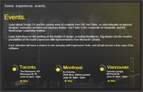
I thought today, I would touch on the debate between Flash and CSS/Accessibility, based on my own work experiences. I would also like to announce that I will be releasing a tutorial/review of Microsoft’s new suite of Expression, as well as the accompanying Silverlight. I was fortunate enough to work on a project for Microsoft, and learned about these tools first hand. I would like to point out, that I was not behind the design however, and would have made a few changes. However, I will be touching on my concerns regarding this as well.
Until I’ve worked everything out on what will be shown in my next Article, I thought I would focus on a few things that have been bothering me at work. You see, I recently started working at an online marketing agency. This means that they don’t focus on the web as much as they focus on making things look “hot”, that being a direct quote from our lead designer.
You see, upon leaving the bank, and arriving at this agency I entered somewhat bitter from the corporate world. When I saw how they operated, as to how the bank operated it was a complete shock to experience such a laid back, great environment to work in. I want to stress this now, because I love my job, and this is by no means a post about how I hate my job, but instead a clash of opinions. So, on that note, let’s get started.
I came in during a rather large turnover, for various reasons. It wasn’t so much a bad place to work, as much as several situations at first. As a result my first project was a problematic dating site, built in ASP. This was problematic, as my job, being hired as a programmer, was to convert the access database to MySQL. This issue, however, was not even an issue in this job. You see this site had been worked on before me, twice before. An attempt to move it to a MySQL database had already been made, with the failed work still showing. It was during this time, did I learn how easily it was to break the layout my new employers had created. It was driven through tables, in a delicate balance of sizing and spacers. If you pushed this layout by just one pixel, it broke unlike anything I’d ever seen before. Things disappeared, navigation dropped to a completely different location, and the text breaking the layout disappeared due to poor CSS.
When I raised my concerns over this, I was told their concerns were not to build the layout in divs and CSS (as at this time, I’d pointed that the layout would be easier to work with, easier to maintain, and quicker to implement new features) as tables were far easy to work with when building and they’d deal with any other problems later on. They turned away and went back to designing for more major projects, and finishing all the flash elements, like the basic rollovers for the navigation. It was at this point did I start to realize that my own web interests may clash. Needless to say, I worked through it (among a dozen other issues) and got the job done.
The next issue came with the Microsoft, as we were in the designing stages. I had raised the question regarding what we would do with all screen resolutions under 1280 x 720. I was told they were merely designing for Microsoft’s resolutions and that anyone underneath that wouldn’t be considered. Again, I had problems with this because I am an advocate for accessibility. I am still learning, but ever seen learning my fiancée was going blind, and often struggled to used the internet due to lack of support and hence why she didn’t understand why it was so important to me, I’ve been learning more and more. I still have a long way to go, but I know some of the basics, and one of those is cutting off anyone who may view a website differently. Again I was shocked. I didn’t understand, at the time, why they would do this.
So again, today I learned of a new social networking project we’ve begun. I do believe it could be very successful, and I am, right now, in support of it. Although the idea is very rough, it could really work out well. However, I then learned they wanted to build this new app, with hopes that it could be the next facebook. Although I don’t see it being a 1.6 Billion, and rising, application, I do see it being somewhat successful.
At least, I did believe that, until I learned they would eventually want this whole site to be designed entirely in flash, and designed for any screen resolution at least 1024 x 768. I could see this being the one thing that could make this project fail in the long haul. I believe in flash, and I believe when used correctly at the right places it’s a great tool. I just don’t think I agree with the concept of sites being designed for flash, and then the HTML being considered secondary, if at all. (As was the case with the Expression project)
I do believe there is a time and a place for certain resolution requirements, but with something that is hoped to be the next big social networking item, I think they need to stop trying to make things look “hot” and “sexy” and instead, focus on allowing as many users as possible to access the site as easily as possible with as little hassle as possible.
My question to you all is, what do you think? When the goal is to make something look good, do we need to sacrifice accessibility, and usability? Or are standards, XHTML, and CSS holding designers back from making something unique and amazing? Is full flash sites still popular, or have they run their course? Could a social networking program be successful in 100% flash?
What do you all think? You know my views, so I’m interested to know yours.
Think Nothing’s Going On?
If you wander around Astereo, you may happen to find to preview the currently in progress Devlounge design. Just thought I’d let you know, you know, if you’re bored or something. Keep checking back for more updates. For now, that’s all from the redesign HQ.
Friday Focus #33
This is a special edition of Friday Focus, as it the very first one (out of 33 weeks, which is pretty incredible) that is being published on the first of the month. This gives us an odd and rather rare chance to explore the month ahead (in what will be a very big and productive one), rather than looking back on the weeks past. And since for us in the State’s, this week was a very short week with Memorial Day on Monday, it makes a bit more sense to hype up some upcoming events.
Digg Weekly
But first, we will start off with our usually top Digg picks.
Design – Hey Ya Typography Animation
For those that remember, we featured another motion text flash video a while back that matched a scene from a movie with moving, animated text. This is a similar experiment, this time matching some background music.
Programming: Google Maps gets upgraded
It hit the Today Show today, and now you can have a look for yourself. Google has updated Google Maps to provide actual street views of some major cities and locations. It’s very cool and fun to play around with.
That mystery illustration
And now to announce who will be designing a whole new set of illustrations for the upcoming redesign. Mr. Fernando Lins, who I have been a long time fan of since first seeing his portfolio, will be putting together some great abstract illustrations for us in the coming weeks. It will definitely help keep the artistic touches fresh around here, something so many have people have said they would hate to see us lose in any type of redesign.
Timetable for Upcoming Updates
These dates are not yet so in stone, but use them to estimate when the new design and content will be arriving. Depending on when the launch is will depend on when other events occur, but if an event is 2 days after the launch, you can expect that to remain constant regardless of the actual launch date.
- Wednesday, June 20 – Launch of the newest Devlounge design, along with many new features.
- Thursday, June 21 – Devlounge version 2 will be released as free WordPress theme.
- Friday, June 22 – Devlounge “Hub” goes live.
- Sat, June 23 – In the Making – An extensive documentation article on the recreation of Devlounge, how statistics were analyzed in constructing the newest design, and an overview of new site features.
- Sun, June 24 – Three interviews with some “major” people in the design / development field will go live.
For Designers, Developers, Entrepreneurs, and You
Yes, that will be the slogan for the next release of Devlounge. The main point in the whole slogan being the emphasis on you. Have an idea for a topic you want us to cover this month? Let us know, we’d love to write about it if it would benefit you.
New Homepage Tomorrow
Not that homepage. With the main focus for the next few weeks going to be on completing and coding the next Devlounge design, as well as testing out new parts and features (along with juggling finals), the content department around here will essentially turn off, with the exception of new Friday Focuses. To prevent the homepage from becoming too stagnant, I will be introducing a lightweight temporary homepage tomorrow or Friday at the latest that will spotlight some of our favorite posts, interviews, and article series. The rest of the site will remain fully functional, without any visual changes. I’d say I’m about 3-4 weeks out of launching the next version. Comments have been mixed, but don’t just go with what that Flickr teaser may have shown you, because the final design will have plenty of nice touches no one has yet to see. If you haven’t done so already, please subscribe to our rss feed to stay on top of updates. We thank you for your patience and understanding during this transition and slow time for us.


