Welcome back for another addition of Friday Focus. Let’s jump right into it this week and not waste any time with silly introductions!
Sites of the Week
Rock Your Stock begins our list this week with the very green, very money like theme for an investing / financial blog. The design matches the content well, which is one of the main reasons RTS was chosen for this week.
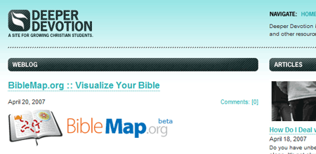
Next up is Deeper Devotion. Church sites are not what they used to be these days. The days of slapped on wysiwyg html are being replaced with some really nice designed sites, and DD was no exception. Everything is laid out quite nicely, and it actually gives an urban appearance to a religious site.
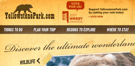
A rounding out this week is the Yellowstone National Park tourism site. A grungy layout meant to give a park feel does the job well, and bits and pieces also use flash to add effect and features. What surprised me was the the site is also up a Webby Award – not something many national parks find themselves looking to score.
Digg Weekly
Design – 25 Reasons you might be a hardcore web/gfx designer
A great fun little post with 25 simple reasons of why you might be a hardcore designer, ranging from studying your boyfriend / girlfriends shirt to critiquing menu design while out to eat.
Programming – WordPress Digg Widget
The past 7 days in Programming only saw a few items get hot, and I though the most interesting [or useful] would be this release of a WordPress Digg Widget, simplifying the digging process from individuals sites’ even more.
Refresh07 Results
The winner of the 2007 Spring Refresh Contest is Greg Wood! Greg took our current layout, played around with it a bit, and cleaned things up to provide a fresh feel for the site. Even though colors remain close and the layout is essential the same, I think in the long run, it benefits readers who have become accustomed to how things look. We will be working off his winning layout (which he is even doing the base coding for us) and trying to add more too it and address some complaints of the site being “too much copy” with so much text stuffed together and such a busy homepage. We’re going to find ways to break things up, so don’t worry. Please leave your suggestions in the comments, so we can get moving in the direction you want us to go with our next design.
Once again, congratulations to Greg. You can see an entire screenshot of his submitted design by clicking the image below (will take you off this page). Once again, thoughts are welcomed!
*Note: Footer won’t really be that big. 😉


