This week’s picks are cute, cheerful, and all scroll horizontally. Let’s see how they pulled off this layout technique.
Designs of the Week
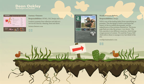
It seems that creating a horizontal-scrolling website need not require too much graphics, just a background that can stay fixed all throughout.
I like that the vines growing around each item in the portfolio are subtle rather than overpowering. It’s pretty common these days for illustrations, especially nature-related ones, to be simply staggering in appearance, but not here.
A full-on Flash site for a corporate brand that went for horizontal scrolling as its navigation. There’s a lot of stuff going on, and all the elements come together in a quirky way. Notice how the color pallette is similar to that of Dean Oakley’s site. Muted, “retro” colors are a good way to instantly change the look and feel of your site.
Social Media Weekly
Design – The Web Time Forgot
A global network of computers envisioned long before the Internet was invented.
Design – Wow! 10 Awesome Interactive Websites
What makes an interactive website stand out from the rest? This article may have the answers.
Programming – The Greatest Invention in Computer Science
What’s the most important invention in the field of Computer Science, apart from computers? You might be surprised.
Programming – Episode 4: Scaling Large Web Sites with Joe Stump, Lead Architect at DIGG
A podcast that discusses how the top 100 websites were built to scale.
