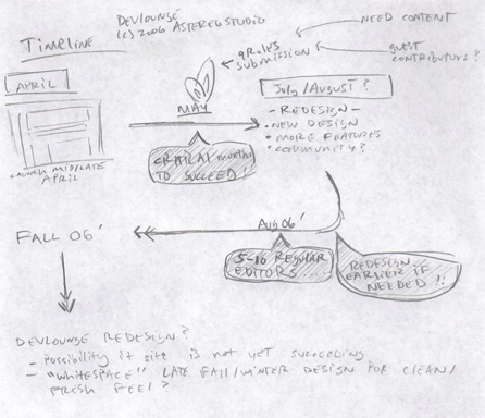
Back when Devlounge first launched in April 2006, one of our very first articles highlighted how we put together Devlounge, titled The Design Process. Roughly four months later, Devlounge is back and sporting a brand new, updated design, and what better way to kick off the new look with an article highlighting everything it takes to redesign your site.
Plan, Plan, Plan
Way back in April when DL was just starting, I was already planning what I would want to see come the next version of Devlounge. Prash continued to tell me to slow down, and not think so far ahead, but I couldn’t help it. I wanted to see Devlounge succeed, so much so that barely a week and a half into the launch I had ideas spinning for DL2.
The thing is, there is no such thing as thinking too far ahead. It’s important to plan for the future, especially on the Internet, because many time in order to stay afloat you need to be on top on the days advancements.

Even in April, I planned to launch DL2 in the summer, hoping for a late July or Early August relaunch. But it would all depend on another event, that was looming in the near future.
Public opinion does its part
It all would come down to the results of the 9Rules Round 4 Submission. I made plans with myself to get going on DL2 if I was accepted into 9Rules. If I wasn’t, I would hold off DL2 until the end of the year.
Devlounge was accepted into 9Rules, so I got right into it, putting together my first mocks and ideas in mid May. One thing that was very enlightening was the public’s view on Devlounge. So many people left wonderful feedback on the Devlounge design, that it pushed me to want to make things better, while at the same time leaving the layout somewhat intact, because it has been received so well.
