In honor of Earth Day 2009, which took place this week, let’s look at organic, sustainable, eco-friendly websites not only in appearance but also in substance.
Designs of the Week
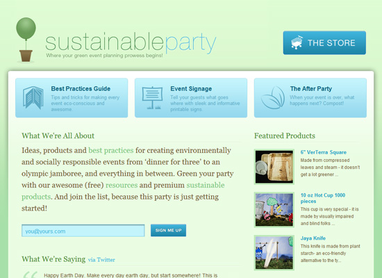
Although not shown here, there’s quirky illustration for this site’s footer and it’s probably the only design element I’m unsure about here. It makes me question the use of the lightest Helvetica for the logo, and makes me wish the upper portion of the design had more fun touches too, which says more “elegant” and “professional” than “party”. But I do love this elegant and professional look.
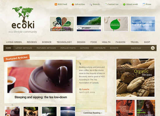
Two things that make this site design great: (1) well-made details everywhere you look; and (2) excellent management of a large amount of content. If you have those two things in your site, you’re good to go.
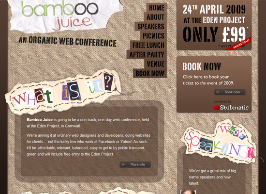
I love the canvas texture as the background for the whole layout. The magazine clipping style text and the stenciled text add to the casual feel of the site. It’s interesting how people use transparency and rounded corners in collage-style sites.
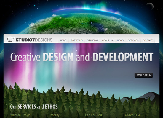
I love the huge and colorful header, including the big Earth in the background. Lots of Apple-style effects here, but what struck me most was the use of nature scenes rather than the usual icons to represent the different sections of the site. It fits in well with their eco-friendly philosophy and makes for memorable branding.
Social Media Weekly
Design – Web Design Trends: Designing Out Of The Box
Programming – 15 Favorite E-Books for Web Design and Development
Eco – 101 Great Eco Companies


