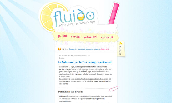
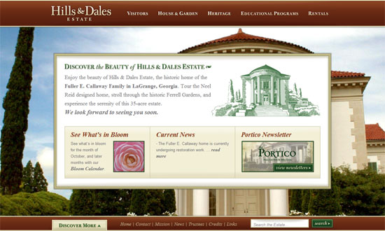
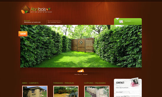
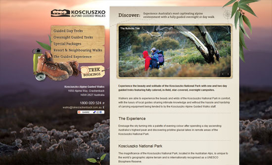
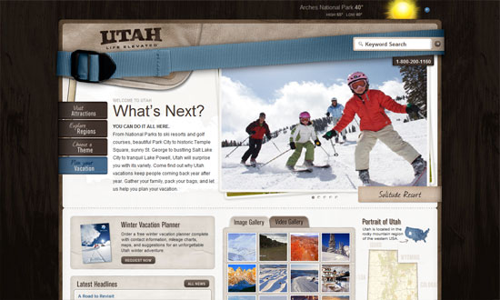
This week, I’ve come across a lot of sites with sunbursts, a specific type of lighting that’s popular with not just the Web 2.0 look anymore. You decide if they’re crucial to the design or not.
Designs of the Week
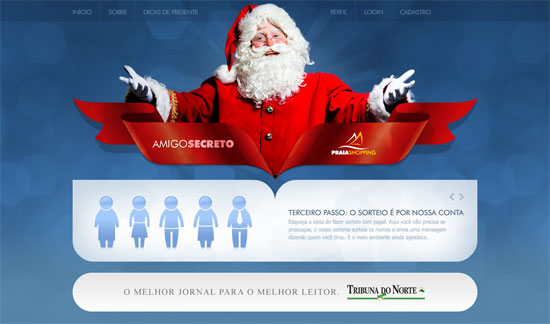
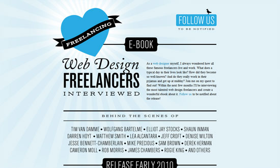
Love the way the shape of the ribbon creates a similar cut for the rounded box below it. Everything in here is so chic, but it makes me wonder if to the ordinary visitor it’s Christmas-y enough.
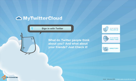
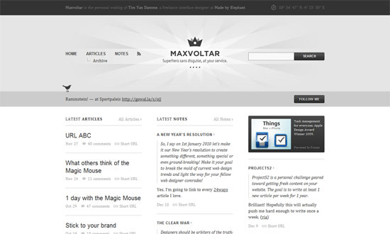
I don’t get tired of seeing 3rd-party bird mascots for Twitter apps, but people could be a little more creative with their “cute” typefaces.
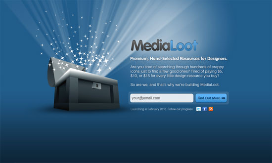
Overall, it’s a good look. But the treasure chest could’ve been more refined, and I’m not too keen about the inner shadow effect on the logo.
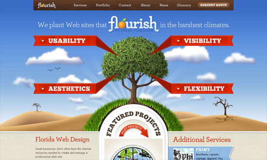
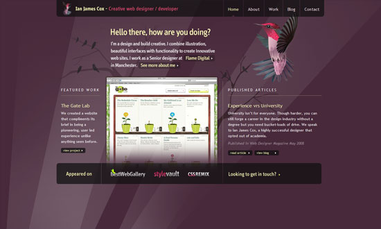
I could waste so much time telling you every bit of awesomeness on this site, or I could just tell you to go visit it and see for yourself. Perhaps the one worth mentioning here is the Featured Projects section, which looks pretty different compared to the other carousel designs we see. Also: respect to the tree!
The way the polaroid-style photos shuffle from front to back is topnotch.
The only thing that disappoints me here is that the blog is not as well designed as this site!
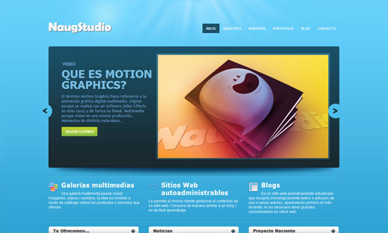
The sunburst is so subtle you’ll barely miss it. It’s practically design with the rest of the design. Lots of icons!
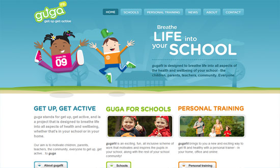
Excellent details here, from the illustrations to the framed photos to the type—the rounded font works so well here.
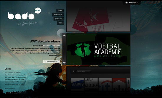
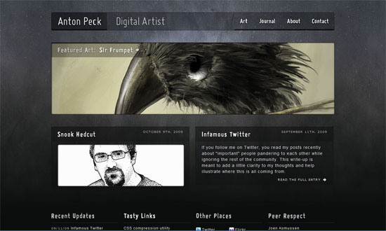
Sometimes a narrow, low-contrast site is the way to go, and that doesn’t mean you have to skimp on the details. I’m not sure the graphics are at the footer, but it definitely reinforces the scrapbook/collage look but doesn’t look heavy at all.
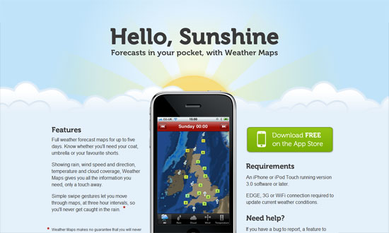
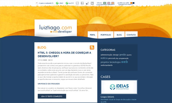
The last thing that appears on the page is the sun, which rises from behind the clouds. Good morning to you too!
Love the rainbow-colored navigation bar at the very top. The subdued blending is like the color palette for the whole site.
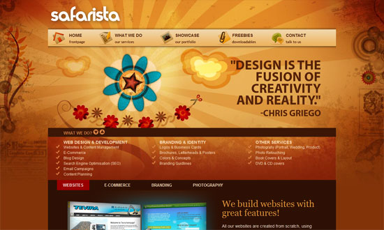
People should be more creative with the shape of their sunbursts, like this one. Love the fixed navigation on the rightmost column.
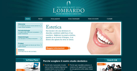
The color matches the dentists scrubs! I also like the arrow treatment—a great way to build to your branding, although I’m not sure if it does match theirs.
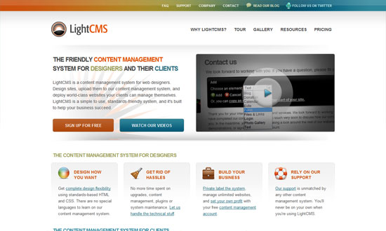
A nicely textured sunburst.
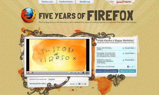
I love the splashes of orange watercolor mixed with the ornamental line art. But most of all, I love how all the user-generated photos are laid out on the page.
Some things need to be tweaked to work better but overall, the warm and playful nature-loving look is a welcome one.
The stark type in black combined with the two shades of blue is a nice departure from typographic sites that are usually black and white.
Needs a bit more color below the fold, but this site has its type and graphic details down pat.
I like the boxiness against the painterly header.
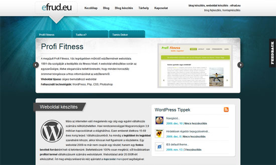
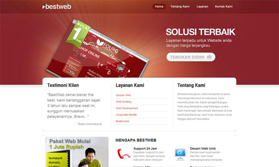
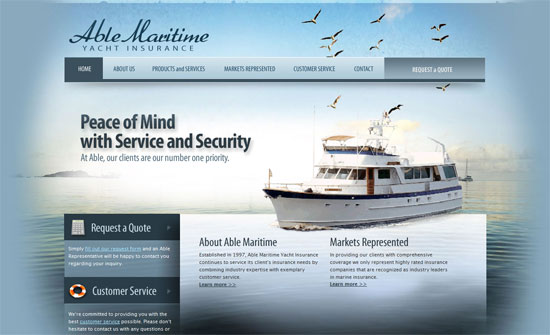
The amount of shine on this site is staggering, you’d think it were the set of Twilight (so I hear). But I like it. The links have large clickable areas, custom fonts are used everywhere, and they know their whitespace (though in this case it’s bluespace).
Social Media Weekly
Design – When Minimalism Backfires: When Too Little Is Not Enough
“This article explores some of the potentially negative side-effects of minimalist designs and the consequences of implementing one incorrectly.”
Typography – The Rhetoric Of Typography
“A functioning message is one that succeeds in connecting with the habits and expectations of its audience.”
Web Design – 10 short ‘n’ sweet tips on how to design for web
“This article will quickly run you through some of the greatest issues with design for web and hopefully give you something to think about when you start your next web design.”
