• Home
  • About
  • Contact
  • Advertise

Devlounge

Design, Develop, and Grow

ateşli sevgilisi fantezisini yaşamak istediğini söyler porno ona arkadaşları varken onunla gizli saklı seks yapmak istediğini sikiş söyleyen kız hafta sonu için gelen arkadaşının görmediği bir sikiş açıdan sakso çekmeye başlayınca adamın yarağını bu altyazılı porno şekilde indiremez ve açık şekilde salonda sikişimeye sex izle başladıklarında misafir kızı da bu sekslerine rokettube konuk ederler seks yapacağını düşünmeyerek onun sex izle oyun oynadığını zanneder sabah olur ve herkes uyanır hd porno bu sırada yanında şişme mankenini de getiren sapık erotik hikayeler genç sınav haftası ders çalışan genç adam üvey annesinin sikiş eve gelmesiyle hayatının şokunu yaşar

  • Home
  • Code
  • Design
  • Design Focus
  • Interviews
  • Publishing
  • Strategy
  • Webapps
  • Extras

Friday Focus 08/14/09: Sewing & Crafts

August 14, 2009 By Sophia Lucero

It’s Friday once again and this week on ‘Focus we’re looking at very “domestic” looking sites, like they were put together with fabrics, thread, and craft supplies!

Designs of the Week

FeedStitch

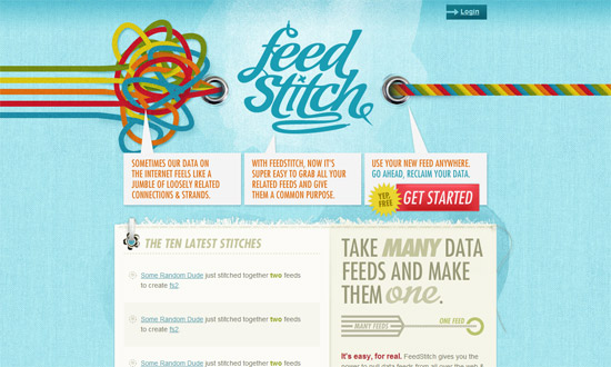
This site is a prime example of a successful collaboration from concept to branding to execution. “Stitching” together a feed is a great metaphor, and consequently a great brand name, and now a great site design. This site is cheerful, has the right amount of texture, and will leave a good impression on those who visit.

Show & Tell Consignment Sale

Beautiful typography, color combinations, and graphic details. The etched text effect here doesn’t look forced as it fits the look perfectly. Perhaps the only thing I’m not 100% keen about (just 99%) are the icons used. They’re a bit impersonal and out of place considering how homey and crafty looking this site is.

Kreativa Unlimited

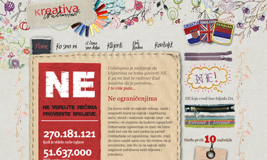
Now this is what you call coming up with an idea and running away with it! The use of real fabrics, embroidery, and other sewing materials are just a joy to look at.

Elegant Themes

Great use of whitespace in the header. The image carousel is great too—gives a nice, 3-dimensional feel to it, even if they’re just images. And the zigzag edge effect (like they were cut by pinking shears) found at the top and bottom keeps the look consistent.

Fabrik Agency

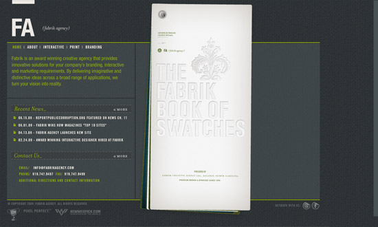
I very rarely feature Flash sites here, but this one’s nice enough: it has permalinks, which makes inner pages more accessible and navigable. Aside from the background and broken line borders, the animated transitions for each section of the site look like you’re flipping through a collection of fabric swatches, completing the metaphor.

Owltastic

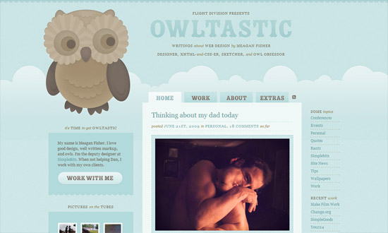
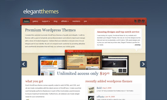
The subtlety of the site’s design—subtle hues, subtle gradients, subtle edges—is what makes the look so delightful. And it pays to have a mascot, especially ones that interacts with you. Hoot!

Social Media Weekly

Design – The evolution of web design
The kind of history lesson us web designers need.

CSS – Away With Widths / Use and Abuse
An in-depth discussion about the right way to declare widths in CSS.

CSS – CSS Deconstruction: Atebits
Take notes on all the little details used to built Atebits.com.

SEO – Optimize your crawling & indexing
Google gives advice on optimizing website URLs

Friday Focus 04/10/09: Dark Rainbows

April 10, 2009 By Sophia Lucero

Rainbows are typically loud and attention-grabbing, but these sites have toned down the explosion of color to bring about a more modern look altogether.

Designs of the Week

Neutron Creations

The background is like a blueprint with an interesting twist. I love the icons in the Services section—I want to see more of them! The color wheel-like logo is lovely too.

WebKitBits

This site screams Apple UI, from the typeface to the pill-shaped interface elements, all with a very subtle gradient and etched text effect. I guess the only thing that bothers me are the color choices: why black for the ordinary text, and why bright blue and magenta for the headers and links.

Stefan Velthuys

The rainbow background here is so subtle, one wouldn’t mind having two strips of brighter rainbow gradients on the top and bottom parts. I like the transparent fixed footer, which is just text. But I’m also oddly drawn to the datestamp on the top right corner—it’s just well-designed.

Main Event

Hip and clubby sites tend to use rainbows and glitter and funky lines, but here I’m glad it’s more of an accent than a trademark look. I love the use of brown. Even the rounded corners, which doesn’t feel like a fad, but a nice touch that somehow adds some funk.

Social Media Weekly

Design – White Space: How to Get it ‘Right’
Examples and practice make perfect.

Design – Top 7 Icon Search Engines
Because image search, let alone icon search, is tricky enough.

Programming – The four stages of programming competence
Which stage are you?

Friday Focus 04/03/09: Pale Browns

April 3, 2009 By Sophia Lucero

The featured sites this week know how to use lighter, lower contrast hues of brown to evoke a professional, comforting mood.

Designs of the Week

Little Silver Behavioral Health

I love how calming this site looks. The light colored wood, the etched/letterpressed text, the shadows underneath the paper, and of course, the tea!

Miles Dowsett

When I first saw this site I thought, “he makes Georgia look so good”. Really, the typography here is inspiring. I also like the ample use of whitespace and ornaments for the welcome blurb.

E3Solutions

I know that company sites tend to stay away from serifs because they’ll come off as too stiff and old, but this site looks striking exactly because every other company is using sans serif text these days. I also like that instead of stock photography, nicely shaded illustrations were used (except for the inner pages, sadly).

Social Media Weekly

Design – 42 Pagination Design Inspiration

Design – 17 Adobe AIR Apps That Can Save Your Time

Programming – Safari’s text-shadow anti-aliasing CSS hack Revision

Programming – 10 Creative & Rich UI & How to Create Them

Code & Tutorials

Which Front-End Development Languages Will Grow in 2017?

Your Guide to Leveraging APIs as a Developer

Bitcoin Processing Website Integration For Web Developers

Website Security For 2016 That All Developers Need To Know

5 Reasons You Need to Be Using jQuery

About Devlounge

Want to read more about Devlounge, or maybe you want to contact us, or even advertise? Oh, and don't forget to subscribe to updates!

The Best of Devlounge

Larissa Meek

Search