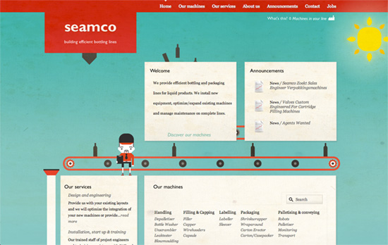
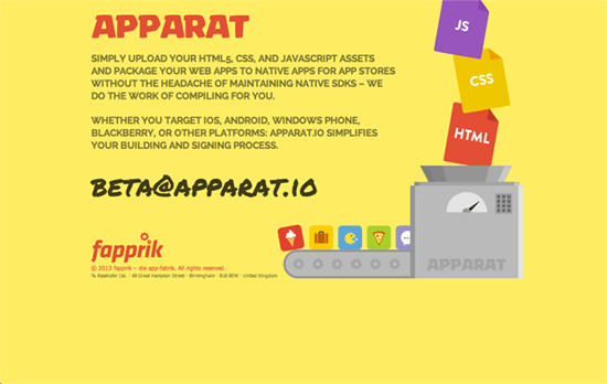
An apparatus that puts products together and transports them for export and consumption is the main element in this week’s featured designs. Interestingly enough they’re not done in the stark, industrial way they hail from.
Designs of the Week
Build on DIYThemes’ Thesis Framework for rock solid SEO and great layout customization options.

Animated sites aren’t hard to come by these days, but what I truly appreciate about this one, besides the fact that the whole bottling process—which is what the company is about—demonstrated from top to bottom and start to finish connects all the boxes of content together, is the level of detail in the animation story, especially in the footer section. There you can see an orange truck backing up to pick up not one but two crates of bottles stacked on top of the other. The animation shows those two boxes being brought down first before they’re shipped away. There’s a great work ethic and design sense in not taking shortcuts to tell that story and I give it a two thumbs up.

How I wish that this one-pager were animated as it’s par for the course in most scene-setting designs these days, but this one’s satisfactory enough.

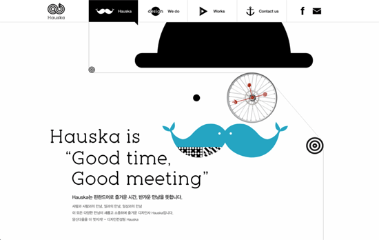
There’s a bit of a recurring floating, anti-gravity effect going on with the objects, tied to the nautical elements on the page. Aside from the predominant black and white theme, accent colors are the primary reds, blues, and yellows.
Social Media Weekly
Make Headway, make intuitive layouts, make it your WordPress theme of choice!
Usability, Mobile Web Design, User Experience – Tablet Usability
“Flat design and improperly rescaled design are the main threats to tablet usability, followed by poor gestures and workflow.”
Design – Coming Clean on Texture
“I’d encourage you to find those things that have become “safe” for you. Those techniques you’ve come to lean on, but that aren’t helping you grow like you should be.”
Optimization – Taking Control of Image Loading
“Having a beautiful, smooth and speedy loading experience for your site is a crucial part of good UX, and should be considered a common courtesy to your designer. After all, who wants to see their design spoiled by choppy line-by-line image loading every time they log on?”
Design, UX – Dude, I redesigned Facebook!
“Make sure you clearly describe what your design attempts to improve upon. Why does this service or product need redesigning, who will benefit and what goal will it help achieve.”
