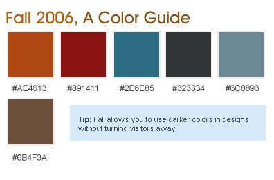
With the 2006 Fall CSS Reboot about to get underway in the next couple of weeks, what better way to get your design senses flowing well with the latest season by using this helpful guide. In it we’ll point out some colors and techniques that you can have a much easier time getting away with using different the fall than any other season.
Fresh Fall Foliage
So it’s that time again. We finally have said goodbye to summer, with it officially coming to and end for a good portion of us just a few days ago. You know how it is – you’ve probably been running with the same old site design since last springs CSS and May 1st Reboots. Don’t you think it’s time for something new? Of course you do!
As with the color of the leaves, sites needs makeovers, even if there is nothing wrong structurally with the site, at least a change of colors and fonts would do.
Keep It Fresh
The best way to get visitors to keep returning is to put together something new every few months, particularly if the only thing you our updating is a portfolio site or blog, because it requires less work than a large scale site. We’ve tried to do this with Devlounge, by updating the design every few months and adding touches here and there as we see fit.
Begin planning for fall designs now, and start fooling around with various mocks of possible colors and layouts you’d like to tinker with.
Get Away with those Fall Darks
One of the benefits of fall is the ability to get away with the use of darker colors in situations where most designers would generally frown upon it. While summer designs tend to have a more wide open, airy feeling to them, fall designs tend to be darker and express the change of the seasons.

Shades of dark oranges, reds, blues, and blacks can be very useful in fall designing. But, remember to limit how dark you make your site, because going too dark can turn visitors away, that is unless you’re Matt Brett.
Let’s take a look at the css reboot site, which has been updated for the fall by switching to a dark black / green color scheme.

Success With Whites
Just because you can get away with darks in fall design doesn’t mean that you have too. Looking back at sites that did well in the 2005 Fall Reboot, you’ll notice a lot of white with use of some of the dark, bolder colors such as greens and blues for content area (ex: previous version of 9rules).
By using colors that pertain to the fall, visitors feel like they are immersed with the actual season itself – think of it as falling snowflakes without the cheap javascript include.
Don’t Leave That CSS Alone
Even if you have no plans to do an entire redesign of your site(s), open up the stylesheet and edit some colors. Add some variety to your life by changing up font colors and sizes, background colors – maybe even a “fallified” logo. Even small changes and enhancements can refresh the site to the state it was at when the design first launched.
Good luck with your fall reboots! In the coming weeks, we’ll be discussing more techniques for preparing for fall reboots, as well as showcasing some reboot designs before they go live from some top designer talents (members of Mintpages). Stay tuned!
