This design pattern also happens to live on the copywriting aspect of the website: a tagline that flashes different words or phrases, often to describe the target audience of their product or subject. You’ll see how each site chose to swap, highlight, or animate the letters into view. It’s another way to make the site more dynamic, and possibly even intriguing.
Designs of the Week
Search Optimized, Turn-Key Designs, Unlimited Everything. Start building with the Genesis Framework today.
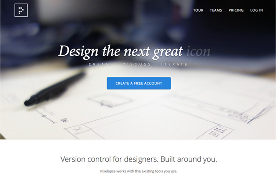
A few combinations at work here: serifs & sans serifs, photographic backgrounds & “flat” vector artwork, static images & animated ones. I like to think it’s a mix between traditional and real-world concepts working together with the digital and modern flows & concepts.
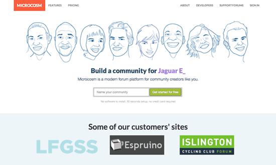
I quite like the illustrated faces greeting you on the homepage, particularly with quirky, striking expressions that stand out. I think the features page could have focused on a screenshot-tour first before busting out that massive comparison table.
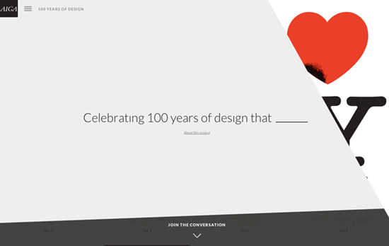
Very interesting to have the iconic art and design pieces flashing in part over the web page. The navigation goes sideways for the main sections, then downwards for its subpages. Don’t be fooled by the grays on the home screen – this site is not afraid to use bold, bright colors even with the text.
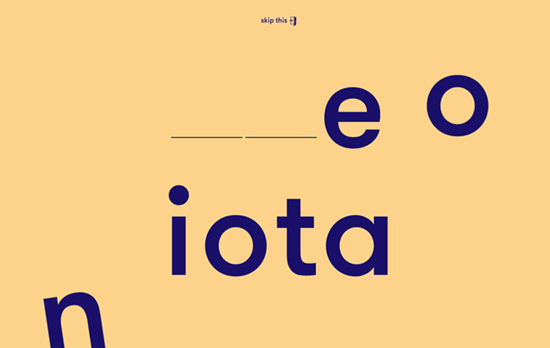
Newcomers get this “puzzle” screen (which has several variations) that expects you to drag the letters into the correct blanks to spell out their name. In a way this site also starts out as a screen with a massive logo first. Inside the color scheme changes to match each item in the portfolio, and the images are a mix of shapes derived from the graphic design used in the project, framed shots of that put the project in context, and standalone objects that “float” outside those photos. Feels playful and even a touch retro.
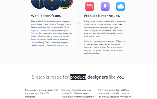
At the top you’ll find beautiful, detailed application icon design that Mac apps are typically known for, while the rest of the icons are simpler.
Social Media Weekly
Need help in promoting your site? INeedHits has been in the search engine marketing since 1996!
CSS – Naming CSS Stuff Is Really Hard
“Class names within a given category tend to share maintainability characteristics. If we make naming decisions with these categories in mind, we can make smarter decisions about what we’re calling things–decisions that will make our CSS more resilient to change.”
Design – Junior Designers vs. Senior Designers
“I like words a lot. But sometimes a few sketches communicate a point more simply and memorably.”
Email Design – Email Design Workflow
“I’m not trying to achieve pixel perfect mockups. Emails never look the same across all clients, so I’m not going to waste time on pixel perfection.”
