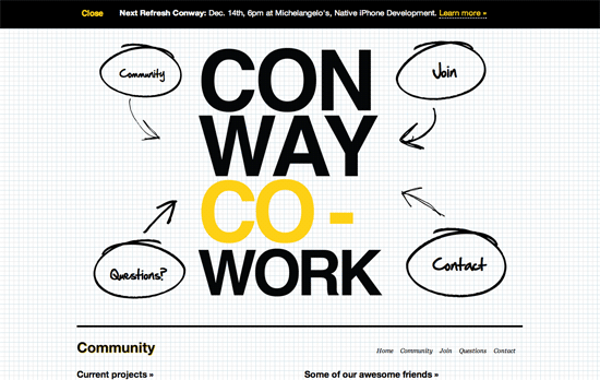
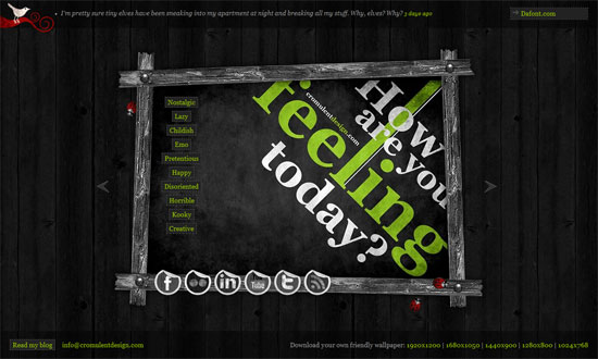
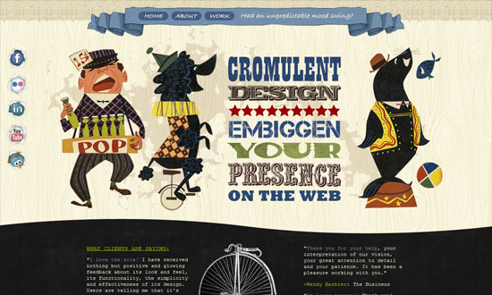
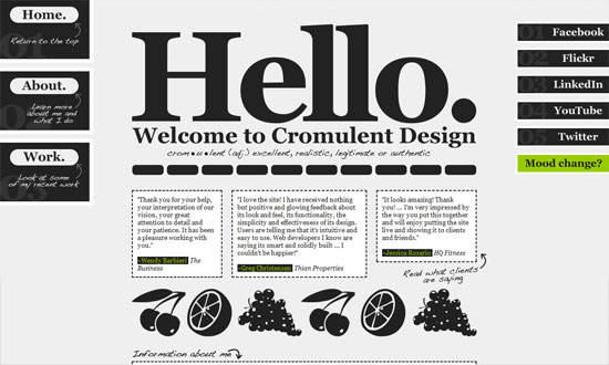
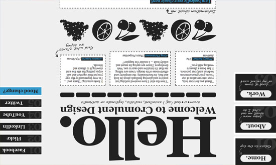
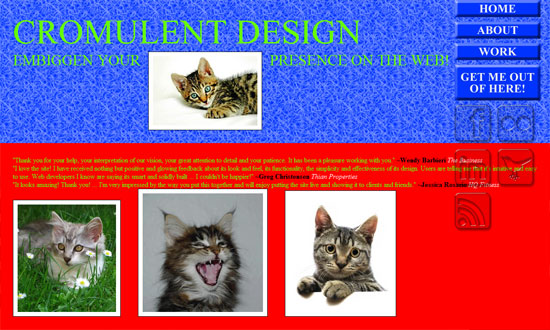
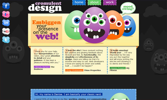
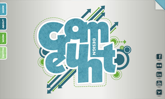
I’m a much bigger fan of this effect than straight-up parallax: using fixed backgrounds and illusions done by layering images to produce clever animations, all triggered by scrolling the page.
Designs of the Week
Get solid WordPress themes, plugins, and even design training from iThemes.
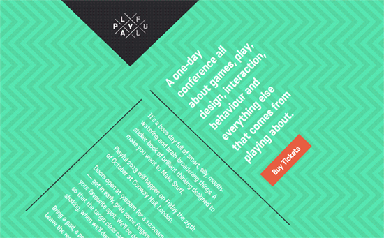
Combined with rotated text, this geometric background pattern animation induced by scrolling is quite hypnotizing. You can see that same shape theme carry over to the logo, the dividers, and the footer.
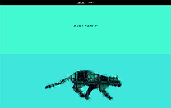
The use of fixed backgrounds and frame animation produces this awesome running halftone cat. The content was repeated several times so the visitor can enjoy scrolling a fair amount, though it would have been fun to have an automatic button that does the work for you like the “go backwards” one does.

Love how the title is deconstructed and then comes together as you move down. There’s even this moving patterned shadow in the subtitle as well. It breaks up again as move further and onto the portfolio. Another cool feature to check out: the group photos under the Cast section are actually dynamic, every single person in the shot is clickable, leading you to his/her individual work. The rest of the people fade out when you hover; the same thing happens if you do it on their names.
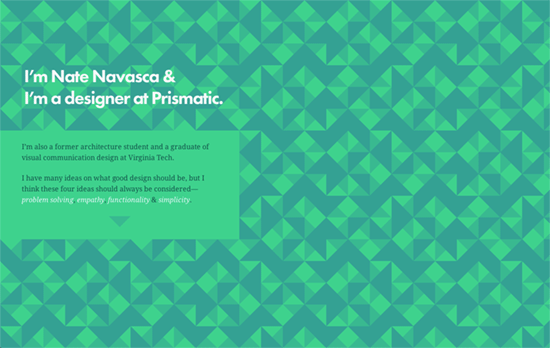
Not only is each section represented visually by the background, the animation produced by scrolling explains it further. All done in geometric, abstract illustrations.
Social Media Weekly
Create unique, extraordinary websites with Squarespace. No experience necessary!
Design, Optimization – One Less JPG
“Before you go worrying about how to minify every last library or shave tests out of Modernizr, try and see if you can remove just one photo from your design. It will make a bigger difference.”
Design – The design process of my infographic about women cycling for Grinta!
“There is a certain order in place of the mayor steps you take during this process, but there is a big part that isn’t very logical, even chaotic.”
Responsive Web Design – Pixel-free CSS
“I think the Web should fully move in this direction. True proportionate sizing seems to me a more authentic way to responsively fit websites to browsers (rather than media queries that simply toggle between set pixel widths).”
