• Home
  • About
  • Contact
  • Advertise

Devlounge

Design, Develop, and Grow

ateşli sevgilisi fantezisini yaşamak istediğini söyler porno ona arkadaşları varken onunla gizli saklı seks yapmak istediğini sikiş söyleyen kız hafta sonu için gelen arkadaşının görmediği bir sikiş açıdan sakso çekmeye başlayınca adamın yarağını bu altyazılı porno şekilde indiremez ve açık şekilde salonda sikişimeye sex izle başladıklarında misafir kızı da bu sekslerine rokettube konuk ederler seks yapacağını düşünmeyerek onun sex izle oyun oynadığını zanneder sabah olur ve herkes uyanır hd porno bu sırada yanında şişme mankenini de getiren sapık erotik hikayeler genç sınav haftası ders çalışan genç adam üvey annesinin sikiş eve gelmesiyle hayatının şokunu yaşar

  • Home
  • Code
  • Design
  • Design Focus
  • Interviews
  • Publishing
  • Strategy
  • Webapps
  • Extras

Design Focus: Uncover

September 14, 2012 By Sophia Lucero

Our featured designs this week have a nice little effect where you uncover content that seems to be under another.

Designs of the Week

Search Optimized, Turn-Key Designs, Unlimited Everything. Start building with the Genesis Framework today.

Summer School for Freelancers : The Institute of Awesome website
Summer School for Freelancers : The Institute of Awesome

I like the brightly colored twist on the traditional coat of arms and other elements like the arrows.

rtraction website
rtraction

Another growing trend: combining vertical scrolling with horizontal scrolling or sliders to maximize the amount of information you can consume in a screenful. The changing fixed backgrounds is also a simple but eye-catching effect especially if you switch between light and dark colors.

Suit Up or Die Magazine #1 website
Suit Up or Die Magazine #1

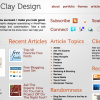
This one does the vertical then horizontal browsing thing too, but it instead of for slider items it’s for each article in the magazine. I also like how each section layered under the previous one don’t have the same heights, they all stretch according to the requirements of the content.

Social Media Weekly

Create unique, extraordinary websites with Squarespace. No experience necessary!

Typography – Web Fonts Performance: Making Pretty, Fast
“To discuss this, and more, we sat down with David Kuettel from the Google Web Fonts team, for an in-depth look at web fonts.”

User Experience – 5 Things to Consider Whilst Sketching
“Sketching isn’t about nuance. It’s about emotion, direction, and ideas. Broad gestures.”

Responsive Web Design – Responsive Patterns
“A collection of patterns and modules for responsive designs.”

Friday Focus 10/01/10: Old Style Illustrations

October 1, 2010 By Sophia Lucero

Happy October and Friday Focus! This week we’re looking at designs that incorporate illustrations you see in old books, which give a quirky yet nostalgic effect.

Designs of the Week

Spring: Supporting Local Biodiversity

I like how even the logo is distressed; a nice confined design.

Simon Collison

In embracing an old style look you’ll probably adopt an old style manner of copywriting as well, or at least a quirky one that contrasts against the serious black and white pictures.

Creativepayne

With all the interest in poster-style web typography these days, I can only wish the introductory text on this page weren’t an just image.

Great Bible Tales

The site hasn’t launched yet but you can glean from this screen that the design is mostly modern and the illustration stays in the background. I hope that’s not the case when it launches because there’s much potential there.

LivingDesign by Asif R Naqvi

This is a fascinatingly ornate design. I’m most delighted by the search, subscribe, Twitter, and Facebook graphics on the sidebar. Makes you want everything else, like the archives list, to have the same touch. The use of sans serif for the post text also kind of breaks that feel a bit.

Roost

There are a couple ofrules that this design seems to break: no descriptions for the menu icons (not even tooltip text) and center aligned body text. Perhaps the site owner actually wanted it that way, but still.

Icelab

Not many illustrations here, so they don’t feel that well-integrated. But the animation on the logo, both in the header and footer, is a nifty touch.

10K Apart

Sometimes you wonder why a design uses a particular illustration. In this case, you’ll get it once you reach the footer. What I really like here is the almost-missable effect below the buttons and images.

Bean Exchange

The border below the header is as refined as the designs on dollar bills. The patterns are not what you see everyday or on stock image sites. The bottom border of beans, however, isn’t as well done; I think it could be a little taller and denser so it looks more appetizing.

Parish Atlanta

No illustration spared here. It’s not too clear which ones you can click on, a usual problem with this look, and some areas can be styled even further, but the site makes you want to keep scrolling.

Social Media Weekly

UI – UI Pattern Ideas: List with Functions
“Last week I asked people to participate in a group design project on a specific design pattern: a list with functions.”

CSS – An (Almost) Complete Guide to CSS3 Multi-column Layouts
“One of the defining features of print design is the ubiquity of multi-column layouts. And there are a couple of good reasons why this is the case.”

HTML – HTML5: The Facts And The Myths
“…A lot of what people call HTML5 is actually just old-fashioned DHTML or AJAX. Mixed in with all the information is a lot of misinformation, so here, JavaScript expert Remy Sharp and Opera’s Bruce Lawson look at some of the myths and sort the truth from the common misconceptions.”

CSS – clearfix Reloaded + overflow:hidden Demystified
“This short article is about enhancing the first method and shedding some light on the real meaning of the second.”

CSS – Keeping code clean with content

Friday Focus 09/24/10: The One Page Experience

September 24, 2010 By Sophia Lucero

Some of the most interesting interactions I’ve seen done on websites utilize the one page format. Is it because there are fewer pages, fewer elements that should be easier to manipulate? Enjoy these one page wonders on this week’s Friday Focus.

Designs of the Week

Maxtron Media

I love how the navigation is a floating chunk of land consisting of various buildings (and the robot mascot) but uppercase everywhere is a bit much.

Pline Studios of Architecture

The lines that play off of the logo work great. Looks freeform but still follows a grid. Uncovering each image in the stack scrolls the page down little by little—I don’t know if that’s intentional but it’s a nice subtle effect.

Eric Johansson

Sliders would be a lot nicer if they could be controlled via the mouse wheel. But it does make sense in this design.

Psynai Design

The zoom on hover effect on the images is a good touch that hasn’t been overdone (yet). The continuous line running throughout the design, though, is a familiar technique for horizontal scrolling.

Mark Dijkstra

I like how all the sections are connected this way, and the connecting lines align with the top navigation. That’s actually really smart.

Genocom Media Group

The use of rainbow stripes gives just the right amount of color to the design without looking too overwhelming. I have to wonder though: should this site have a footer, or is this enough?

Fat-Man Collective

Another thing I wonder about: does it make sense to still have an indicator of which section the page is currently at, considering they’re clearly demarcated and everything? Anyway, I like the big text and bold colors, as well as the photo tooltips. And the walking fat man of course!

Netontwerp

Now this approach feels so close to a brochure. It’s very simple but still feels quite novel.

Dovetail Together

This one feels a bit similar to previous in “experience”. Love all the subtle lines and shapes in the background. Additional props to their blog being designed the same way, because lots of one page sites have completely different looks for their blogs.

Morphix Design Studio

Beautiful illustrations despite the overdone sky-to-underground style, although the typeface almost steals the show for me. Somehow Trebuchet looks really good on this page!

Social Media Weekly

Design – Defining User Experience as Brand Experience
“Whether or not you realize it, user interface (and by extension user experience) is as much about the branding of the business as it is about the logo, product, or day-to day business.”

CSS – CSS3 Support in Internet Explorer 9

CSS – Are CSS Frameworks Evil?
“From what I can tell, designers and agencies that work with frameworks on a regular basis tend to use either Blueprint CSS or 960 Grid System (often abbreviated to 960gs). Yahoo!’s YUI Grids is also a popular one. These were the three frameworks I experimented with.”

Friday Focus 04/16/10: Slanted

April 16, 2010 By Sophia Lucero

This week on Friday Focus: designs that tilt to one side and keep the perpendicular lines away.

Designs of the Week

Synch Media

Love the warm hues, transparency, and even the tiny polka dots. Everything blends in nicely.

Crealo design

I like how the logo is used as a prominent design element, not just as a header. One thing you will notice with these slanting designs is how they usually mean they’re left-aligned too. More often than not that leaves a lot of whitespace on the right side, which may be a good or bad thing.

Living Lyric

Really simple design, but looks fresh with the bold colors changing in each page and the boxy look.

Incrediblend

The nice thing about a vertical user-generated gallery is you only have to browse from top to bottom and not from left to right. I really like how the fixed footer has the logo slashed out!

ASOS plc

Forget rounded corners, slanting edges is the next big thing! Love the subtle, translucent shapes in the background and behind the content area.

Adesivos Decorativos Coolar

An extremely fun-looking design with not one traditional design pattern in sight! Love how the plus icons turn into arrows.

SWAG Designs

Instead of the usual horizontal lines to separate sections of a one-page site, this design slopes them upward.

Amanda Wakeley

There’s something about slashes and slanted shapes that just fit with designy sites including fashion. Love the hover effect in the inner pages reinforcing this.

Ignaty Nikulin

That other trend that’s also getting popular, circles, is in here too, but there’s an animated twist. The rainbow-colored header breaks the gray-filled design.

The Student Project

The hand-drawn effect is always a good way to add to slanting lines.

Panic Blog

And finally: the easiest, most modern way to implement the slanting look in your design? Use CSS3 transforms!

Social Media Weekly

Design – Holistic Web Browsing: Trends Of The Future
“The future of the Web is everywhere. The future of the Web is not at your desk. It’s not necessarily in your pocket, either. It’s everywhere.”

Design – Designing with Lenses
“A design lens allows you to view the user experience through the eyes of a single design principle. Lenses were originally created for game design but are just as powerful for user experience design.”

HTML – Introduction to HTML 5
“Are you interested in HTML 5 and what’s coming down the pipeline but haven’t had time to read any articles yet?”

JavaScript – RequireJS
“RequireJS can help you manage the script modules, load them in the right order, and make it easy to combine the scripts later via the RequireJS optimization tool without needing to change your markup.”

Friday Focus 02/19/10: Fixed

February 19, 2010 By Sophia Lucero

This week on Friday Focus: excellent websites that happen to have fixed elements in them.

Designs of the Week

Adii Rockstar

Not only do we have a light on dark design here, but a glowing light on dark design. It’s colorful too, because of the thick demarcations color-coded by content type. My only wish is for the search bar to be part of the fixed area; I think that’s just as important a navigation element as pagination.

Taylor Frassinelli

Interesting choice of content in the fixed area: name and contact info (very important), quick links to portfolio items grouped by year, and quick links to additional info about the designer. Overall, neat and nicely organized.

Ryan O'Rourke

Another split, one page site. Cool hover effect on the brain graphic, and interesting combination of background patterns (one ornate, one techie).

Fresh01

Brilliant effect on the blue markers, telling you exactly where you are on the page and keeping things dynamic.

Rich Brown

A custom font makes a big difference. Big, bold, boxy, but not overwhelming.

177Designs

Not so exciting fixed area (they’re more for utility anyway) but does well in presenting the portfolio.

Jon Leverrier

More than half of the page is fixed—narrow content areas isn’t quite dead yet!

Fuel Brand Inc

I like how you start with a practically blank screen when you load the site. Then you get a simple yet dramatic transition animation to load each section’s content.

EMQuinn

Another thing that isn’t dead: left-aligned layouts. No skimping on the amount of whitespace either.

Vuu Media

The thing about changing backgrounds is the foreground has to match, and amazingly enough, this site pulls it off. Other than that, graceful details everywhere.

Jaype

I like the three different shades of blue in three different columns. Not too thrilled about the use of the drop shadows and inner shadows here though.

Rather Splendid

I love endless scrolling. I’m on the fence about the stark black icons, although they give a quirky feel to a text-filled site.

Drew Wilson

What really sets this design apart is the carefully chosen and crafted custom photos for each post, everything blends well. Not to mention custom type everywhere.

Social Media Weekly

Usability – Why Not a User

CSS – CSS gradients for all web browsers, without using images

CMS – 10 Simple and Light Weight CMS Solutions

Next Page »

Code & Tutorials

Which Front-End Development Languages Will Grow in 2017?

Your Guide to Leveraging APIs as a Developer

Bitcoin Processing Website Integration For Web Developers

Website Security For 2016 That All Developers Need To Know

5 Reasons You Need to Be Using jQuery

About Devlounge

Want to read more about Devlounge, or maybe you want to contact us, or even advertise? Oh, and don't forget to subscribe to updates!

The Best of Devlounge

Randa Clay On Breaking Barriers

Search