Apologies for posting this a day late, but I will try to make it up to you with yummy-looking websites. It’s a food-centric Friday Focus!
Designs of the Week
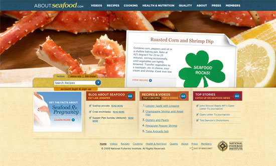
The full-width background photo under the earmarked recipe notecard is great. Unfortunately I’d rather that the top navigation wasn’t part of the Flash objects on this site. I like the very subtle grungy texture used here as it does seem to reinforce the seafood/marina feel.
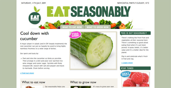
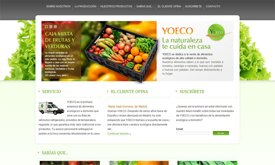
A very green website, both in color and food group. Perhaps the best way to present veggies (and fruits) is to photograph them on a crisp, white background, and that works quite well here.
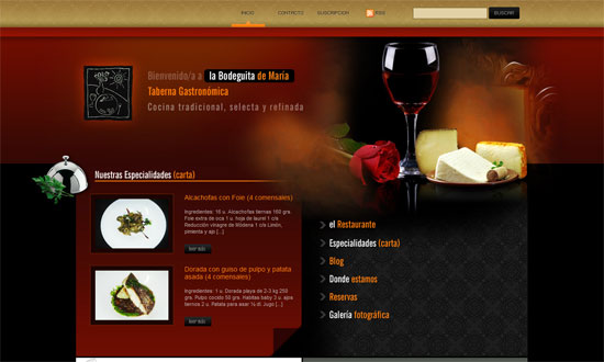
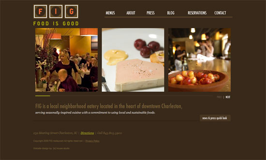
This is a nicely-designed restaurant site—elegant photography, rich dark hues, and good spacing all over. I like the high-res icons jutting out of both sides of the layout.
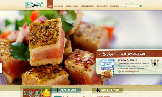
Another full-width background photo effect, this time it’s much bigger and has several rotating images. I kind of wish the content below it were longer—more than 3 links each for the new and popular recipes, for example—because you want to give more diverse options to your readers.
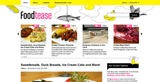
This is one of the more “different” designs of the bunch, because of the illustrations, brighter colors, and the overall lighter attitude this site has. But, really, when it comes to food websites, the greatest measure of good design is in the food photography, so make sure you prioritize that!
How pretty is that lettuce as a frilly background! Brings way more to the table than any other Photoshop brush, no? I would’ve liked a little more tweaking on the navigation but on the whole this is a nice, clean site. Very easy on the eyes.
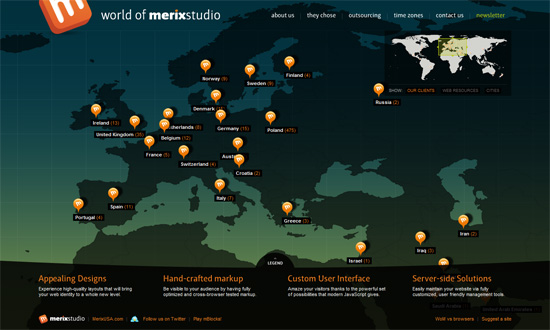
We get a more hip atmosphere from this site, but the food photos are still front and center. Great JavaScript effects, typography, and color scheme.
Social Media Weekly
Design, Typography, Freelance – 25 Must-Read Books For Designers, Typography Lovers And Freelancers
User Experience, Usability – Recommended Books for your User Experience and Usability Library
Design – Using Wireframes to Streamline Your Development Process
HTML, CSS – Four Methods to Create Equal Height Columns
