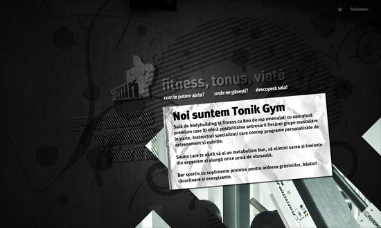
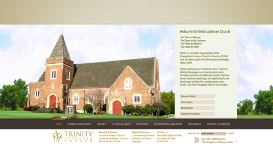
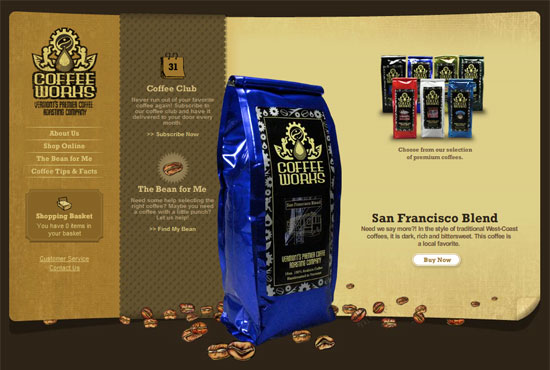
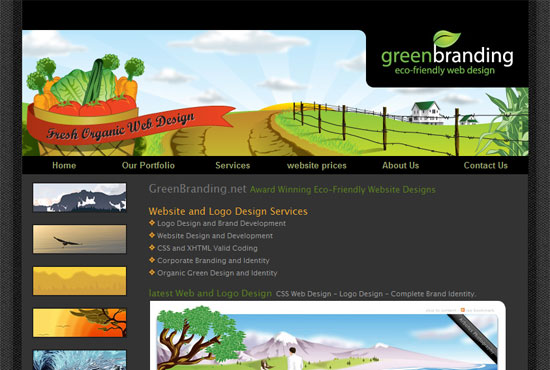
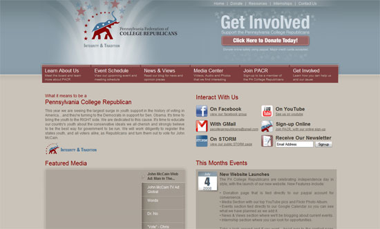
Focus is one of the most important aspects of design—you need to tell the audience which elements are important and which aren’t. This week’s featured sites execute this idea well, and even take it to the next level. See if these designs don’t grab your attention at all!
Designs of the Week
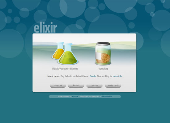
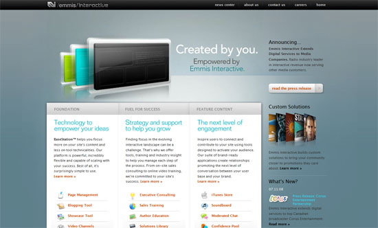
This layout makes you feel you’re really interacting with an application as opposed to a webpage. And it doesn’t hurt that Apple’s design touches are at play here: colorful icon art reinforced by shades of gray on everything else. Plus transparency, gradients, and rounded corners, of course!
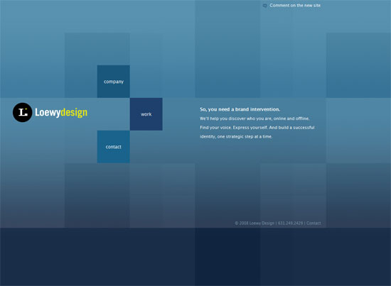
Achieve focus by making the foreground far more pronounced than the background. And if you have few elements on your page, big, shiny icons are great for the most important links.
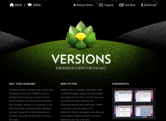
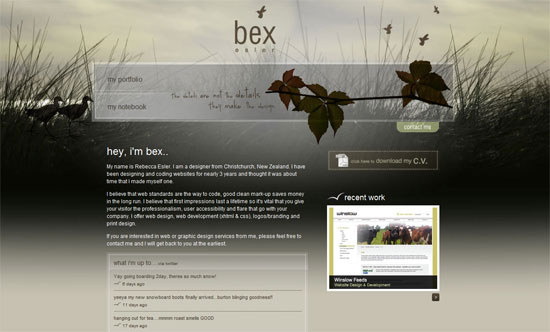
This looks completely stunning. Great lighting, great detail. Almost wallpaper-worthy, I’d say!
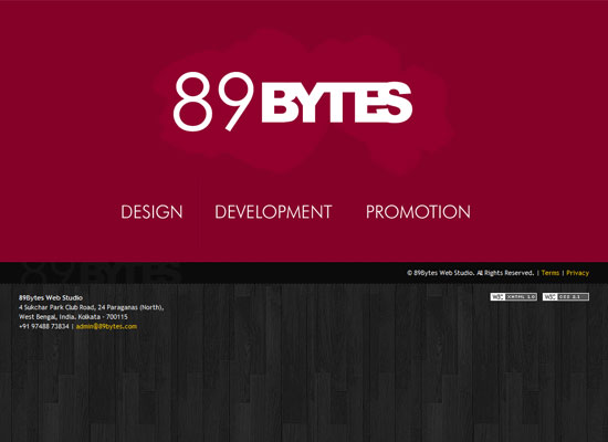
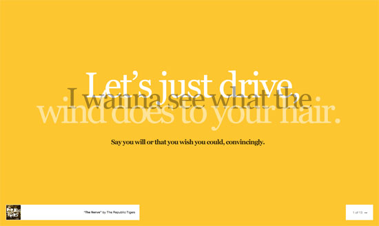
You can get away with no illustrations at all and just use good type. Then try an unusual combination like fuchsia and wood. Simple but very catchy!
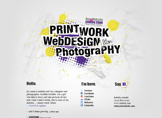
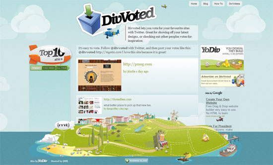
Or you could play with both type and complementary graphics. Here’s a good hint for “coming soon” pages: put all your keywords front and center to keep your guests from guessing. That’ll increase your chances of returning visits.
Social Media Weekly
Design – Large Website Backgrounds Do’s and Don’ts
A great design trend that should not be abused!
Programming – How to SEO Flash
Flash and SEO don’t mix, right? They can!

