Here’s a larger-than-usual Friday Focus for this week, featuring simple yet beautiful designs that just work. Four site types (blog, portfolio, static, e-commerce) that do a standout job of making an impression.
Designs of the Week
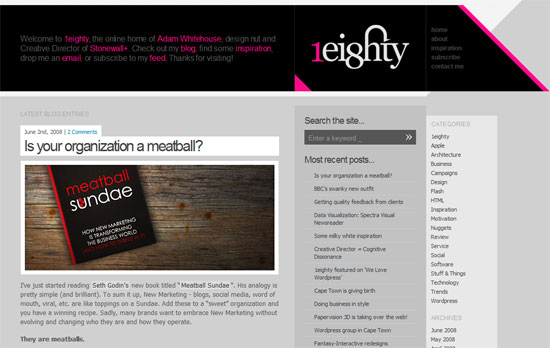
90% of this site is made of varying shades of gray, but the black and hot pink header is what makes it infinitely more interesting. I’d say the body text color needs to be a bit darker for optimal contrast, but other than that I like it. See what you can do just by simple lines, shapes, and colors.
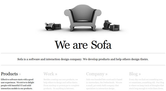
Utterly simple site, but the implementation is fantastic. The four sections below are actually clickable tabs that contain the whole site. Check out the blog tab—I particularly enjoy its layout even if there’s only one post right now. I wish I could say it’s fluid, but when I resize my browser to 1024 or 800 pixels wide, the ugly horizontal scrollbars appear.
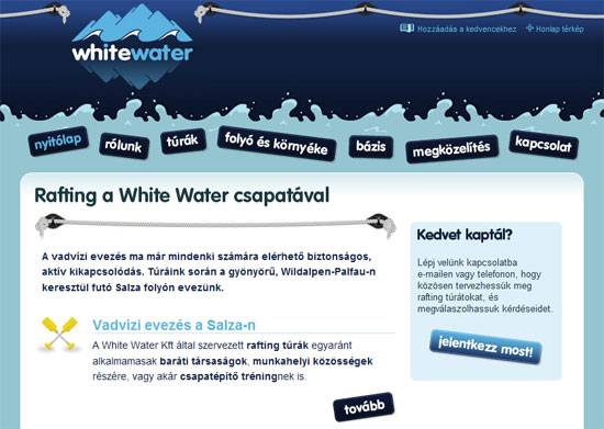
Delightful use of the rafting motif, from the splashes of water to the boat ropes to the icons to the blue buttons. The site makes rafting seem like such great fun—even if I don’t understand a word that’s written on it!
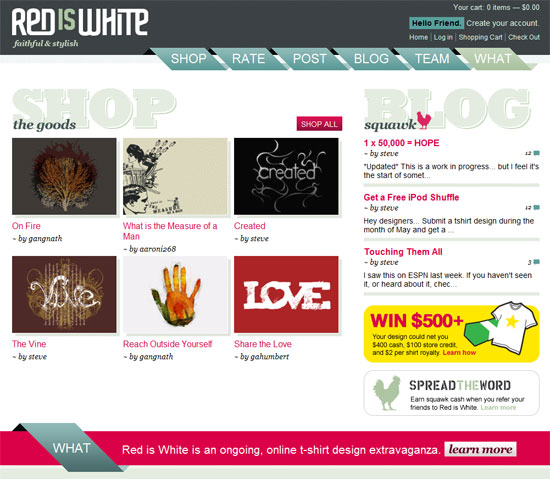
This site is pretty busy compared to the rest of the designs featured here, but it doesn’t get too crazy. I absolutely love the navigation. And the hues aren’t bad at all. I feel the “Red is White” logo doesn’t feel like it fits into the design because the funkiness of the font doesn’t seem to repeat elsewhere, but the big, chunky, headers make up for it!
Social Media Weekly
Design – How To: Make the Viget Inspire Background
The Viget Inspire blog design is a thing of beauty and is one of the few painterly/watercolor-y designs I actually like. If you’re wondering how they did it, the step-by-step process has arrived!
Design – Icon Design Tutorial: Drawing A Pencil Icon
Vu Tran and Min Tran of Frexzy also write a detailed walkthrough on icon design.
Design – ColorFlip.com by Rafaël Rozendaal, collection of Sébastien de Ganay
A virtual flipbook of random colors, with animation and sound effects to boot. There’s technically not much to this page, but those looking for some color inspiration—or perhaps some interaction design inspiration even—might consider this a godsend.
Programming – Did Rails Sink Twitter?
An interesting look at Twitter and the framework it is built on—Ruby on Rails. Making applications scale is an important goal for backend programmers, and with Twitter and Rails as an example, this should be a good read.
Programming – Presentation Layer Best Practices
A look at the best way to write HTML, CSS, and JavaScript. It’s one thing to know how to code, but it’s another to know how to write beautiful code.


