This week on Friday Focus: vines, blooms, and other foliage that do a great job of framing your website.
Designs of the Week
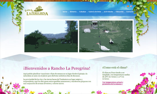
When doing vines on a sky background, it doesn’t make much sense to have drop shadows, does it?
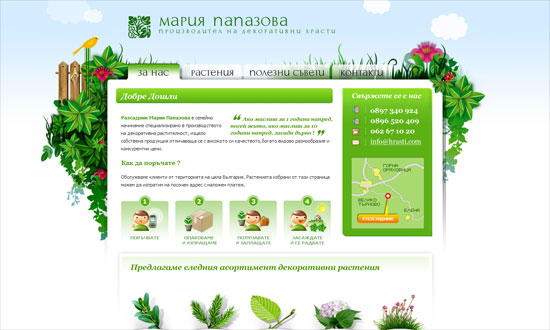
The gradient on the tabs are a little severe but the translucent ones look great. I kind of want more blue in the background though, feels too white.
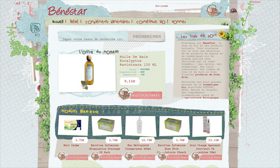
The use of fixed-width type is curious, but I like the mixed textures. The actual photo of a basket for a shopping cart icon is priceless.
The Quick Search box looks a little cramped; the Map Search could be more accessible.
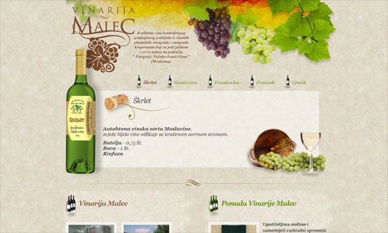
Some nice watercolor textures here although again the shadows get to me. A little bit of a split layout going on below.
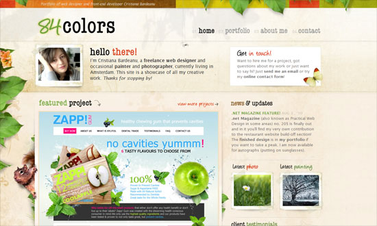
The subtly moving leaves (and the squirrel’s tail) look great—they barely call attention to themselves so when you do notice them, they’re a nice treat. Attention to detail everywhere.
I like how the leaves are behind the large sign up button.
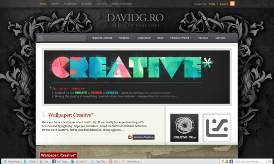
Something more ornate and abstract. I feel a disconnect between the gray-black top and the brown bottom, though.
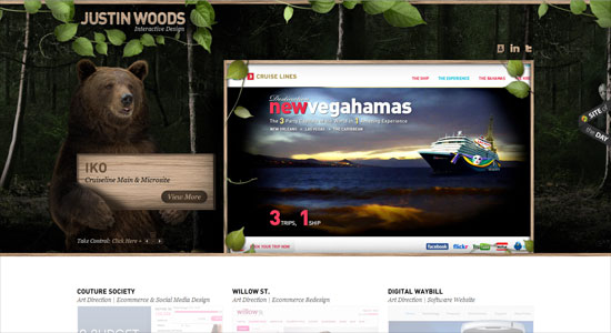
Another disconnect here. The header is awesome—there’s a bear! carrying a sign!—but the bottom is just too light and doesn’t even carry any hint of nature in it.
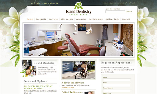
Beautiful design. Not sure what a music player is doing on a dentist site, but perhaps they thought it would be a fun little touch.
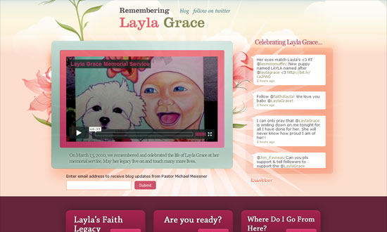
The flowers look so pretty I they weren’t just in the background. The turquoise is a nice contrast to the floral hues of pink and peach.
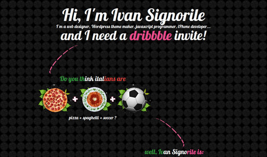
I like how the leaves are used as frames for the circular icons here.
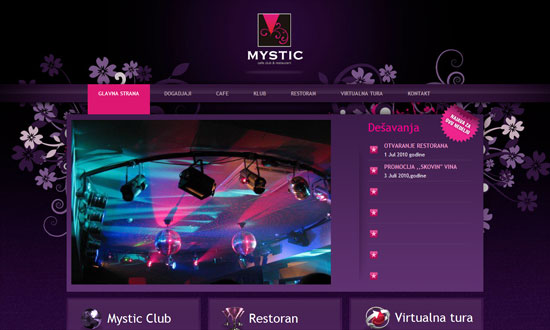
Love the purple and fuchsia, it even matches the club photo on the front page. Centered logo alert!
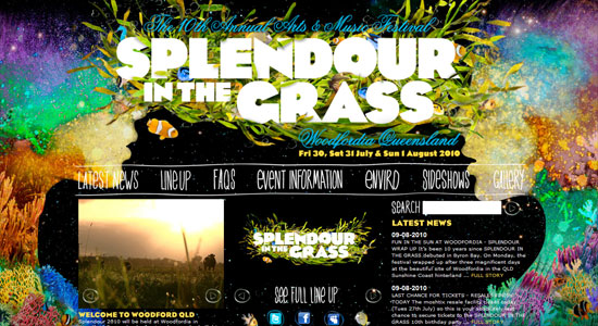
Make sure your eyes are well-rested before you view this site; every color of the rainbow seems to be on here. The content area could have used at least a translucent background to make the text more readable, which is already so small.
Social Media Weekly
UX – Designing with Paper Prototyping
“The basic premise of this method is that a paper prototype of a feature’s UI is crafted and then given to a user who will attempt to complete a task or a scenario. Evaluators record and analyze the results from these sessions, which are then used to create another prototype.”
Accessibility – Misguided accessibility: access keys
“These days, accessibility experts recommend strongly against the use of access keys, instead putting focus on accessibility enhancers such as “skip-to” links and clear navigation and layout, fully tested with assistive technologies like screen-readers.”
Accessibility – What should be the minimum / maximum length of alternate text?
“Putting undue length restrictions on alternate text can undermine the quality of alternate text, limit the amount of information conveyed to readers, and can affect the style of writing in a way that inhibits comprehension.”
Usability – Shlock and Awe: Little Things on Your Website that Drive People Nuts
“No website will ever be perfect (unfortunately), but we’ve compiled a list of little tweaks and changes you can check on your website to make sure you’re not irritating your visitors.”
JavaScript – Commonly Confused Bits Of jQuery
“jQuery brings to the party its own API, featuring a host of functions, methods and syntactical peculiarities. Some are confused or appear similar to each other but actually differ in some way. This article clears up some of these confusions.”
