This week on Friday Focus: the most popular color on the planet, blue. After the immense popularity of green (and pink?) during the Web 2.0 wave, it looks like web designs are going back to everyone’s favorite color. And we have a bucket full of examples to prove it.
Designs of the Week
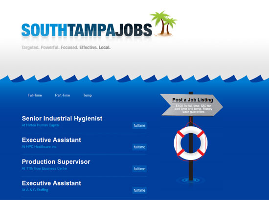
What makes this website work? It’s to clutter-free and straight to the point (the jobs), and it uses a fun motif (the beach).
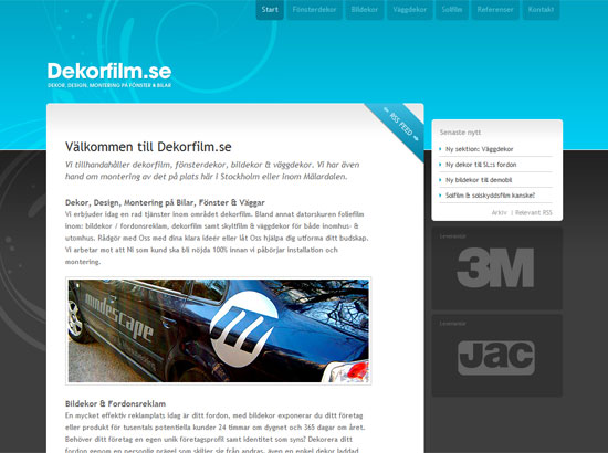
Another simple design that delivers through the details, like fading hover effects and decorative elements that make sure they don’t overpower the content. It really is the focus here, because as soon as you get out of the white boxes, the elements become dark gray. They give way.
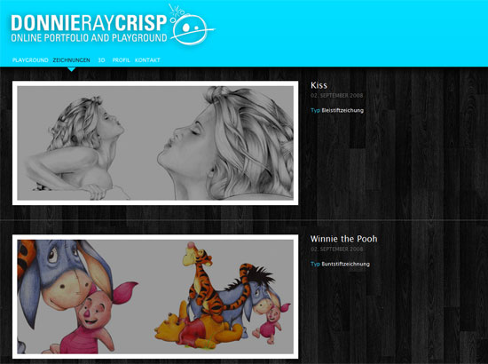
Once more we see blue offset by dark gray, this time in the form of a wooden texture. I like that the header area covers the fixed background. I also like the screen overlay on the portfolio images. It’s an old school web design element, but it still works!
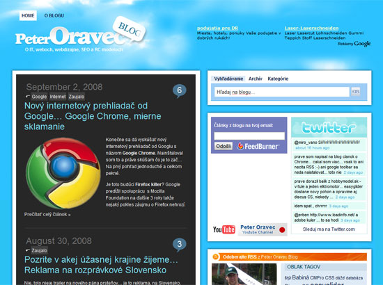
First there was water, and now we have sky. Another “cliche” association with the color blue, but with a twist. There’s a very elaborate footer graphic in green. Another interesting feature of this blog is that the posts use white text on a dark gray background. Again, people seem to like pairing blue with dark gray.
If there’s dark gray, then there’s sure to be black as well. It seems like this website took the complementary color of its company logo to make it stand out. Another nice one-page website.
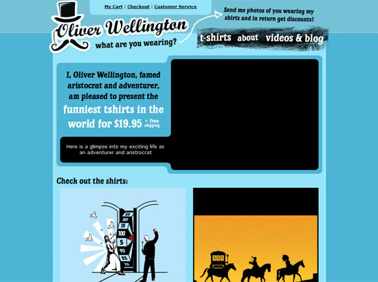
This design is a little more quirky, combining grunge elements and illustration on a blue-and-black color scheme. There’s also a footer graphic here, though I’m not too sure this time why they chose an aerial view of the African jungle.
Social Media Weekly
Design – Breaking Bad Habits in Photoshop
Bad habits are hard to break. And when you’re working on bulky software such as Photoshop, you might want to streamline your process as best as possible. Start by getting rid of those bad habits like unnamed layers and erasing instead of masking.
Programming – Typechart
Preview different different styles of web typography as seen on Macs and PCs, then grab the CSS! Fantastic idea. Also contains excellent resources on the same topic.
