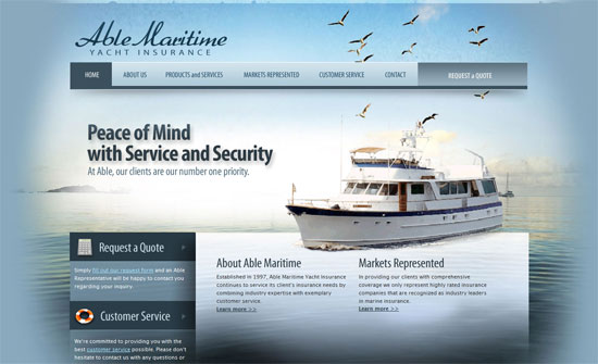
Intentional disarray is tricky, but provide a playful, organic mood to designs. Do they make browsing websites more exciting or confusing? Let’s find out.
Designs of the Week
Pagelines lets you build WordPress websites and it’s as easy as drag and drop, go check it out!
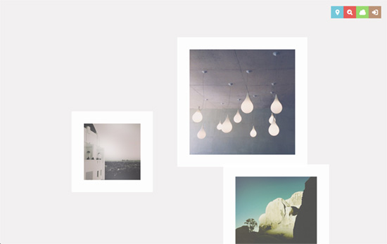
I think I like that artsy, moody (hipster?) Instagram photos are presented like this: wordless, faded, and ultra clean. It feels extremely serene. Each time you load the page you’re also getting a slightly different layout: it’s the same order of photos, but the sizes and positions change. The map view is another arrangement that fits right in with the freeform look. The only pop of color is from the icon-based navigation on the top right.
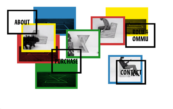
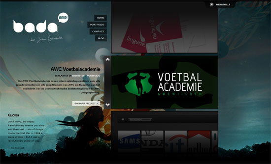
Never a fan of autoplaying audio (or video for that matter), but this is a website transformed into an interesting art installation of its own. You can click on each box to bring it to the foreground and load its content, be it a more detailed version of the image, a video, or a lightboxed page of text. Unfortunately for the text, however it’s too wide and not really typeset properly.
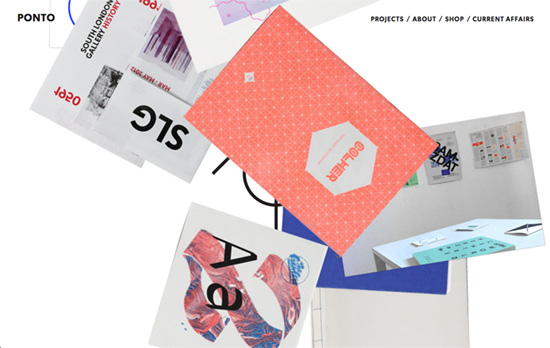
Another case of randomly positioning the elements with every page load. It gets more organized inside, though, and you can see that photographing actual objects instead of just using the finished digital versions is becoming very popular in portfolios lately.
Social Media Weekly
Search Optimized, Turn-Key Designs, Unlimited Everything. Start building with the Genesis Framework today.
HTML5 – Using the main element
“The beauty of <main> is that it is already supported in modern assistive tech. Most of these understand aria role=main, as browsers map this to an operating system thingummy (technical term).”
Typography – Universal Typography
“By focusing on traditional typographic principles, embracing progressive enhancement, and understanding how fonts, CSS, web-enabled devices, and user contexts coexist, we can reevaluate what it means to successfully set type — and inform the decisions we make about typefaces, font sizes, and white space. Let’s practice future-friendly, responsive typography.”
User Experience – How To Get Started In UX Design
“For an activity such as conducting user testing, a handful of sessions is all you need to get the hang of things. Once you’ve introduced that user feedback loop to your project, you can start focussing on developing other skills.”
Design – Art Movements and Web Trends (and Gratuitous Mucha Posters)
“It just means we, as an industry, have lately been consciously focusing on another option in our collective toolbox. Though it may start to feel like overkill, this reflection on our evolution is worthwhile.”
CSS – Dig deep into CSS gradients
“CSS gradients are really powerful and understanding how they work can be really useful for creating all sorts of imageless textures or shapes that would be difficult to obtain otherwise.”
