• Home
  • About
  • Contact
  • Advertise

Devlounge

Design, Develop, and Grow

ateşli sevgilisi fantezisini yaşamak istediğini söyler porno ona arkadaşları varken onunla gizli saklı seks yapmak istediğini sikiş söyleyen kız hafta sonu için gelen arkadaşının görmediği bir sikiş açıdan sakso çekmeye başlayınca adamın yarağını bu altyazılı porno şekilde indiremez ve açık şekilde salonda sikişimeye sex izle başladıklarında misafir kızı da bu sekslerine rokettube konuk ederler seks yapacağını düşünmeyerek onun sex izle oyun oynadığını zanneder sabah olur ve herkes uyanır hd porno bu sırada yanında şişme mankenini de getiren sapık erotik hikayeler genç sınav haftası ders çalışan genç adam üvey annesinin sikiş eve gelmesiyle hayatının şokunu yaşar

  • Home
  • Code
  • Design
  • Design Focus
  • Interviews
  • Publishing
  • Strategy
  • Webapps
  • Extras

Friday Focus 02/01/08

February 1, 2008 By David Peralty

Continuing on last week’s success, I figured I would give the Friday Focus another go, and will hopefully be continuing until told otherwise.

I hope you enjoy my picks of the week.

Designs of the Week

evaneckard.com
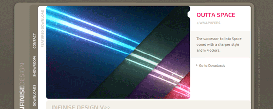
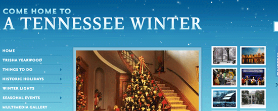
Lately, I have been seeing many designs implementing space or star images to their designs. The design is darker than I usually like, but for some reason the contrast seems really strong, and I love the use of red and blue to make certain elements “pop”. This is my favourite of the week.

ashwebstudio
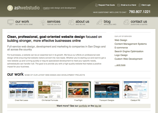
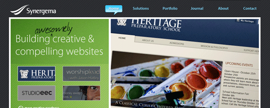
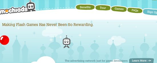
I am really enjoying sites that use green effectively, and ashwebstudio integrates the colour nicely. The content area is really nice and clean. Everything looks fairly balanced and the design is not overstated. I wish the navigation hover effect was stronger, but I love the little icons they used to emphasize their items.

Forest River Timber Homes
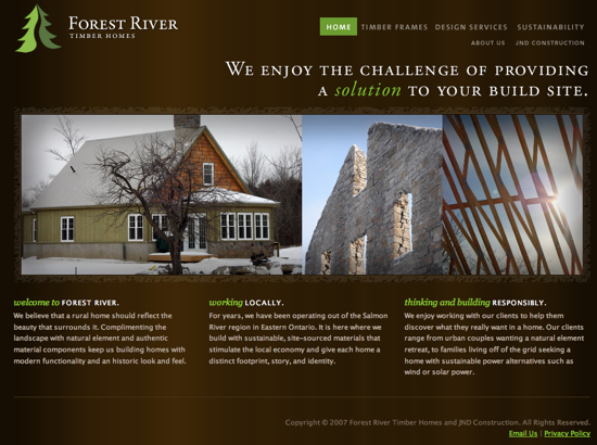
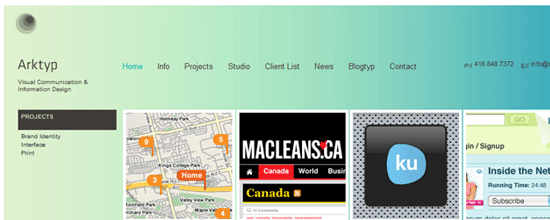
I had a really hard time finding a third design that I enjoyed. I wanted something that was pleasing to the eye, and interesting to look at. I wanted something that wasn’t blue and orange, and the Forest River Timber Homes site fit the bill. I don’t really like their sub-pages as much as their main page, but overall the style is interesting, and the strong contrast of the green on the dark brown works really well.

Digg Weekly

Design – 8 Web Design Mistakes That Developers Make
I have made more than one of the mistakes mentioned in the Wake Up Later post, but I continually hope that others will wise up and deal with their design and usability mistakes. Hopefully they will all read the post.

Design – Old Websites Sure Are Funny and Internet ’96
On the same line of thinking, there are some great articles on what the web was like twelve years ago now. It is funny to look at what corporate budgets bought online back then. Apple, McDonald’s and others all looking really ugly by todays standards.

Friday Focus 01/25/08

January 25, 2008 By David Peralty

Another Friday Focus coming your way this week. The first one of 2008, and what I think to be one of the first not done by AJ, as he is a busy man, so I figured I would try to fill his shoes when it comes to the focus for a while.

Things will mostly be staying the same, but I will of course be choosing the designs that really amazed me, as well as the top stories on Digg’s programming and design sections that caught my eye.

This week, I have three designs, one design article found via Digg, and one freelance article found via Digg.

I hope you all enjoy my picks.

Designs of the Week

Oddly enough, all of my picks this week for designs are from Web Design firms from various locations around the world.

The first one is from GregOne from Belgium. I love how dark the overall design is, but to make it easier to read sections with a black background, he pumped up the font size, and in the content area I love the green tab he used as the background for titles. I find the serif font used for most of the white text content a bit difficult to read, but overall, I really enjoy this design.

GregOne

Next, I have South Creative from Australia. This design caught my eye because of the use of the creamy colours of the content topped off with a much darker header, and a brightly coloured logo. The design itself is fairly simple looking, but I found it to be very effective.

South Creative

My third choice this week is FortySeven Media from the USA. Again a very distinct difference between the header and content areas, this time going for a lighter header and a much darker body. I haven’t seen much green focused web designs lately, and so walking through the normal black, blue, orange, and more blue, I really enjoyed this design. A very nice palette of colours used as part of a very interesting style.

FortySeven Media

Digg Weekly

Design – 26 Things to Do When Business is Slow and in Downtime Mode
There is no doubt on my mind that we are going into a recession, and it is the perfect time for all freelancers to find some extra work, get important tasks completed, and save a little extra money.

Design – Creating A Fantastic Fantasy Night Sky In Photoshop
I am usually not a fan of photoshop tutorials, but this one is really fun to do. With all kinds of interesting effects taken into account, this tutorial could be used as a basis to create all sorts of cool poster worthy designs.

Friday Focus 11/30/07

November 30, 2007 By Devlounge

Hey everyone, Friday Focus is back. I’m sure you’ve been hanging off the edge of your seat after dealing with a tough week without the focus last week. Well, no more worrying to do now. Hopefully everyone that was celebrating Thanksgiving last week enjoyed the holiday and any kind of vacation that may had have, but it is now time to get back to business. Let’s kick things off with three fresh sites.

Sites of the Week

First up is Beanstalk. This organic looking design features brown and light greens to create a simply fresh look for this hosted subversion tool.

Beanstalk

Next up is Synergema. Another slick portfolio site, this one utilizing blues and greens, along with some snappy javascript to scroll between portfolio work. Plus, you have to give them points for that name.

Synergema

And wrapping this week up is Come Home to a Tennessee Winter. Seeing how tomorrow is December 1st, I figured this was pretty appropriate. Falling snowflakes included.

CHTATW

Digg Weekly

Design – Pure CSS Dropdown Menu
I know there are a few of these out there, but what’s another one to add to your collection of bookmarked resources? This quick tutorial will guide you through the creation of a css-only drop down menu, without the need for JS.

Programming – 10 Absolute No-No’s For Any Freelance Web Designer
From Digg description: If you’re a freelance web designer, make sure you don’t make any of these common mistakes.

Hope everyone enjoys the week ahead.
Get your holiday shopping done! (or started)

P.S., If interested in what I’d like, please use the contact form. 🙂

Friday Focus 11/16/07

November 16, 2007 By Devlounge

How’s it going everyone? The focus is a little late this week because I didn’t get a chance to pre-write it like I usually do. Anyways, better late then never right? Before we get into things I’d also like to let you know that the focus will be taking an off week next week with us here in the U.S. resting after stuffing our faces on Thursday. Here’s to hoping this focus will fill you up until then!

Sites of the Week

Kicking things off this week is MochiAds. I am absolutely loving this design. The color scheme and “fun” theme that it features really goes well with the whole idea behind the site (ad network for flash games). If you are a flash developer who makes the occasional game, that might just be another reason to check this one out.

MochiAds

Next up is the portfolio of Tim Lahan. Once again, this portfolio site makes the weeks favorites because of the unique and creative portfolio setup, along with an excellent collection of work.

Tim Lahan

Wrapping up this week is Arktyp. What originally caught my eye with this one while I browsing thumbnails over at CSS Mania was the blueish-green background color. When I dug a bit deeper, I discovered a clean portfolio by a studio that has even done work for Adobe.

Arktyp

Digg Weekly

Design – 99 Resources for Web 2.0 Designers
A list of 99 items for web 2.0 designers, from badge generators to icons, navigation, and much more.

Programming – 10 Projects ever php developer should use
From Digg description: As a php web developer, you should know that php is probably the language that has the biggest code repository. So no matter what module you want to include in your project there should be an open source solution.

Friday Focus 11/9/07

November 9, 2007 By Devlounge

Friday Focus Year 2 It is with great pleasure that I start the second year of Friday Focus, the weekly run down of cool things worth checking out before you kick back and relax for the weekend. There is no better way to start your weekend then to be reading the focus every Friday. Enjoy the weekend everyone.

Sites of the Week

Another extremely simple yet functional and super-clean portfolio site kicks off this weeks focus. Poccuo is a design collaborative that has done some pretty nice work ranging from websites to logo designs.

Poccuo

Infinise Design finds itself at number two this week, with its clean and compact portfolio design. A ton of truly excellent icons and other designs can be found in the showcase, plus a sweet collection of downloads too.

Infinise Design

Wrapping up this week is Kareo. I discovered this site on CSSGalleries, which I usually do not use when I’m pulling my weekly three sites. This site just happened to catch my eye, and I thought it deserved to make the list. I guess you could classify this one under the “smooth” category.

Kareo

Digg Weekly

Design –50 Ways to Become a Better Designer
Devlounge is on this list, so what the hell, I figured I should mention it.

Programming – Graceful E-Mail Obfuscation
From Digg description: Posting a naked e-mail link anywhere on the web, in a newsgroup, chatroom, or weblog comments page is generally the kiss of death for your once-healthy address. Now you can protect your addresses in a fully automated way while at the same time being gracious to all users, so you can focus on what’s really important: getting your content out.

Underdog – Webunload: A web marketplace
Yes, I have done a whole lot promoting on Devlounge already about my new project, but there were some issues that needed to be tended to the first few days, and now that everything is settled, I figured why not one more time. The official Digg post really did horrible (1 damn digg), so even if you do not care about the site, please help support my new project by digging it so I can hopefully get the traffic up there quickly. Thanks in advance!

Next Page »

Code & Tutorials

Which Front-End Development Languages Will Grow in 2017?

Your Guide to Leveraging APIs as a Developer

Bitcoin Processing Website Integration For Web Developers

Website Security For 2016 That All Developers Need To Know

5 Reasons You Need to Be Using jQuery

About Devlounge

Want to read more about Devlounge, or maybe you want to contact us, or even advertise? Oh, and don't forget to subscribe to updates!

The Best of Devlounge

5 Ways to Get Trust Through Design: A Look at Healthcare Design

Search