It’s one page portfolios this week on Friday Focus. And you just know there has to be some JavaScript-y effects when that happens. An added twist: let’s alternate between designs that are dirty and clean!
Designs of the Week
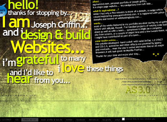
It may look chaotic on first glance, perhaps because of all the details, but if you stay on this site longer it feels organized, well-thought. I kind of wish the designer used the same type in the lefthand menu as the one in the content sections, but grunge is about breaking the rules.
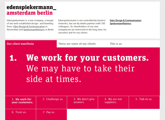
For a company that was just formed from merging two big ones, this site is surprisingly simple. I like that they featured their client manifesto before their actual clients. It’s a great way to get to know the company better. And of course, the fuchsia makes the clean, boxy look pop.
I’m not too happy about the type choice on this site, but I do like the interaction and the content. For example, there’s a whole screen that illustrates the designer’s skill levels, which is important information for his potential clients.
Very simple but very effective. The spacing between blocks of text, the sizes of the headers and body text, everything just looks modern and professional. However, I wish one could jump to the different sections on the page, and not just to the contact form. And of course there’s a carousel effect for the portfolio items.
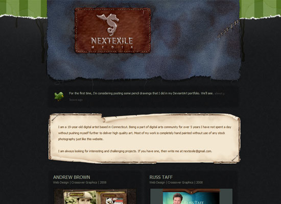
Again, no navigation cues here. Maybe I’m so used to the JavaScript scrolling effect that I feel it’s almost a requirement on one-page sites. Is it, though? Or am I too lazy to manually scroll now? Anyway, I like how different textures are being mixed on this site: at least two types of fabric, two types of torn paper, and even spilled liquid!
Social Media Weekly
Design – 10 tips for efficient design
“Being a good designer is not always enough to survive hard economic times. You need to be efficient too.”
Programming – Libraries and Examples for working with Canvas
Scripts that take advantage of the Canvas.


