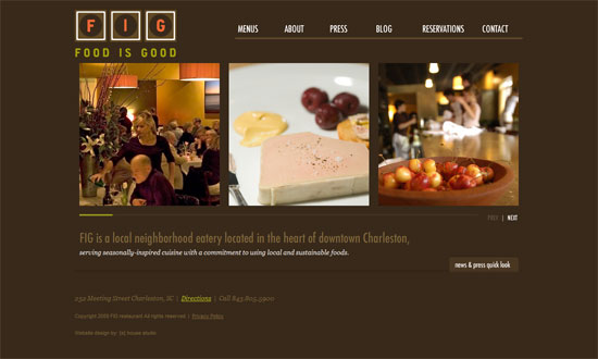
Slideshows are a staple in websites but the possibilities for them never end. This week’s Friday Focus features designs that revolve around its full-width sliders, making for an engaging conversation with the audience.
Designs of the Week
Get solid WordPress themes, plugins, and web design training from iThemes.
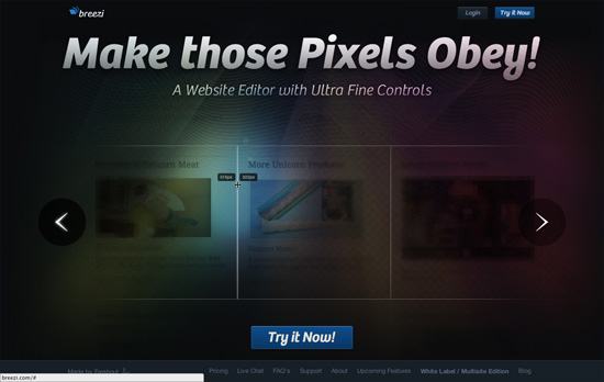
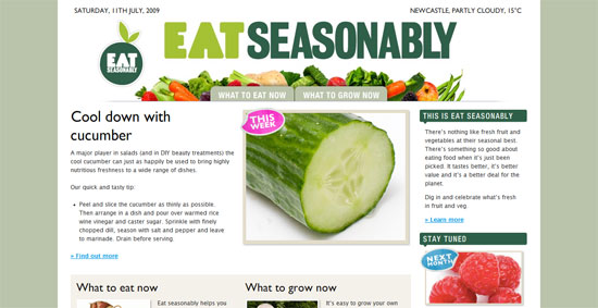
Several interesting things going on here: first there’s a decidedly dimly-lit feel to the slides and only portions of the image are highlighted, and even those areas aren’t completely bright. There’s also a mix of rainbow gradients, texture, and guilloché going on. The same whimsical look carries on below in the way the icons and illustrations have glows and reflections on them, all while sliding in as you scroll past.
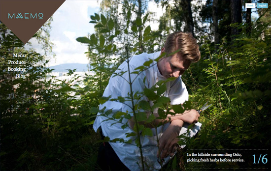
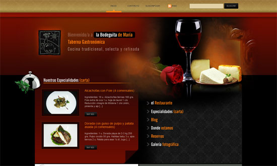
It’s quite convenient, although a little unusual behavior, that the controls for the sliders follow the mouse cursor. Since the photographs cover the whole screen, though, it makes sense. For a site like this it’s really the images that do the talking, and it’s a good idea that there are different sets of pictures on each page. The text in the inner pages disappears once you click right or left, and you have to select it from the left side menu to read it again. It’s quite disappointing though that the blog is offsite and nowhere as immersive.
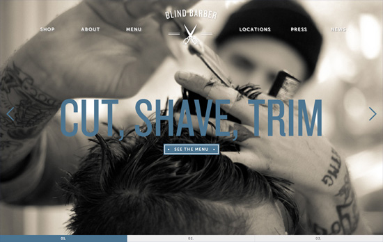
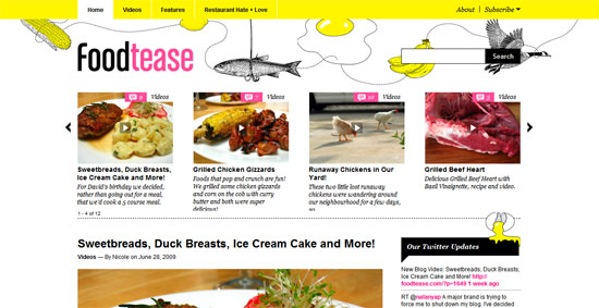
Cute idea to use an animated version of the barber’s pole/barber shop lamp as the loading gif. I also noticed that although there’s content below it, the slider area makes it a point to fill the whole browser screen first (although it doesn’t adjust if you resize or go fullscreen). I also like how the navigation tabs below the slides, also occupying the full width of the browser, are designed. Most of the inner pages have their own sets of slideshows as well (including video).
Ready to go out and design your next website? Try building with the Catalyst Framework.
Social Media Weekly
Design, User Experience – Style Tiles
“Style Tiles are similar to the paint chips and fabric swatches an interior designer gets approval on before designing a room.
An interior designer doesn’t design three different rooms for a client at the first kick-off meeting, so why do Web designers design three different webpage mockups?”
CSS – Negative Proximity
“There’s a subtle aspect of CSS descendant selectors that most people won’t have noticed because it rarely comes up: selectors have no notion of element proximity.”
CSS, JavaScript – CSSrefresh
“CSSrefresh is a small, unobstructive javascript file that monitors the CSS-files included in your webpage. As soon as you save a CSS-file, the changes are directly implemented, without having to refresh your browser.”
Semantics, Optimization – About HTML semantics and front-end architecture
“A collection of thoughts, experiences, ideas that I like, and ideas that I have been experimenting with over the last year. It covers HTML semantics, components and approaches to front-end architecture, class naming patterns, and HTTP compression.”
CSS – Why You Should Use Inline-Block when Positioning Elements
“Inline-block isn’t a magic fix, but as long as you are aware of its quirks, you can work around them.”
User Experience, Responsive Web Design – A Simple Device Diagram for Responsive Design Planning
“There are an ever-increasing number of devices with different screen resolutions to take into account with a responsive design, so we put together a simple but handy diagram that lists the most common device widths as of the present, along with overlays for potential device width ranges.”
Pagelines lets you build WordPress websites and it’s as easy as drag and drop, go check it out!
