Dive into the colorful and detailed world of illustrated web design this week on Friday Focus.
Designs of the Week
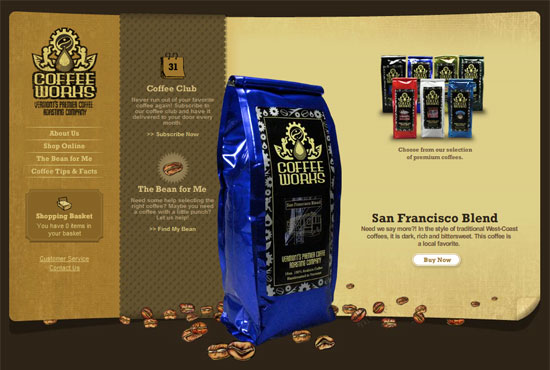
I like that this is a 3-column layout that gives off more of a brochure vibe than an online shopping cart. I also like that this site could have been done fully in Flash, but the creators chose to use it moderately.
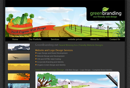
This web design company has a signature elegant look to its illustrations, showing you don’t always have to look cartoony when employing this design technique.
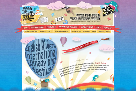
Now here’s a site that literally rides on the comedy of cartoony illustrations. Again, Flash is used only in the header to add even more quirk to the site. And at the bottom we see another fixed footer using translucent waves (from the French Riviera?).
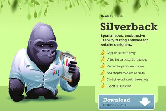
I know, this site has been featured every which way you look months ago, but now Silverback has launched and aside from the parallax effect when you horizontally resize your browser window, you get to scroll down for more jungle-y goodness—love the furry border at the footer!
Social Media Weekly
Design – Getting Moody: A Look at Inspiration and Style in Early Design Techniques
Tom Osborne from Viget Labs shows you how to cultivate inspiration with the help of a mood board.
Programming – Top 10 Concepts That Every Software Engineer Should Know
Go back to basics and check off this list of what you should be studying or brushing up on as a software engineer, or just a curious geek in general.
