This week on Friday Focus: a bunch of sites that use rocketships in their designs. Unfortunately not all of them take the metaphor as far as one would like, but carry interesting designs nonetheless. Ready of take off?
Designs of the Week
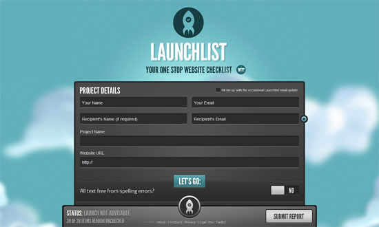
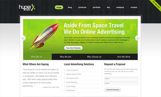
No doubt about it, this design is slick, and customizing form elements is no walk in the park. I just wish the narrow font wasn’t so narrow, and the submit button were blue.
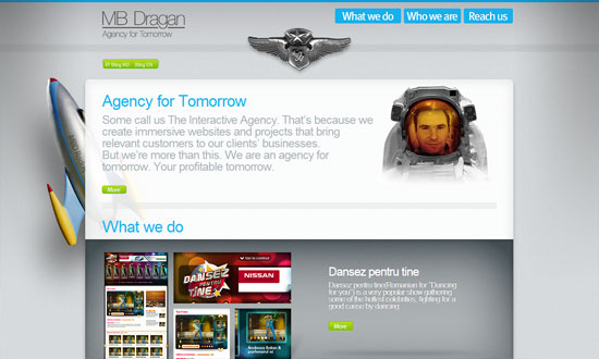
I want the green buttons to have bigger padding (Fitts’s Law), and the portfolio info text in the carousel isn’t so readable, but I quite like this site. Putting the designer’s face into an astronaut suit is clever, and what I meant by taking the metaphor to the next level.
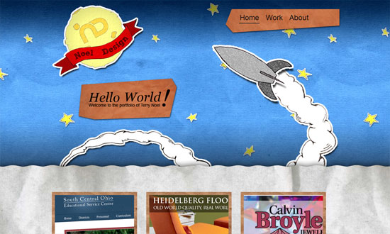
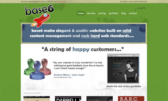
I enjoy the mixed textures and playfulness here, but I think it could stand to be more playful. The footer looks completely different from the rest of the site.
Love the scribbled-on-paper touches but I feel they blend into the background too much and one wouldn’t think to look or click there.
Applying a grunge texture to originally glossy illustrations? Not a very good idea.
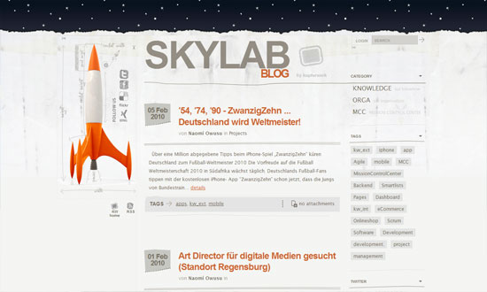
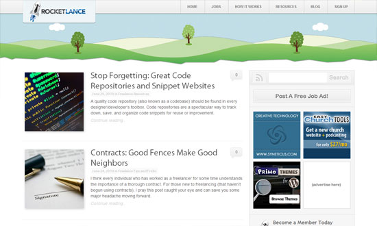
I like the overall look and feel of this site, but if you look more closely it needs polishing. It’s an 8.5, but not a 10.
Lovely details, go check out the icons and other illustrations on the inside pages. My favorite part is the glass frame around the main content area.
Social Media Weekly
SEO – 5 Ways to Be an Ethical SEO Expert
“Today we’ll briefly look at how to engage in SEO in an ethical manner by pointing out five key techniques to avoid.”
Programming – Using Firefox’s Geolocation API
“One interesting aspect of web development is Geolocation; where is your user viewing your website from? You can base your language locale on that data or show certain products in your store based on the user’s location.”
UX – UX Myths
“Debunking user experience misconceptions”
Information Architecture – Card sorting: a definitive guide
“Card sorting is a great, reliable, inexpensive method for finding patterns in how users would expect to find content or functionality.”
