• Home
  • About
  • Contact
  • Advertise

Devlounge

Design, Develop, and Grow

ateşli sevgilisi fantezisini yaşamak istediğini söyler porno ona arkadaşları varken onunla gizli saklı seks yapmak istediğini sikiş söyleyen kız hafta sonu için gelen arkadaşının görmediği bir sikiş açıdan sakso çekmeye başlayınca adamın yarağını bu altyazılı porno şekilde indiremez ve açık şekilde salonda sikişimeye sex izle başladıklarında misafir kızı da bu sekslerine rokettube konuk ederler seks yapacağını düşünmeyerek onun sex izle oyun oynadığını zanneder sabah olur ve herkes uyanır hd porno bu sırada yanında şişme mankenini de getiren sapık erotik hikayeler genç sınav haftası ders çalışan genç adam üvey annesinin sikiş eve gelmesiyle hayatının şokunu yaşar

  • Home
  • Code
  • Design
  • Design Focus
  • Interviews
  • Publishing
  • Strategy
  • Webapps
  • Extras

Friday Focus 09/03/10: Ribbons

September 3, 2010 By Sophia Lucero

Using ribbons is really big these days, bringing both sophistication and a hint of nostalgia to this week’s designs.

Designs of the Week

Worry Free Labs

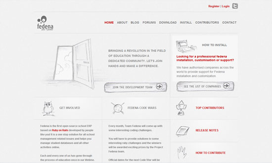
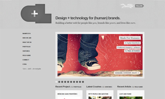
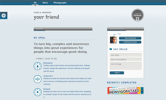
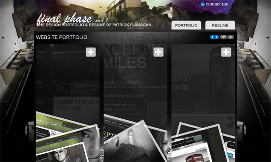
The Work section slider is great. What I really like is the lightbox contact form—go all out when customizing it.

Aint Rocket Science

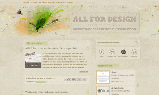
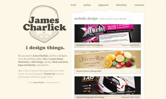
I find the gray shapes in the background an interesting touch, but needs better spacing, better association by proximity.

Tweetsicles

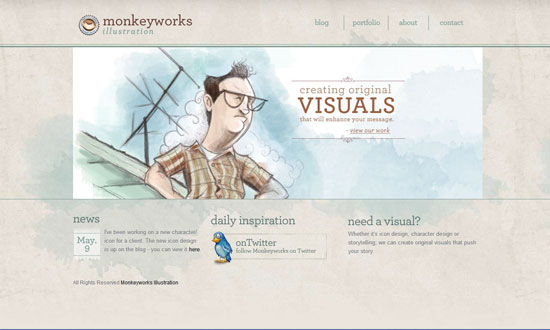
The details on this design are really fun but the colors—mostly the gray—seem to dampen the overall mood.

TDB.RS

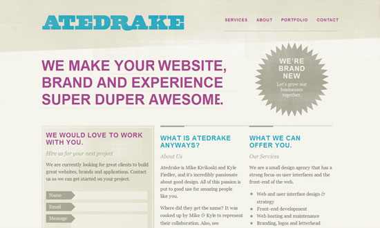
Doesn’t make much sense for the entire space beside the top left logo to be a hyperlink. I think the submit button could echo the glossiness of the ribbon.

The Combine

Love the use of textures on both the ribbons and the headings. I also like the diamonds, which do match with the angles of the ribbons.

Blue Ribbon

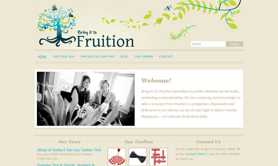
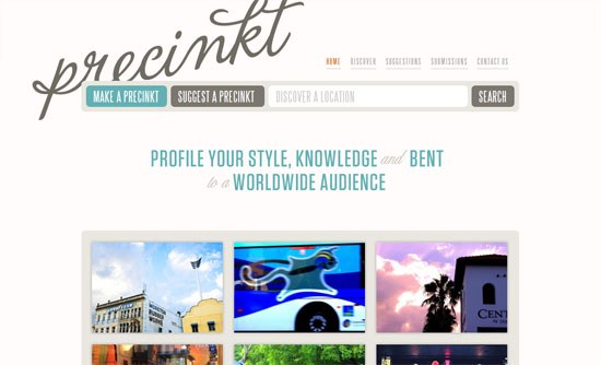
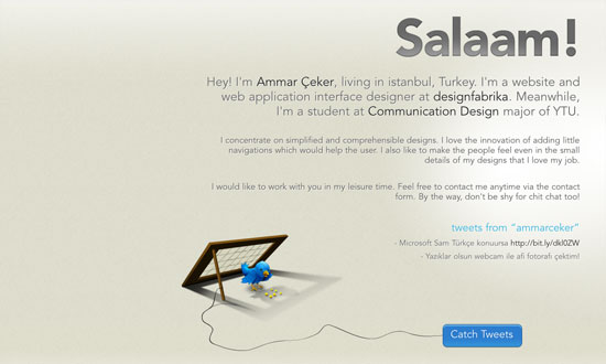
This site needs a description of what it’s about. What exactly is the place? Where exactly can you find it? Always reach out to your visitors.

Forever Heavy

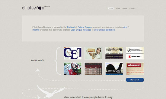
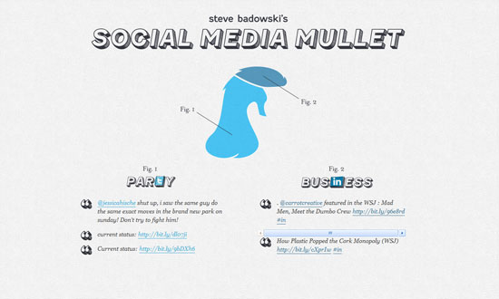
Put your logo on a ribbon like that, hanging like a flag, and you get elegance for cheap! Some texts are too small due to the delicate nature of Garamond, but don’t you just love the bird silhouette and that watercolor smudge behind it? Social media intergration at its finest.

Le Chti

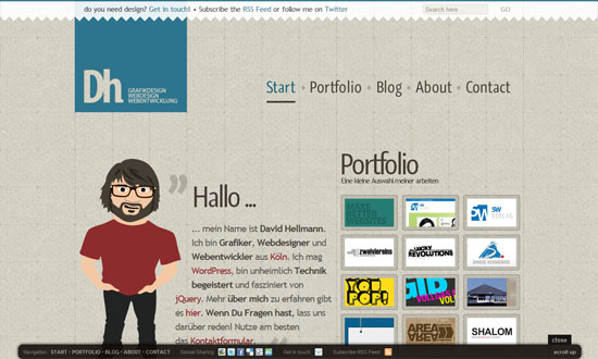
Header navigation is excellent but the “Connexion / Inscription” link should have been styled in a similar way. Other than that, really cohesive design.

Take My Texture

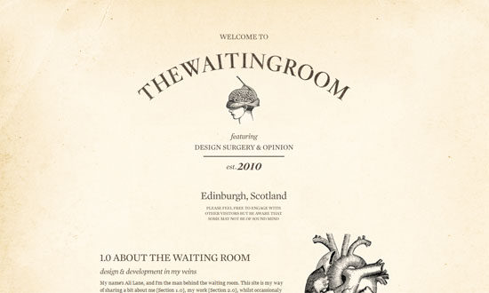
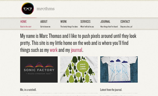
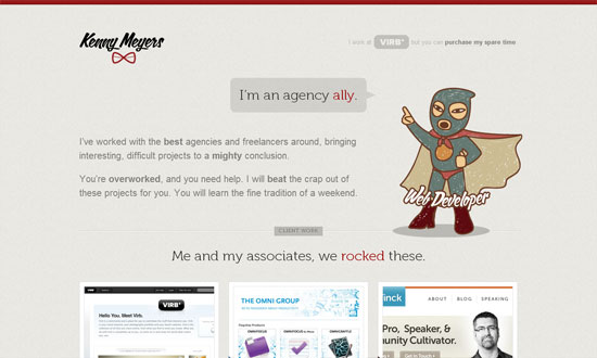
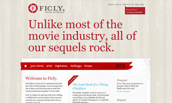
Straight to the point! And does away with default browser fonts.

theIdeaLists.com

I like every single detail on this front page. So imagine my disappointment with the membership request page.

50 Back

The dropdown menu shape is neat, and it’s just the Times New Roman text that throws me off, but more or less fits the design anyway.

Social Media Weekly

CSS – BonBon Buttons – Sweet CSS3 Buttons
“There was a goal: Create CSS buttons that are sexy looking, really flexible, but with the most minimalistic markup as possible.”

HTML – WebKit HTML5 Search Inputs
“It just behaves like a text input. This isn’t a problem. The spec doesn’t require it to do anything special. WebKit browsers do treat it a bit differently though, primarily with styling.”

User Experience – How Choice Impairs Your Visitors
“Many sites provide an array of methods to interact with their offerings, but excesses in decision-making pressure can render less empowered visitors into a cyclone of stress from the barrage of questions being asked. As an industry, we place a great deal of emphasis on getting visitors to make decisions, but are we turning a straightforward path into a labyrinth with our need to know?”

Friday Focus 05/21/10: Neutralized

May 21, 2010 By Sophia Lucero

I’m seeing a lot of sites whose color palette consists almost exclusively of light grayish, brownish hues. Sounds boring? No such thing for a smart designer.

Designs of the Week

Bring it to Fruition

The Waiting Room

Cannolificio Mongibello

elegantweb

Atedrake

Precinkt

Marc Thomas

Monkeyworks Illustration

Project Fedena

Thinking for a Living

Jelle Versele

Dave Redfern

Elliot Swan Designs

Aaron Irizarry

The Theme Foundry

Francesco Fonte

Crush + Lovely

Kenny Meyers

David Hellmann

All for Design

Ammar Ceker

James Charlick

Chris Wronski

Ficly

Social Media Mullet

Social Media Weekly

CSS – 13 Pure CSS Techniques for Creating JavaScript-like Interactions
“Here are 13 tutorials that teach you how to push the limits of CSS and make it do things that we’re not accustomed to it doing.”

HTML – The Origins of the <blink> Tag

Typography – 10 Great Tips For Improving Your Web Typography
“Once a specialist occupation, the digital age has opened typography to computer users and web designers. When creating pages and laying out text with other content there are several guiding principles that designers should bear in mind.”

Bloggers – The History of Web Design Blogs
“Although the article may seem rather subjective to you, we hope that it will give you at least some basic understanding of how it all started and evolved into its current state.”

Friday Focus 04/02/10: Easter Spheres

April 2, 2010 By Sophia Lucero

Since it’s Easter next Sunday and I haven’t really seen egg-inspired designs yet, circles will have to do for now! More on this growing trend in this week’s Friday Focus.

Designs of the Week

31Three

I first noticed the circles “trend” on this site, but it’s really the subtle beauty that draws you in.

Advuli

Excellent typography and ornate details, and the use of circles for buttons reinforces is neat. I also like how strongly balanced the layout is and a lot of it is center-aligned, but not at the expense of legibility.

Solegiallo

The use of circles here isn’t so groundbreaking but the thin, translucent lines blending in with the photographs are the signature look for this design.

Curious Generation Group

Now this uses circles in every possible way—like bubbles floating to the top. Even the lightbox popup for the newsletter was modified into a circle.

Lucia Soto

Now this one “bubbles” horizontally, and uses other forms to create seemingly animated transitions from one section to the next.

Old Guard

Very simple, but I like the idea of using circles with a grid.

Trident Campaign

I have some alignment issues with the bottom area but the way you play videos on this site is clever (click on a face, video shows up on the top right circle).

Proiect 1000

Also clever: spin your mouse around the middle wheel to view different project thumbnails. Using circles as arrows on the left menu is also a nice trick. Finally, I like to overall vibe here: abstract shapes based on but not limited to circles.

Social Media Weekly

HTML – HTML5 Forms Are Coming
“HTML forms have been, to date, quite simplistic. We’ve had limited options: the text field, the checkbox, the radio button, the textarea and finally the select drop down. Any complex data like phone numbers, email addresses or dates had to be checked by JavaScript.”

CSS – CSS Specificity Part 1: Weight, Specificity and Overruling properties
“This article will do its best to map out the problem and will hint at several fixes and workarounds. None of them fool-proof or particularly implementor-friendly. A follow-up article will then take a closer look at the core issue we’re dealing with, diving into the depths of the human mind to uncover the true problem at hand. Sounds exciting, no?”

CSS – CSS Specificity Part 2: Lacking Proximity
“In last week’s article on fuzzy css specificity I presented a case that illustrated the difference between regular specificity and css specificity. While it’s interesting to review these cases, it’s even better to get to the very core of them. This article will do just that.”

UI – An Accessible Pagination Pattern
“Pagination is a basic building block of the web, appearing practically everywhere content is displayed. From a UI perspective, a pagination widget generally ends up being presented in a very straightforward manner as a horizontal list of links, framed by “previous” and “next” links to give the user clear calls to action.”

Friday Focus 01/29/10: Split

January 29, 2010 By Sophia Lucero

This week on Friday Focus: websites that are split right in the middle! Is there a schizophrenia outbreak somewhere that caused these designers to break the rule of thirds? Let’s find out.

Designs of the Week

Erika Works

A great opportunity to exercise good contrast. And a neutral tone against a deep red gives that rich, royal feeling.

Attila Acs

The schizo’s kicking in. Love the code peeking out in the middle, and that the right half looks hand-drawn.

The text is way too small, but otherwise a great look.

Weisswein Party

Very classy. I just wish that one didn’t have to scroll up and down to read the content and then select a new item from the menu, which could have been fixed in its place.

Quipsologies

Pixel-precise graphics are still in vogue. And you can’t do better than the logo!

Matt Brett

A nice touch in the Twitter area: the older the tweet, the more faded it is. Pink and brown is a pretty sweet combination too—and the site belongs to a guy!

Jimmy Oh

Lots of lovely little details here, and no stone was left unturned.

Questionable Characters

This site looks elegant but not too stifling, and has touches of quirkiness here and there.

Social Media Weekly

Design – Front-end Quality Levels

Programming – Find The Right JavaScript Solution With A 7-Step Test

UX – Label Alignment in Long Forms | Paper Prototyping for Engineers

Friday Focus 10/02/09: Destructive Design

October 2, 2009 By Sophia Lucero

Our featured sites today look like they were all hit by something disastrous. It’s an interesting trend perfect for the scary month of October. Welcome to this week’s Friday Focus!

Designs of the Week

Danny Diablo

I like the level of detail on this site, especially the interface elements like the scrollbars and buttons. I also like how the destroyed surface seems to have streaks of light coming from it.

Stefan Kovac

This is the only design that avoided that grim, dark gray color palette, and has a different sort of impact altogether. I love the concept of the main content area looking like it dropped to the ground. I also like that the rubble in the footer is also used in the blog section, though I wished it also showed up in the info page.

Ogrish the Movie

The typography and graphic treatment are imperfect, but this site still packs a punch.

Final Phase

This site looks a bit chaotic if you ask me—even if chaos was the driving concept here—but it’s got an interesting way of presenting the designer’s work. The use of pink feels off for such a dark site, but I like the idea of using such a bright color to change things up.

Social Media Weekly

Design – Crucial Rules to Follow When Designing a Logo

Programming – Password (un)Masking

Information Architecture – Breaking Up Large Documents for the Web – Part 1 (Part 2) (Part 3)

Next Page »

Code & Tutorials

Which Front-End Development Languages Will Grow in 2017?

Your Guide to Leveraging APIs as a Developer

Bitcoin Processing Website Integration For Web Developers

Website Security For 2016 That All Developers Need To Know

5 Reasons You Need to Be Using jQuery

About Devlounge

Want to read more about Devlounge, or maybe you want to contact us, or even advertise? Oh, and don't forget to subscribe to updates!

The Best of Devlounge

5 Reasons To Reconsider Hiring A Web Designer

Search