Time to break out the costumes and candy ’cause it’s All Hallows Eve again. Will these websites do a good job of spooking the daylights out of you? Step inside and find out!
Designs of the Week
Get solid WordPress themes, plugins, and even design training from iThemes.
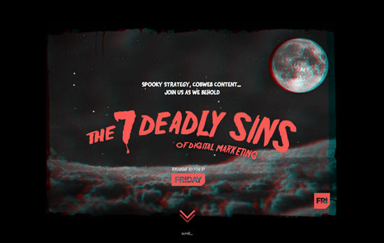
This microsite is available in two forms: 2d and 3d, which is pretty cool. The effects are good and the copy is on point even with the Halloween theme. This is how interactive infographics should be done.
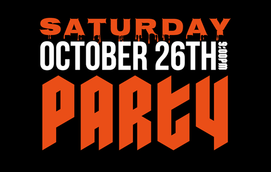
A simple party invite that puts kinetic typography to good use. It’s very flat and clean compared to what you’d expect out of “spooky” designs, which is a nice change.
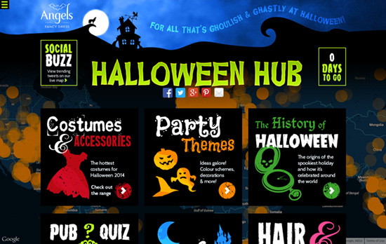
Most sites look similar to this one, you got all the quirky fonts and figures representative of the holiday, but not as thoughtfully designed. The more fonts and colors you throw onto a page, the more chaotic and less accessible it feels, but this knows how to tread carefully and have fun.
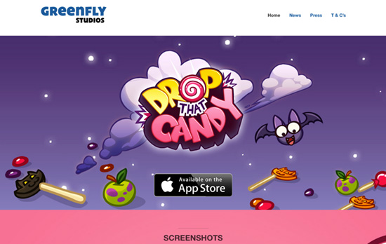
This mobile app game about candy put on a slightly darker look for the occasion and put typica Halloween treats front end center, but still has that light personality. Unfortunately the inner pages feel disconnected to the homepage.
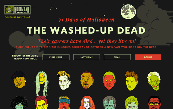
Besides the funky, zombified illustrations, I like that there’s a blur effect on the modal background when it shows up. I think one nice takeaway from this design is to embrace not just orange, but also the yellows, purples, and greens for Halloween. The typefaces are classic and not particularly eerie, but it’s the illustrations that bring the look and feel home.
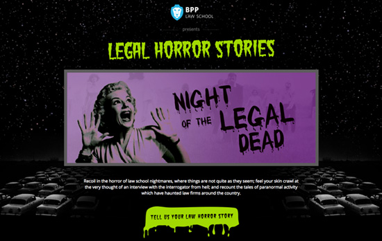
Not exactly the most brilliant design out there, but it’s fun and campy enough.
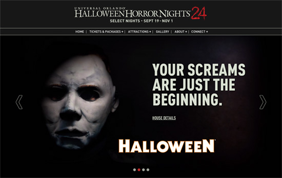
There’s a disconnect between the theme park logo and the rest of the fonts used on the site, but if you don’t think about that bit too much the pages are actually neatly executed – calendars, packages, social icons and all. Plus, the animated horror attractions in the slider are an excellent feature.
Social Media Weekly
Want your site to be as good-looking and inspirational as these? Start by choosing a well-designed theme from ThemeForest.
Design, Business – Halloween’s 13 Scariest Clients
“Halloween is time for the undead to rise up and bombard us with woeful website requests. Fortunately, we can recognize the warning signs and exorcise the demons!”
Design – Monsters and Thieves
“Amateurs tend to be poor at imitation. When they see an idea, they clone the whole thing and offer it as their own work. The pro knows to chop these things into pieces and find new uses for them.”
