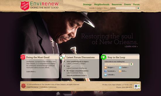
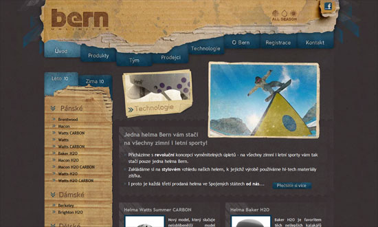
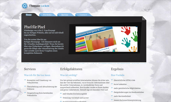
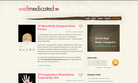
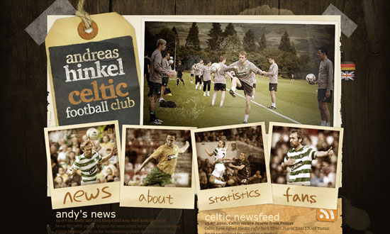
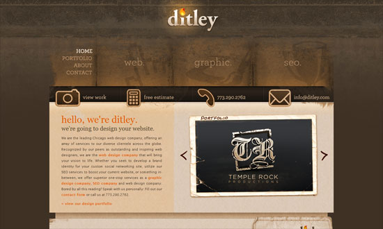
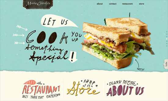
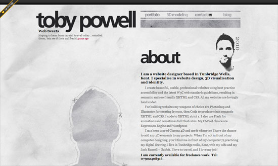
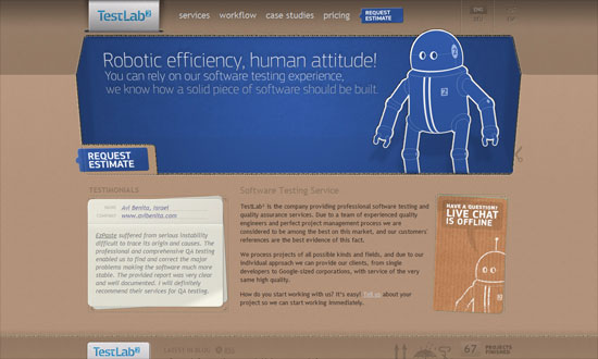
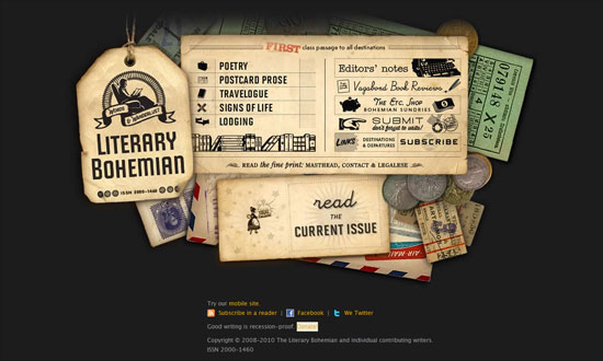
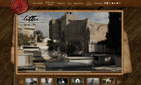
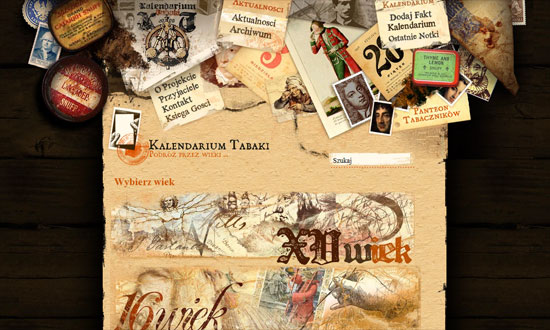
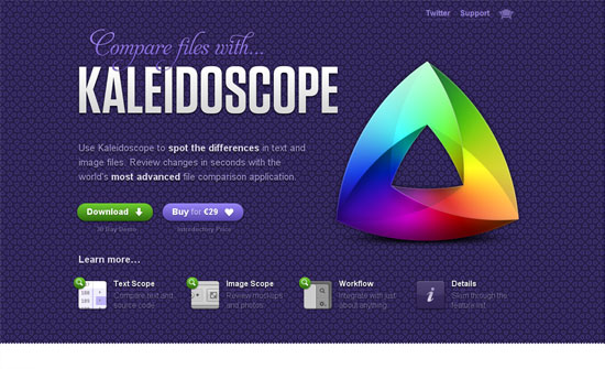
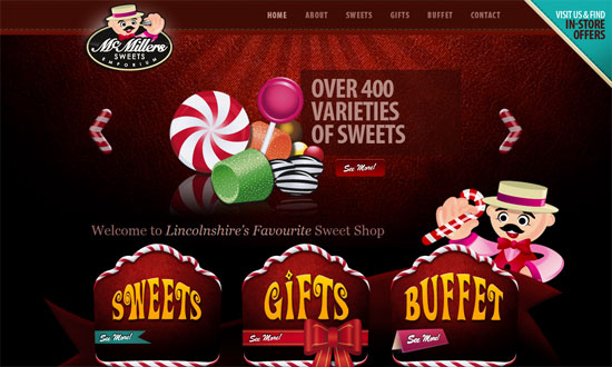
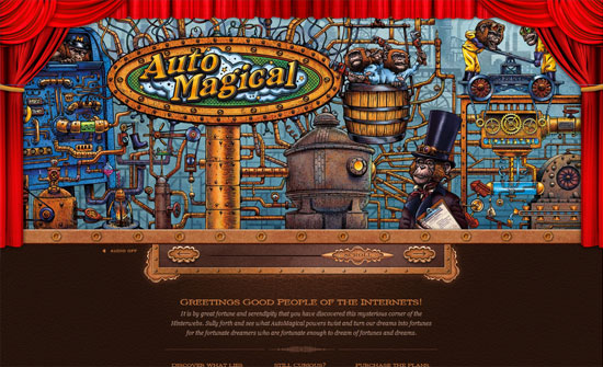
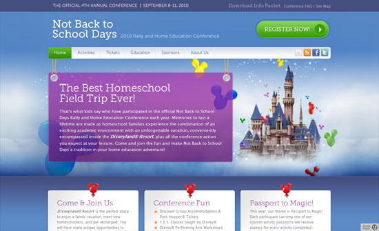
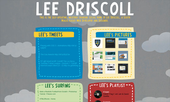
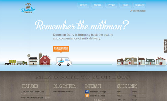
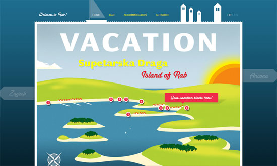
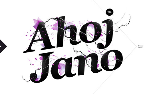
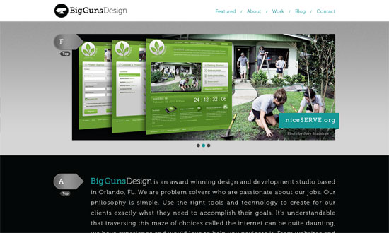
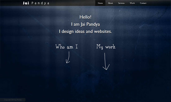
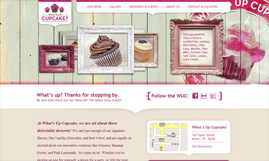
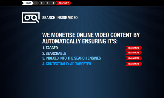
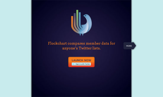
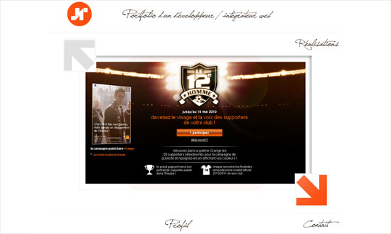
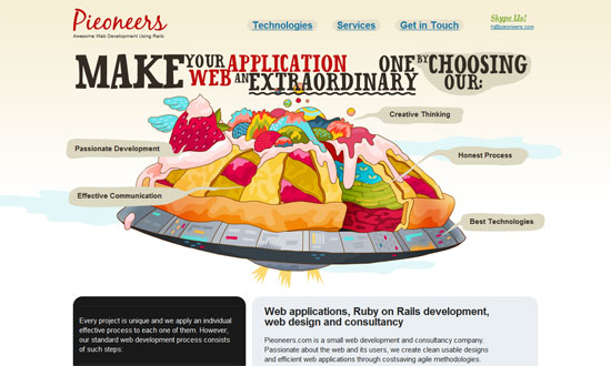
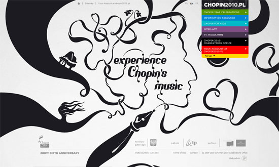
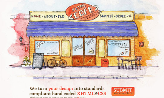
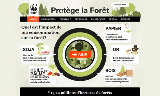
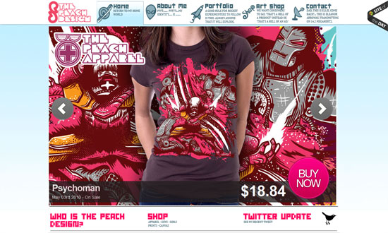
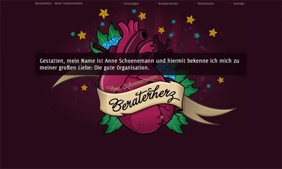
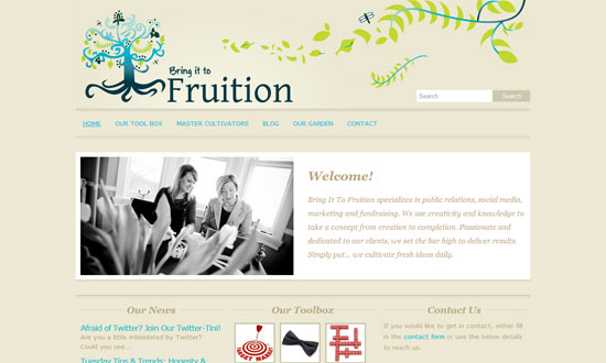
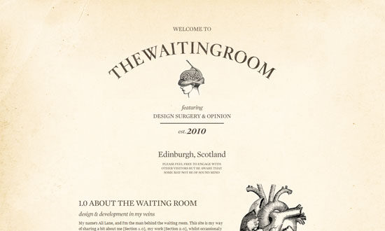
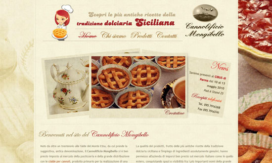
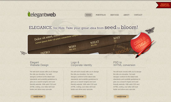
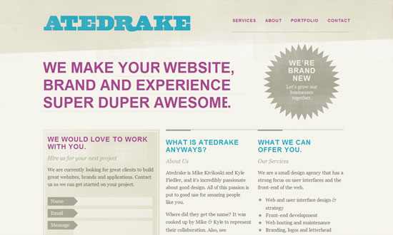
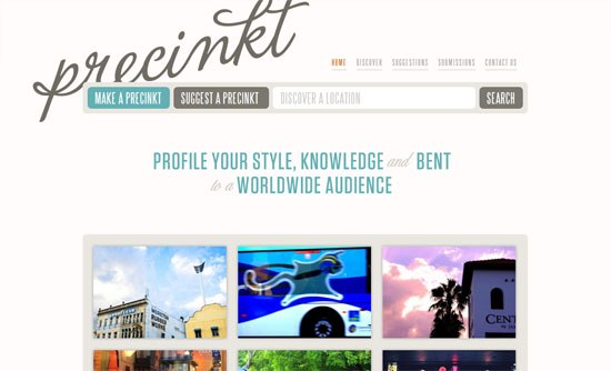
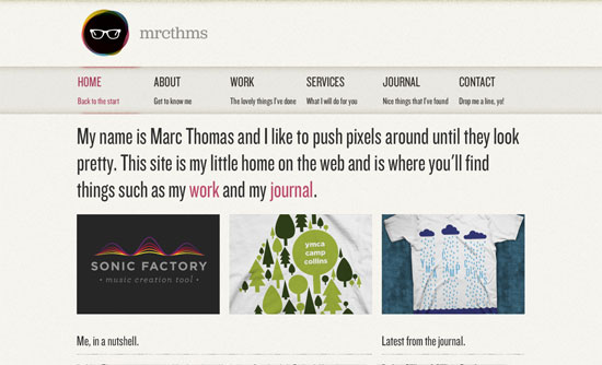
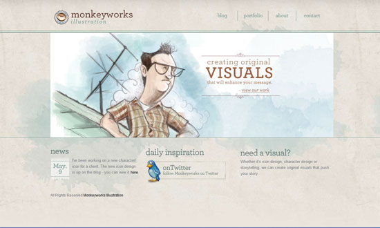
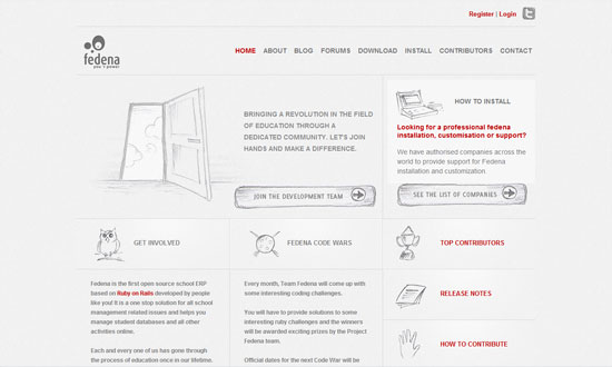
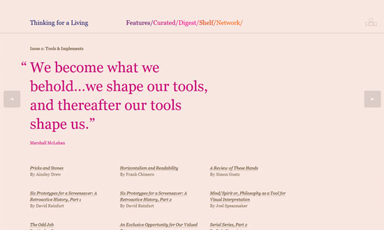
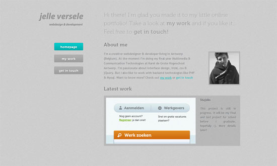
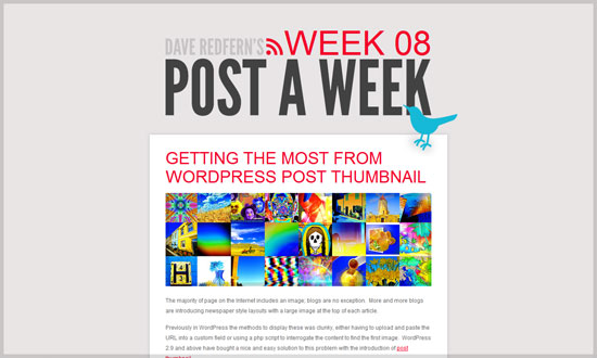
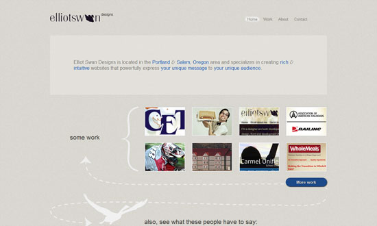
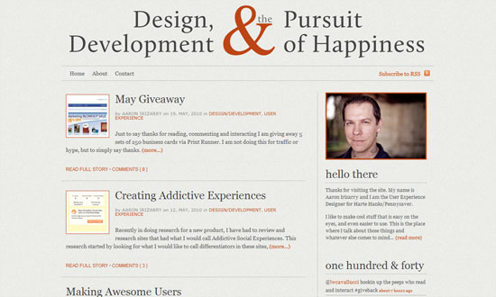
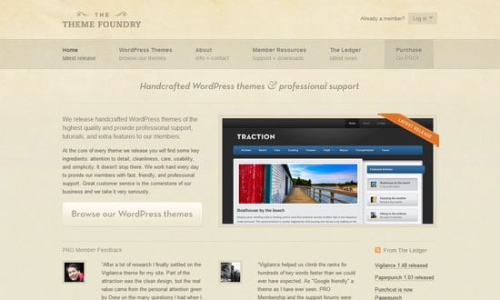
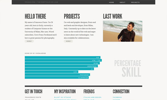
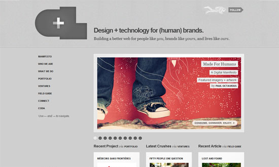
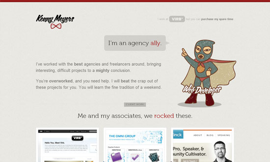
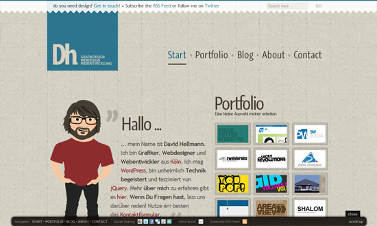
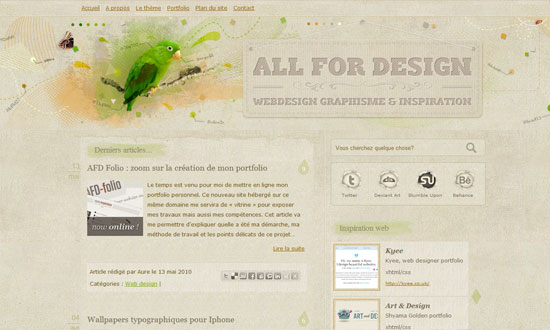
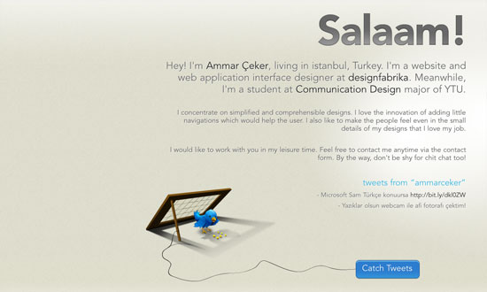
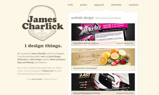
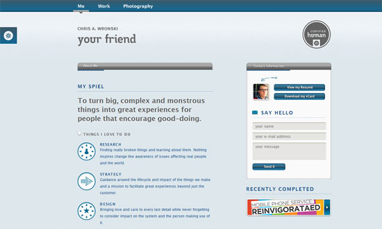
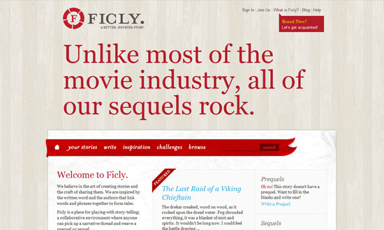
The many different textures, colors, and treatments for paper allow infinite possibilities for their use in websites. Not one of these designs look remotely alike, and that keeps things very interesting. Happy Friday Focus!
Designs of the Week
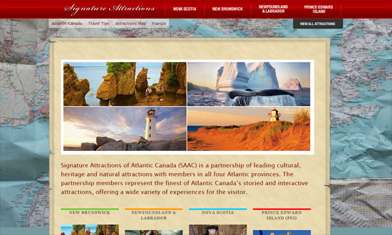
Great idea to do a slideshow that spans the whole background. Looks much less artificial that way.
Everything looks impressively blended in: the logo, Facebook icon, drop-down navigation menu, and tabbed navigation.
Needs refining, but looks pleasant.
Love the navigation background as a torn section of the paper, and you can see the brown wallpaper pattern peeking through.
Excellent hover effects and that overall “big” and “scrapbook” feel.
Love the glowing flame on the logo and the large navigation. I just have some issues with the text padding in the inner pages.
Delightful, delightful details. Love the custom borders most of all.
I like the way the borders and section headers blend into the paper, like faded newsprint.
There are tons of paper textures, but few bother to design with corrugated paper. Especially this way, with the cutouts, layers, and shadows.
A visual and literary feast!
I think it’s great that the video thumbnails have frames that echo the overall look, and the video player interface almost disappears from view.
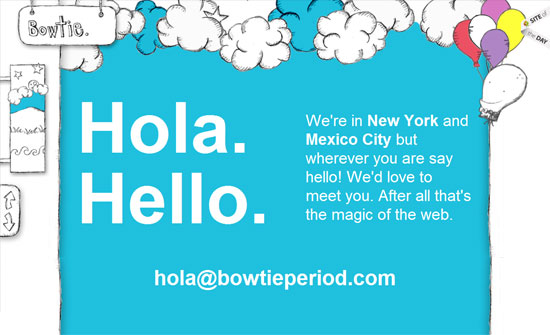
The page title isn’t so prominent, and there are no visual cues for the navigation in the header, but all the collages look fascinating, if a little overpowering.
Some alignment problems here and there, plus the map background image is a little distracting (could be lighter or darker), but good call on the drop down menus.
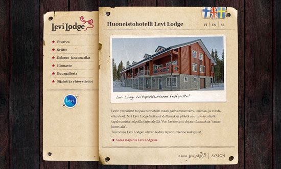
I really like the styled translation/localization flags! And pretty much every detail on this site—everything falls into place nicely.
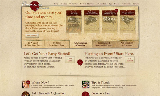
The detail on this design is great, although the font choices for the headers are a bit tired. Not pictured but the animated thing going on in the footer isn’t as refined as the graphics above, looks awkward.
The shadow is a little too heavy, but the tabbed slideshow looks amazing, perfectly blended! Using the red wax seal effect for the social media icons is a good idea too.
Social Media Weekly
Design – Code an Email Newsletter from PSD to HTML
CSS – Vendor prefixes—what happens next?
Design – Zappos.com redesign case study
CSS – CSS Media Queries & Using Available Space
CSS, Typography – Font metrics and vertical space in CSS
Typography – FontShop Education
