Happy New Year, dear Devloungers! For our first Friday Focus of 2009, I have one-page websites that are impeccable not only in their design detail, but also in their presentation. They’re answers to the question “why make Flash sites when you can have these?” and Jason Santa Maria’s challenge to us to add art direction in our websites. And these are some of the best sites I’ve seen.
Designs of the Week
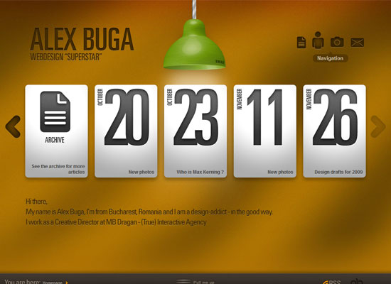
There are so many good things about this site that I don’t even know where to begin. Perhaps the most notable one is how all the inner pages load in a floating layer. It’s like the lightbox effect, except the design is much more polished.
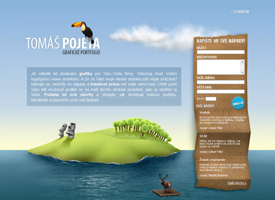
This site instantly reminded me of Volll.com, especially since both move from outerspace to underwater scenery in each scroll, but it is completely breathtaking in its own right. Great websites tell stories, and illustrations are the best ways to do that.
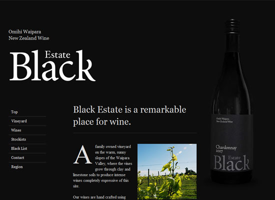
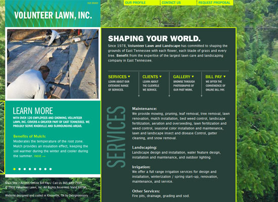
Typography had a large role in making this site a seemingly simple but effective one. My favorite part has to be the map found in the Region section, which just blends into the background—very smart!
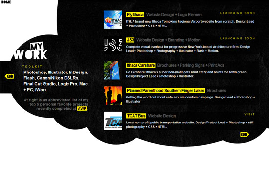
This site takes advantage of scrolling to add transitional effects as it loads each section. That’s so much better than waiting for a blank page to fill up, right? The only thing that’s slightly disappointing is that Tyler’s blog looks completely different from the main site. Still, you’ll enjoy browsing this site.
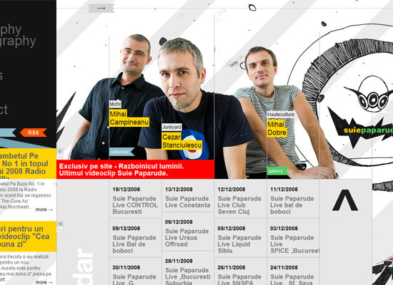
Here’s a horizontally scrolling site that combines the hand drawn look with grids and bright colors. What makes it different from other horizonal sites is that the content also grows vertically, which I’m not too sure about. But plus points for making managing a whole lot more content than one-page sites usually have.
Social Media Weekly
Design – Looking Back On 2008 With Top Web Designers
Great interview with top designers on the year that was and the one coming ahead.
Programming – 9 Realistic New Years Resolutions for Developers
Done your New Year Resolutions list yet? This might help.
