Don’t laugh! Don’t think it’s anything morbid, either! Let’s see how this week’s websites have made use of people’s heads as part of their designs.
Designs of the Week
This site feels a little heavy because everywhere you look there’s something, but it does help that the headshots in the background are in neutral hues, not bold, high-contrast ones. It makes the colors on the shoe products pop, too. I like that the featured products slideshow use big photos, is placed front and center, and contains ample whitespace.
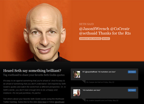
Now for something cleaner and simpler. Good use of bold colors and whitespace. And you can’t go wrong with Seth Godin’s head!
A one-page site with transparency, grunge, big backgrounds, and horizontal scrolling—what’s not to like? The split-screen effect, with varying fonts even, provides maximum impact and a great way to divide the two main sections of the site.
Social Media Weekly
Fonts, CSS – 10 great free fonts for @font-face embedding
HTML, Accessibility – Imporance of HTML headings for accessibility


