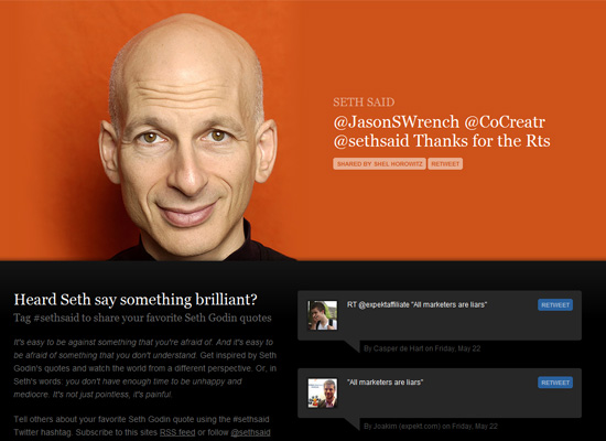
You might remember a feature on split designs over a year ago. The look is alive and kicking in 2011, and this week we’re taking another look. Happy Friday Focus!
Designs of the Week
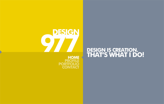
This is actually a completely fluid site, and that’s one feature you can take advantage of when dividing your layout 50-50. Using a custom scrollbar is quite useful in this case as well although I wish it weren’t the only one that got such a treatment—the form elements could be tweaked a little bit more. The Facebook/Twitter/validator links are tucked away on the small arrow at the leftmost side of the site, which randomly turns into a plug icon.
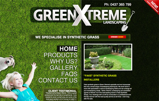
Bold look, big logo, but at the cost of what could have been a better experience. The split layout forces the products to be listed only on one half and after a screenful of scrolling because of the narrow space for the intro text. Not to mention, the photoshopping of the kid and puppy to the lower left isn’t so realistic.
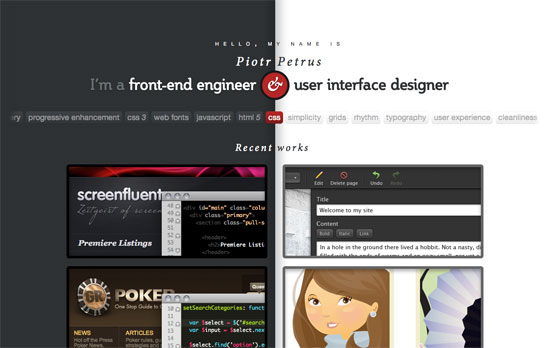
Who said split designs had to keep their division in one place? On this site, clicking on one of the portfolio images pushes and squeezes the other half of the layout to make way for a large tooltip description of the project, written in a playful tone. I also like the idea of putting keywords relevant to his work.
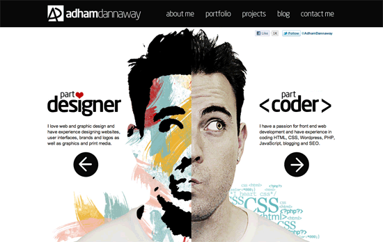
Love both the artistic and comedic headshots. The color palette used in the painted side also echoes in the circular links found in the footer as well as the skills/tasks required in each item of his portfolio and the bar chart in the about page. Other than that, this is a very black and white design, and you could say the look is split in that regard as well.
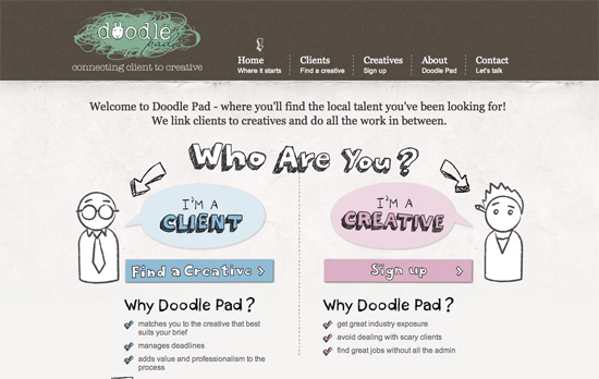
I like all the fun illustrations in this design, but the only thing that throws me off here is whitespace at the top right due to the tall logo; makes me with the menu were vertically aligned instead.
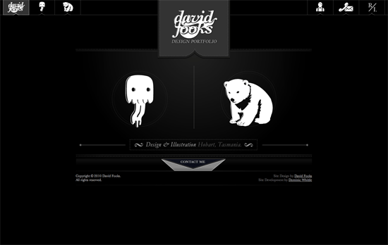
Like the previous site, only the homepage is split in two, but the execution here is striking: elegant and fun (I could even say cute) at the same time. The fixed, icon-based top navigation is also a nice touch.
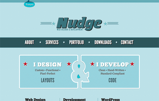
Great retro look on the logo and the rest of the design. The best part has to be the negative space ampersand right in the middle!
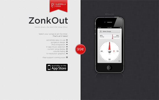
I find it interesting that the bullet points and the left-hand text are right-aligned. Another thing I like is the use of red as accent on exactly three areas: the logo, the price, and the hands on the app. Not too sure about the reflections and shadows on the iPhone illustration though, is it standing up or lying down?

This one looks less obvious but it still is a split design, with a third column halving the design. Almost predictably, there are animated clouds in the background.
Social Media Weekly
Typography – Free HTML / CSS for type & palette proposals
Mobile, iOS – The iOS Design Cheat Sheet
Usability – Top 7 split testing blunders you must avoid
HTML5, Accessibility – HTML5 Accessibility Chops: form control labeling
CSS – Pseudo Spriting

