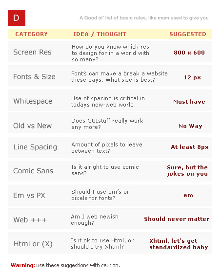
It seems like these days you encounter a new “some name here cheat sheet” on digg almost everyday. They all aim to help you with something, be it coding, designing, using some application – whatever. I figured it was about time Devlounge jumps aboard, but with one of our own – more of a checklist / things to remember type than a cheat sheet, but still worthy of consideration anytime you’re about to design. Let’s start off with this cool little image before we break down just exactly what in the world I’m talking about.

9 Things to Focus On
Yes, we know there’s plenty more than 9 – in fact, I could probably go on for nine hours about the multitudes of things you should be thinking about while designing – not to mention how much money you’ll be making when you finish this for your client… Anyways, let’s get back to the subject here. For this list, I’m focusing on 9 areas including screen res, fonts, white space, new web looks, line spacing, comic sans, how “2.0” you are, pixels vs ems, and finally, xhtml. Next let’s see me go into detail about all of them, and just why they made my first list of things to consider when designing.
Screen Resolution
Virtually all of the design world has moved on to bigger and better things – included larger monitors and more powerful graphics cards. 800 x 600 has all but disappeared to the powerful new numbers your desktop is capable of showing, and the amount of monitors one person might have themselves. But then, there’s me. I fall into that obscure 1% you probably see on your mint logs after I visit your site. Why? Well for one, it’s because the computer I do my designing on is fairly old, which one would consider odd when I have a newer computer just a few rooms away, but also to keep myself from designing too big. (And it also makes it a challenge for me to keep Photoshop up without it crashing, but that’s another story.) I always start off most of my designs at or around 800 pixels by whatever. Even though the percentage of people using 800 x 600 has greatly declined, you never want to rule them out. Having to make long horizontal scrolls if your design is too big for a 800 x 600 screen can really annoy people, but for the most part, designs at 800 by whatever look fine in larger resolutions. If you plan on having a fixed width, make sure your design looks fine in 800 x 600 display.
Fonts
The next thing to consider is fonts. First off, pick a generalized font that everyone has or should have, and be sure to set alternatives. “My new summer dingbats” isn’t going to do very well displaying on other peoples computers if they don’t have the necessary file.
Another thing to consider is font size. We like to start with the basic 12px. (Devlounge also features some use of 11px, but we keep it minimal.) Making your fonts too damn tiny or going to have people squinting so much they’ll be saying the **** with this site, and never coming back. Line spacing is essential, but we’ll get more into that below.
Whitespace
White space (which doesn’t have to be white), is just a term for leaving areas of space between different elements of your site to distinguish certain parts. Using css you can set anything, from the margin between header and paragraph, indent (padding) of paragraph – you name it, and it can be set. Having white space is important because it creates separation, makes things easier on the eyes (even if the site is dark), and breaks apart the design so it’s not too tough to swallow.
Old Vs. New
Another thing you should always be taking into consideration is what year we’re in. Sites like guistuff that used to generate the oh-that’s-so-cool-let-me-generate-my-own-exactly-like-it nav bars and images have been replaced with that new found web goodness called ajax, xhtml, and css, and you can find generators that will build standards compliant nav bars, buttons, and more with a much more up to date look.
