• Home
  • About
  • Contact
  • Advertise

Devlounge

Design, Develop, and Grow

ateşli sevgilisi fantezisini yaşamak istediğini söyler porno ona arkadaşları varken onunla gizli saklı seks yapmak istediğini sikiş söyleyen kız hafta sonu için gelen arkadaşının görmediği bir sikiş açıdan sakso çekmeye başlayınca adamın yarağını bu altyazılı porno şekilde indiremez ve açık şekilde salonda sikişimeye sex izle başladıklarında misafir kızı da bu sekslerine rokettube konuk ederler seks yapacağını düşünmeyerek onun sex izle oyun oynadığını zanneder sabah olur ve herkes uyanır hd porno bu sırada yanında şişme mankenini de getiren sapık erotik hikayeler genç sınav haftası ders çalışan genç adam üvey annesinin sikiş eve gelmesiyle hayatının şokunu yaşar

  • Home
  • Code
  • Design
  • Design Focus
  • Interviews
  • Publishing
  • Strategy
  • Webapps
  • Extras

Design Focus: Mosaic

July 5, 2013 By Sophia Lucero

Websites that break down their imagery into bits for a different view, a different experience.

Designs of the Week

Need help in promoting your site? INeedHits has been in the search engine marketing since 1996!

82nd & Fifth
82nd & Fifth

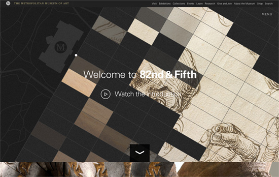
Beautiful large photographs from top to bottom. There’s something about the way the “mosaic wall” is slanted that blends well with the graphic on the left, like it’s part of the New York map, tying in with the name of the site as well. There are a few instances where the split layout comes into play as well.

DSFN Dewey Santos & Felix Ngo Architects

On most of the pages the sliced-up background photographs simply fade in and out, but there’s also a bento layout going on in the portfolio page.

Digital Bakery
Digital Bakery

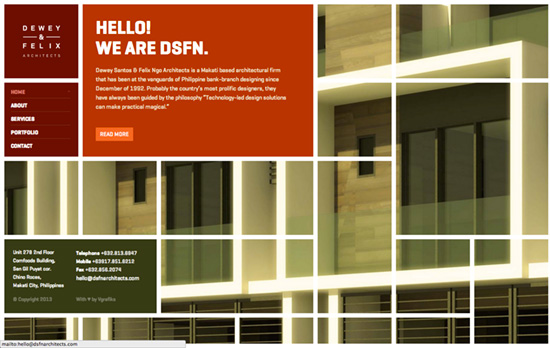
The almost kooky-looking default view of the company’s projects actually has provisions for displaying markers on them with different classifications: type, chronology, scale, etc. Moving your mouse over the area produces effects that play with the “surface” of the graph, providing a 3rd dimension you probably wouldn’t have expected. (There’s a safer-looking grid if that’s more your speed.) What’s also cool is the images on the other pages also have irregular sides.

The Drawing Room
The Drawing Room

The recurring diamond motif remains exciting from page to page, and my favorite has to be the blog, which like the work page is laid out horizontally.

Social Media Weekly

Ready to go out and design your next website? Try building with the Catalyst Framework.

JavaScript, Optimization – Progressive enhancement is still important
“There’s a perception that progressive enhancement means building everything on the server then building it again, like for like, on the client. This is rarely the case. Lean on the server as much as possible.”

Web Standards – Native Form Elements
“This is what every HTML5 form element looks like on your current operating system and browser.”

Design Focus: Horizontal Storytelling

August 3, 2012 By Sophia Lucero

This week’s featured designs use the not-so-common method of horizontal scrolling to tell their stories, each screenful an idea to absorb on your way to getting to know them fully.

Designs of the Week

Create unique, extraordinary websites with Squarespace. No experience necessary!

Small Studio website
Small Studio

I love the illustrations, which fit the whole storybook vibe that most horizontal scrolling sites carry. Especially that wide panorama “painting” inside the frame—you don’t see that sort of thing online! There’s no ‘you are here’ indicator in the fixed top left menu, but it’s kind of a good idea that it fades in and out while in the process of scrolling, like a visual cue that you’re doing something. Even the way the site stops on the far right, with book spines, is pretty brilliant.

Reality LA Ruth Series website
Reality LA Ruth Series

Walking animated character, flying in and moving objects, and subtle parallax effects—all token components of this design genre. I also appreciate that the text in each banner uses true webfonts.

ParaNorman website
ParaNorman

The whole look and feel of the movie touches everything here, even the social media icons on the lower right. The fly-out menu meanwhile slides vertically from the bottom, which isn’t too usual, and it’s one big collection of images, which also makes sense since the site is extremely visual and users will remember the pages better by the scenes they’re about.

Social Media Weekly

Search Optimized, Turn-Key Designs, Unlimited Everything. Start building with the Genesis Framework today.

Responsive Web Design, Email Newsletter Design – Responsive Email Design
“In this guide, we’ll look at why designing for mobile has become a necessary skill for email designers, cover the fundamentals of designing and building a mobile-friendly email and back it all up with some neat tips and techniques.”

SEO, Semantics, Web Standards – On web semantics
“Up until today authors were not always certain about what HTML element to use for what functional unit in their HTML page, though, and “living” specs like HTML 5 require authors to keep an eye on what elements will be there going forward to mark up what otherwise calls for “meaningless” fallback elements like div or span.”

CSS – Creeps and Weirdos in the CSS Spec
“So in this post, I’ll run through a bunch of things from the CSS specifications that you might not have heard of yet. None of this is even close to ready to use (unless it degrades really gracefully), but it will serve to get you familiar with some of the rounded corners and drop shadows of the future.”

Web Standards – A future friendly workflow
“User experience director Luke Brooker explains the thinking behind the Future Friendly initiative and how it can help adjust your workflow.”

Friday Focus 02/10/12: Final Frontier

February 10, 2012 By Sophia Lucero

This week on Friday Focus, we’re exploring outer space. Get ready to blast off!

Designs of the Week

Search Optimized, Turn-Key Designs, Unlimited Everything. Start building with the Genesis Framework today.

Quazar website
Quazar

Lots of animated objects on this page, from the space dust to the ribbons, icons, and buttons sliding back and forth on hover. I like the gleaming borders and the group photo on the “Design Troopers” page with the helmets to drive home that space motif.

Team Viget website
Team Viget

This one’s a horizontally scrolling site with a fun little animation that tilts back the objects on the page to their upright state as you page through each screenful. The use of an outer space view of the earth for a map is also a clever idea.

We Came From Mars website
We Came From Mars

Space designs are usually in cooler colors but it’s all hot hot hues here due to the Mars theme. I like how the two M’s in the logo look like a spaceship too. There’s also a nice “folded paper” background in the middle, and to drive the illusion of depth home, some parallax scrolling with objects floating in the foreground (not background). Also check out the astronaut heads in the second to the last section!

Create unique, extraordinary websites with Squarespace. No experience necessary!

Social Media Weekly

User Interface Design – Pea.rs
“Collect, test, and experiment with interface pattern pairings of CSS & HTML. Pears is an open source WordPress theme, enabling people like you to get your own pattern library up and running quickly.”

CSS, Web Standards – CALL FOR ACTION: THE OPEN WEB NEEDS YOU *NOW*
“Without your help, without a strong reaction, this can lead to one thing only and we’re dangerously not far from there: other browsers will start supporting/implementing themselves the -webkit-* prefix, turning one single implementation into a new world-wide standard. It will turn a market share into a de facto standard, a single implementation into a world-wide monopoly. Again. It will kill our standardization process. That’s not a question of if, that’s a question of when.”

Friday Focus 12/23/11: Happy Holidays!

December 23, 2011 By Sophia Lucero

It’s that time of the year once more, so let’s soak up some Christmas cheer with these designs. Happy Christmas Friday Focus!

Designs of the Week

Occupy North Pole website
Occupy North Pole

This is a wonderfully decked out design from the logo to the interface elements to the themed graphics in each blog post. The cookie charts look yummy and the Twitter/Facebook widgets blend in perfectly, and it’s all topped off with subtle falling snowflakes.

A Real Letter from Santa Claus website
A Real Letter from Santa Claus

Site’s defunct now but still worth mentioning for the lovely look it has. Deep red and gold hues combined with classic type make for a warm and elegant seasonal website.

A Very Warwick Christmas website
A Very Warwick Christmas

Deep blue and white is typical for a snowy night scene but this site adds a touch of not red but hot pink for a more funky, modern touch. Each slide of the screen loads a few animations in the background and invites you to click on the ribbon button which loads a lightbox fashioned like a scroll.

You Better Not Stress website
You Better Not Stress

Simple but striking (you can never go with red and white!) and packs a responsive web design punch. Each red box shows a subtle background on hover, then loads a white box that’s the exact width of the grid. Beautiful type, photography, and concept.

It's A Shape Christmas website
It's A Shape Christmas

Another red and white design but takes the color scheme in a bolder direction: pretty much all of the text is in red on white, while other areas  simply flip the colors around. That, combined with the thin diagonal line pattern in the background makes this page a little challenging on eyes, but it’s certainly bright and cheery.

Christmas Cracker App website
Christmas Cracker App

The only design in the bunch that does not use typical Christmas color combinations, or typical color combinations at all! Also taxing for the eyes, especially with the non-stop animations in each box, repeating several screenfuls down, but it’s a fun concept.

Social Media Weekly

HTML, Accessibility – The Hidden Nuggets of WCAG2: When Not to Use ALT Attributes
“Hopefully, that’s going to help you make the right choice as to when to give an image an empty ALT attribute so that screen readers ignore it, or one that has meaningful information that will help the user.”

Business – From Side Project to Not So Side Project
“There still seems to be something of a disconnect between having a side project and turning it into something that is moderately successful; in particular, the challenge of making enough money to sustain the project and perhaps even elevating it from the sidelines so that it becomes something not so on the side at all.”

Web Standards – IE to Start Automatic Upgrades across Windows XP, Windows Vista, and Windows 7
“Today we are sharing our plan to automatically upgrade Windows customers to the latest version of Internet Explorer available for their PC.”

Friday Focus 11/18/11: Moustaches for Movember

November 18, 2011 By Sophia Lucero

Last week we celebrated 11/11/11; this Friday Focus we’re looking at inspiring moustache-themed designs in celebration of Movember or men’s health awareness month.

Designs of the Week

Movember website
Movember

Lovely use of varying textures as backgrounds to the equally grungy icons. Even the boxy graphic items employ rough edges to break up the straight lines.

Gallery of Mo website
Gallery of Mo

Hilarious seeing moustaches in the background wallpaper of this gallery style site. It doesn’t stop there, either: hovering on the donate button shows a moustache as an arrow/marker replacement, while the left and right arrows for sideways scrolling use curly braces instead of the usual sharper brackets or triangles. I also like that the gallery frames vary from portrait to portrait.

Octavo Designs Movember website
Octavo Designs Movember

Very few elements on this page, but it’s notable how the layout is responsive and adjusts to smaller screens. Also, animated GIFs seem to be making a comeback.

Lambert Street Handlebar Club website
Lambert Street Handlebar Club

Brown seems to be the predominant color in all these designs, not to mention an adaptation of vintage elements and typography. This site’s spiced up a bit with collages and a brighter than usual color for its wooden background.

Movember Austin website
Movember Austin

This tumblelog actually uses a slightly modified theme but I thought it would be nice to feature its look here, especially the bento-style menu I’m growing to love more and more. Too bad the drop-down menu doesn’t look as rugged!

No Shave History website
No Shave History

Love the idea of the logo matching the background for a masked look. The hover effects on the photos are also a snazzy little idea (read on below for similar ones).

Social Media Weekly

CSS – Original Hover Effects with CSS3
“We are going to create some thumbnail hover effects with CSS3 transitions. On hover over a thumbnail, we will reveal some description of the thumbnail, using a different style in each example.”

HTML – Interactive Typography Effects with HTML5
“I will go over the development of dynamic, and generative banners to give your website that little extra wow!”

Interaction Design – The 10 principles of interaction design
“Chad Vavra, interaction design director at The Barbarian Group, rounds up 10 key rules that make good interaction designs and designers and that you need to understand before you can break them”

JavaScript – Exploring JavaScript’s Logical OR Operator
“With the || (OR) operator, since values don’t need to be explicitly true or false (they can be truthy or falsy), the operator can return non-boolean results when evaluated.”

User Experience – A Brief Rant on the Future of Interaction Design
“Our hands feel things, and our hands manipulate things. Why aim for anything less than a dynamic medium that we can see, feel, and manipulate?”

Next Page »

Code & Tutorials

Which Front-End Development Languages Will Grow in 2017?

Your Guide to Leveraging APIs as a Developer

Bitcoin Processing Website Integration For Web Developers

Website Security For 2016 That All Developers Need To Know

5 Reasons You Need to Be Using jQuery

About Devlounge

Want to read more about Devlounge, or maybe you want to contact us, or even advertise? Oh, and don't forget to subscribe to updates!

The Best of Devlounge

Vectr: a free graphics editor on your desktop and in the browser

Search