jQuery is one of the best-known development tools available, and since its emergence just 10 years ago, it’s exploded in popularity. In fact, it powers roughly 65 percent of the top 10,000 most popular sites on the Internet. So what exactly is it, and is it worth learning? [Read more…]
Make your site more sociable with OpenGraph markup
These days, before people click on your site they will probably see it through a link shared on your social network of choice, such as Facebook, Twitter, Google+, and so on. Usually these sites are smart enough to extract descriptive information about your page and display that so followers already get a good idea of what they’d be clicking on, but wouldn’t it be great if you could optimize that information to ensure you get more engagement?
With a bit of HTML knowledge (and perhaps some programming knowledge, depending on what website templates you’re using), you can make more sites more “sociable” by adding these tags to the <head> portion of your site. Text in {CURLY BRACES} are placeholders for the values you need to insert.
og:url
<meta property="og:url" content="{URL}">
Use this to show the canonical url of your page, free from various query variables or tokens. If you use a CMS like WordPress, this can be automatically generated for posts and pages through a function like the_permalink()
og:title
<meta property="og:title" content="{TITLE}">
Use this to show the title of your page. By default sites like Facebook usually get the text from the <title> tag, displayed on the browser title bar or tab name, but that usually contains extra stuff like the site description. With a custom OG tag you can opt to modify that to your liking.
og:type
<meta property="og:type" content="{TYPE}">
Use this to indicate the type of content your link is all about. Of course all links are websites, but they can also be more specific things like articles, products, books, movies, restaurants, and more.
og:image
<meta property="og:type" content="{IMAGE}">
A lot of times the images that displays with your link can encourage or prevent people from clicking, so make sure that you define this. There are optimal sizes for what Facebook, Twitter, and Google+ recommend, so be sure to check their individual documentation on that.
og:description
<meta property="og:type" content="{DESCRIPTION}">
Similar to title and image, you’ll want to optimize the description of your webpage since there is only so much text social networking sites can include in their link previews.
Closing note: on Twitter and Testing
When you’ve plugged in the above tags, you’ve pretty much guaranteed Facebook and Google+ to display your website links the way you customized it. However, Twitter has a couple more tags you might want to integrate, including twitter:site, where you can plug in the Twitter handle of your website, and twitter:creator, a different person or organization that is behind the website.
Twitter also has content types called Cards, which lets you specify the most appropriate layout for a link preview—whether it’s a summary card, a summary card with a large image, an app card, or a player card. Each card type emphasizes different data, so choose wisely or switch things up as you see fit.
Finally, it’s always the best practice to test things before rolling them out. Check out the links below for more detailed documentation and tips for sharing content on each social network:
- Facebook Debugger Tool
- Facebook Guide to Sharing for Webmasters
- Google+ Platform for the Web
- Twitter Cards Guide
- Twitter Card Validator
Design Focus: Websites are Made of These
Metaphors are a cornerstone of design, but what if the design itself shows the tools and components used to build a website? The result is an interesting “x-ray” into the web design process, as seen in this week’s featured sites.
Designs of the Week
Get solid WordPress themes, plugins, and even design training from iThemes.
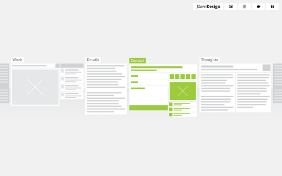
Instead of the usual links or thumbnails, this site uses website wireframes to represent the subpages, showing the actual yet abstracted layout of each page. The cool thing is the transition, where you see the wireframe “come to life” with the live content and color-coded elements. All the pages also appear side by side once you go into one of them, so it’s like you’re zooming in, almost physically exploring the website.
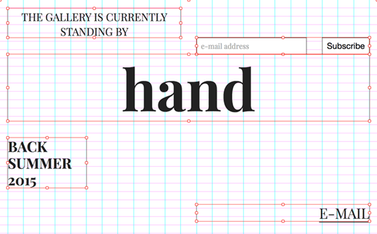
This design is reminiscent of speed painting videos, except done in the context of creating a website. You’re literally watching the site transform in terms of typography, color, and layout live. It’s probably intimidating and gimmicky for certain audiences, but being an online art gallery and still in its coming soon phase makes for an interesting art piece itself.
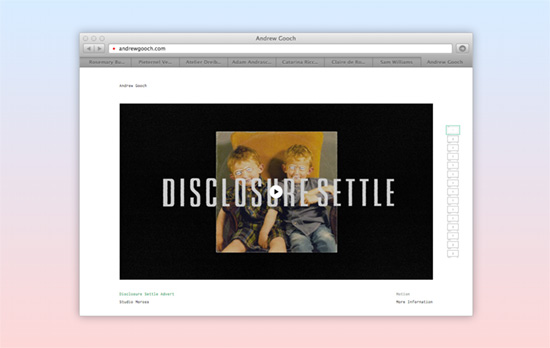
Browsing with a browser inside of a browser seems a little on the nose, but the fact that these are live sites shown in each tab speaks to the confidence of the designer in presenting the work—no pixel perfect screens here, you’re interacting with the real deal. In a smaller container of course, but you can click on the “go” icon to see it in a new window. I also like that the description above fades out and the background becomes this powder blue to light gray gradient.
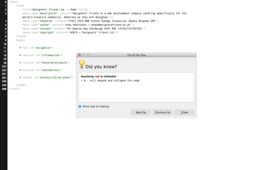
And what is a website without HTML? The page shows a Tip dialog which you can close or move out of the way, as if you’re using a Linux OS inside the browser. You can then proceed edit all the code on the page, click on the red links, and hover on the <img> tags. Again, this interface could intimidate non-techies, but that will also tell you whom this page is really for.
Social Media Weekly
Pagelines lets you build WordPress websites and it’s as easy as drag and drop, go check it out!
User Experience – Designer’s Toolkit: A Primer On Capturing Research
“A good structure is to have a moderator and a note taker, that way one practitioner can focus on conversing with the participant, while the other focuses on capturing what is occurring.”
Design – Why the Golden Ratio matters
“The visually-inclined — artists, architects and designers, historically keen observers and documentarians of both nature and the human condition and who we can thank for much of what we know about the world — have for ages incorporated this ratio into their work due to its intrinsically alluring balance between symmetry and asymmetry.”
Usability – 6 Usability tasks you haven’t tried so far, but really should!
“Below you find 6 example task that can provide new and different insights than the standard usability tasks.”
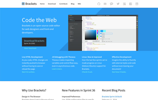
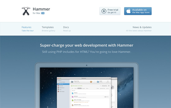
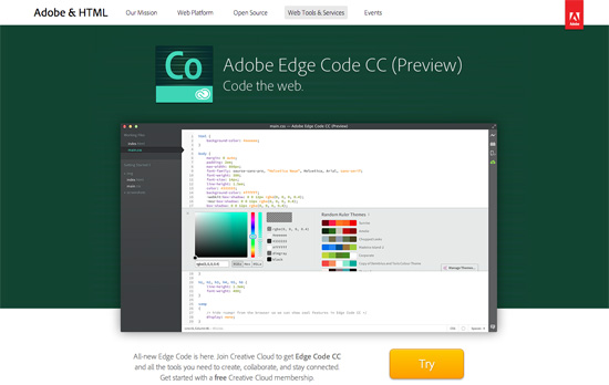
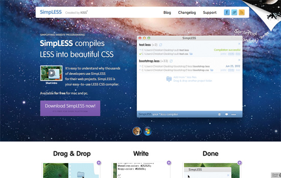
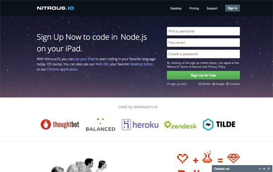
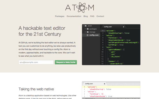
Design Focus: New Age Editors
Check out these modern tools that will help you build websites faster and better than ever before, and the design patterns they employed for their landing pages—from animations to familiar color schemes.
Designs of the Week
Want your site to be as good-looking and inspirational as these? Start by choosing a well-designed theme from ThemeForest.

Social Media Weekly
Ready to go out and design your next website? Try building with the Catalyst Framework.
Web Standards – Code Guide by @mdo
“Standards for developing flexible, durable, and sustainable HTML and CSS.”
Design – The Troublesome Misconception of Parallax in Web Design.
“The sites above are either using different scroll effects to simulate movement of objects not naturally expected by the user, or simply sliding two planes over one another at different scroll speeds.”
User Experience – How we work
“We always start by trying to understand the problem: the users of the website or product, the organisation on their customer strategy, the goals and needs of the project, who’s in charge and who isn’t.”
Friday Focus 09/02/11: Over the Moon
This week’s Friday Focus features designs that incorporate the moon in them.
Designs of the Week

Let’s talk about the moon and how it’s in the top right, in the foreground, spinning oh so slowly—just enough for people to notice it’s moving. Overall look seems simple, but I think it’s effective and still makes an impact. I think it’s interesting that the site labels the homepage as the About page at the same time. One nit to pick, while not visual, is that there are two different email addresses being used in three email links.

It’s funny how this site also uses the Star Trek logo as one of its icons in keeping with the outer space theme. I love the illustrated, painted look in the header, including the word “design” in the logo (which doesn’t look like just another handwritten typeface). It’d be nice to have the headings as real web fonts now instead of images, but then I discovered that the whole design—and I mean every graphic you see on the page—is one big sprite, so kudos to that!

This is just a demo site created by Dan Cederholm for An Event Apart Seattle 2010, but there are a lot of neat things to be inspired by here, particularly CSS3 features in the hover effects and typography. Love the idea of the halftoned moon landing picture as a background. The use of purple is also a nice touch, since it’s easy to just reach out for midnight blue when depicting skies and space.
Social Media Weekly
Mobile Web Design, E-Commerce – Add to Cart: 5 Ways to Improve Shopping on the Mobile Web
Five steps to optimizing online shopping on mobile devices.
HTML5 – The Current State of HTML5 Forms
Check out the latest browser support and techniques for using form attributes in HTML5.
CSS3 – Sizing with CSS3′s vw and vh units
Another set of measuring units included in CSS3, this time based on viewport dimensions.
CSS – The Minimum Page Project
Another iteration on the CSS resets out there. The idea is to avoid redundancy due to broad-sweeping resets.
Design, CSS – Adapted
Reflections on the challenges and options in adapative, responsive web design.
Design, User Experience – Thoughts On Communicating Design
“Communicating design, in general, needs to be less about documentation and more about clear, concise and ongoing two-way communication.”
