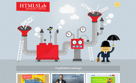
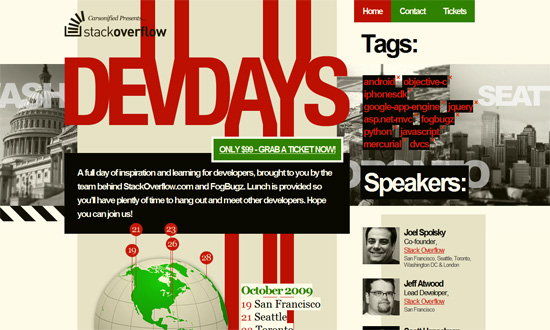
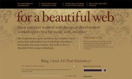
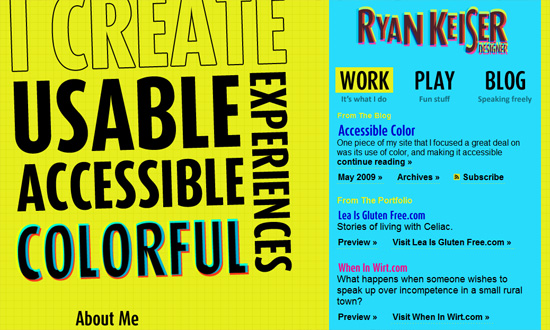
This week on Friday Focus, we’re taking a look at designs with that laboratory/factory feel to them.
Designs of the Week
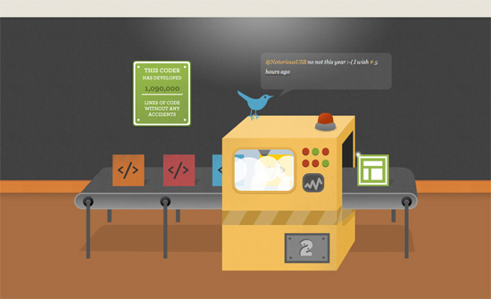
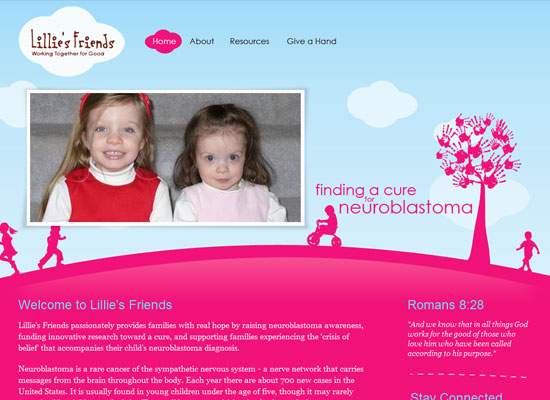
Everything here is just warm and sweet. Custom textures, illustrations, and type everywhere, even the slideshow controls, form inputs, and location map blend in. The blog section is surprisingly understated though.
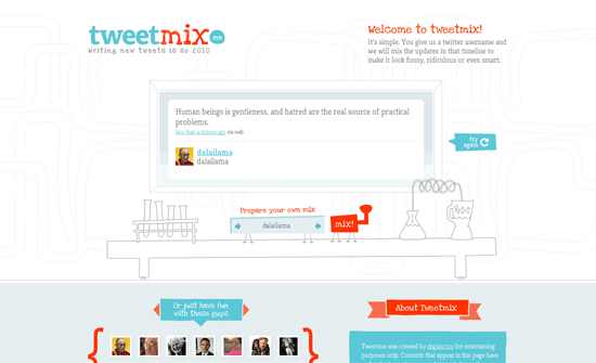
Interesting how only the salient parts of the site are in full color while the rest are in sketchy gray. I like the color palette and even the AdSense integration looks acceptable.
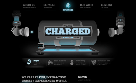
The animations look great, and I particularly like the glow and lighting effects everywhere.
Another immersive design; the only distracting part would be the navigation bar for the main site, which could have been downplayed more.
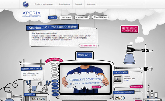
Simple and straightforward. I somehow prefer, though, that the inner sections show up on their own pages rather than in lightboxes.
Social Media Weekly
CSS – Styling Texty Inputs Only
Browsers – IE6 Countdown
Design – Our Tools
“Rather than picking a camp, I think it’s wise to step back and examine the effects of each approach because I believe there is a bigger issue hiding under the guise of simple tool selection.”
Web – Same As It Ever Was
“If I had to nominate one thing about the Web for the title of “Most Under-appreciated”, I think this would be it.”
Design – Stop the press! Design costs money?
“Implying that web designers are systematically over charing their clients is just wrong. Sure there are bad agencies out there with bad practices, but the majority of people I’ve met in this industry are nothing but honourable.”
CSS3 – Browser Support for CSS3: What’s the Current Status?
“This outline will be divided up into sections beginning with the safest CSS3 features to use, and going down the list towards the not-so-safe.”
