Imagery that will kindle your spirit of adventure is this week’s Friday Focus. After this, go outside and play!
Designs of the Week
The text section feels a little underdesigned against all the images, but the impression they make is great.
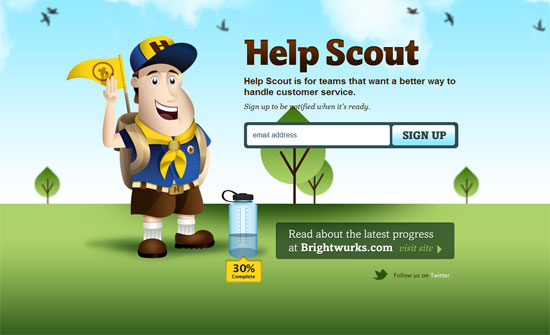
Nifty metaphor to use the water bottle as a completion status indicator.
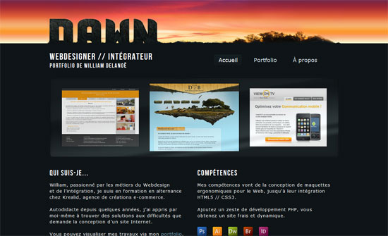
It’s a really simple idea to integrate your logo into the design this way, but it makes quite the impact.
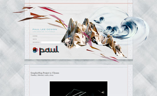
I like the vertical approach to this design and all the slanted edges.
Whimsical and light at the top, then futuristic and dark in the bottom? There’s a disconnect that isn’t too appealing.
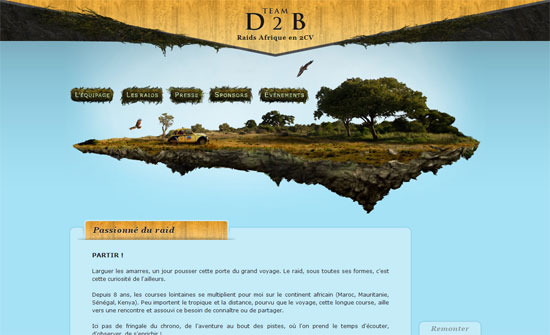
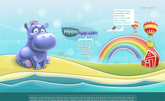
I love how the illustration flies out of the content area, but I wish the navigation items had more contrast to them.
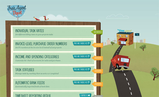
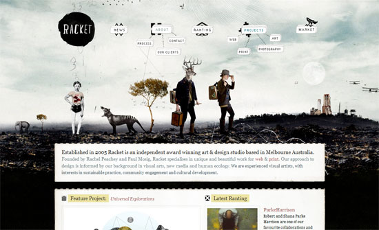
Not really the “fun” type of outdoors but look at all the nice little icons and patterns used here. The menu looks great!
Love the vertical parallax, and using paddles as borders is neat.
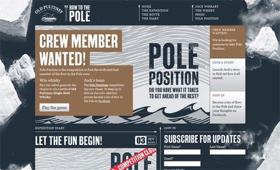
Just one of three exhibitions in typographic prowess; be sure to inspect every element.
Social Media Weekly
Design – Improving the Web for Digital Publishing by Adobe
“Check out a few of the prototypes we’ve been working on to improve webkit for Digital Publishing.”
Typography – Type-a-file
“I couldn’t find a simple css stylesheet that adhered to best typographic practices that anyone could just grab and run with. Type-a-file was inspired by—and is to be used in addition to—the famous meyerweb reset css file.”
CSS – !important CSS Declarations: How and When to Use Them
“Let’s take a look at what exactly these kinds of declarations are all about, and when, if ever, you should use them.”
CSS – Breadcrumb Navigation with CSS Triangles
“Did you know you can make triangles with pure CSS? It’s pretty easy. They are fun for all kinds of things, like little arrow sticking out from speech bubbles, navigation pointers, and more. One neat use that came to mind in this vein: breadcrumb navigation.”
CSS – Things Worth Noting About CSS Attribute Selectors
“This article will go a little further and focus on some interesting facts and bugs surrounding attribute selectors that you may not have known.”
CSS – CSS3 :target based interfaces
“The new properties in CSS3 give us more scope for creating more powerful design features with very little effort, many of which were previously only available through JavaScript or Flash. This example uses the :target selector, a healthy dose of CSS3 transitions and the general sibling combinator to create a modern user interface.”
JavaScript – Close Pixelate
“Inspired by American portrait painter Chuck Close, this script converts an image into a pixelated version using an HTML5 canvas element. It’s basically a simple demo for canvas’ imageData functionality.”
