Let’s take a look at websites that all use illustrated mountains (or are those hills?) in their designs. See how the sloping sceneries change with each purpose and mood. Welcome to this week’s Friday Focus!
Designs of the Week
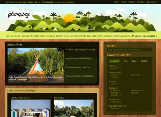
Go Glamping is a much more specific website as it is about luxury or “glamorous camping”. It therefore makes sense to see the use of mountains in the header. But what’s even better is that the illustration is very stylized: see how the camping tents look like arrows. And the site logo uses an elegant script font. It gives you a very trendy and almost elite feel.
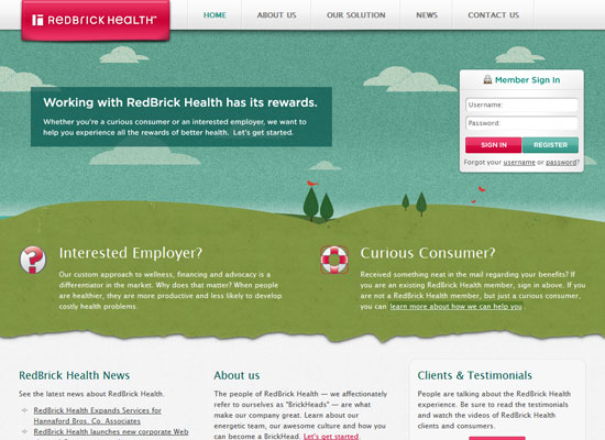
Here’s a more subdued version of a mountain scene. Since the illustration covers a lot more real estate than just a header would, it was a very wise idea to lessen the elements in the scene. Just a few trees, bird, and a sailboat in the distance. And instead of a bright red or orange for contrast, we see a cheerful shade of pink on the icons, buttons, and the logo.
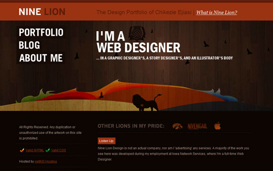
The mountains on this Nine Lion Design are fiery, colorful, abstract…and even translucent on the wooden background texture. And since this time we’re looking at a dark design, the effect is brooding and artistic.
Social Media Weekly
Since Barack Obama was sworn into office this week, let’s look at some presidential links.
Design – Newspapers Covering Obama’s Inauguration
Headlines, typography, photography, layout, grids—take notes.
Programming – whitehouse.gov Website Code
Moments after the Obama inauguration, the new White House website was put up. This post goes behind the scenes into its structure and components.


