Our last set of inspirational sites for the year should encourage you to keep a record of your daily dealings and look back on them fondly in an annual infographic report format.
Designs of the Week
Build on DIYThemes’ Thesis Framework for rock solid SEO and great layout customization options.

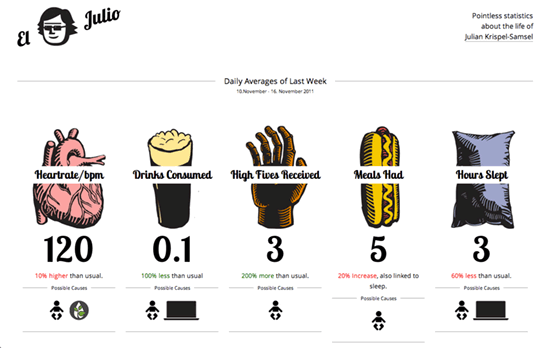
Most chart visualizations rely on shapes and colors to present information, so seeing illustrations with thick black strokes breaks this one out of computer-generated coldness. My only suggestion would be to align the caption heights.

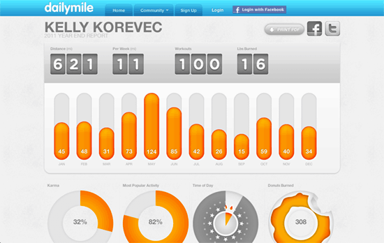
This one isn’t a personally designed page but generated by a fitness tracking web app, but it’s a nice added feature to round up all the stats accumulated in a year. Flipboard-style numerals are a go-to, while adding in a donut statistic beside all the circular graphs adds a touch of humor to the whole thing.

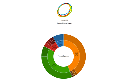
Kudos for the interactive elements on this page, including the colorful transitions happening when you filter the information by category. Noticeably absent here though are numbers describing the data, so it’s all viewed in a comparative/relative manner.

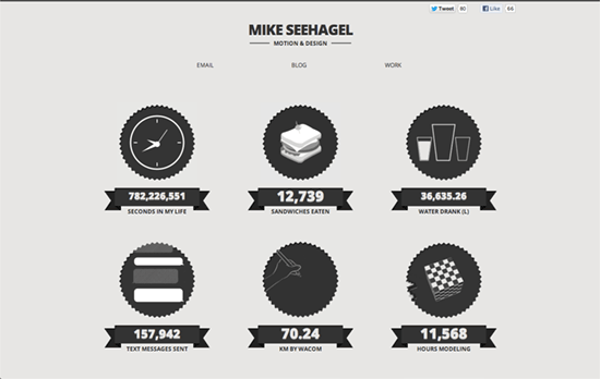
Not sure if these numbers are really accurate but the animations and styling are strikingly energetic.
Social Media Weekly
Ready to go out and design your next website? Try building with the Catalyst Framework.
HTML, Semantics – Principles of writing consistent, idiomatic HTML
“The following document outlines a reasonable style guide for HTML development. These guidelines strongly encourage the use of existing, common, sensible patterns. They should be adapted as needed to create your own style guide.”
Web Design – The 20 best new tools for web design and development of 2012
“Mark Penfold compiles a top 20 from his monthly roundup of the best new tools that saw the light of day this year – and many are free!”
