We have some interesting uses for arrows in this week’s batch of designs. Let’s see where they take us.
Designs of the Week
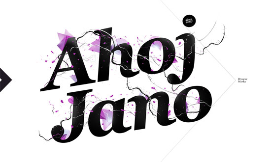
I like screen-high, hairline-thick arrow that appears on hover. The navigation and the subtle animation on the link hovers is great too. And don’t forget the stunning type on the front page!
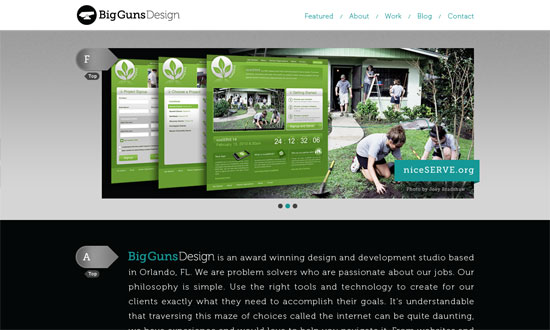
Simple design concept but looks beautiful. Here the arrows are section markers and lead you back to the top. I wonder why I’m only seeing this design element now.
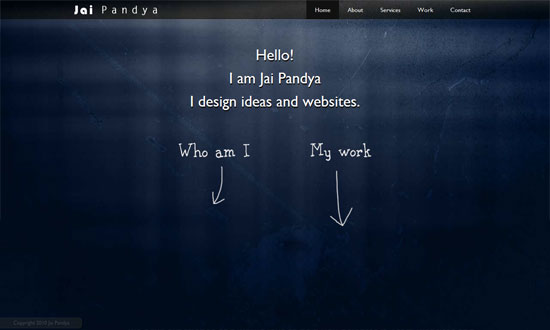
The hand-drawn arrows and text links add transitions from one section of content to another. It’s a good alternative to the fixed navigation on top.
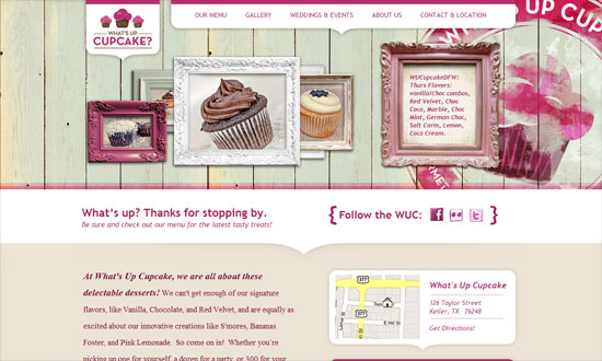
Where are the arrows on the page? I can count six! Great way to lead the eye and match the elegant look of the site, is it not?
Arrows for every step of the way. The list needs better alignment but other than that, the infographics are well done.
Hiding the arrows when there’s nothing left to browse is a good idea.
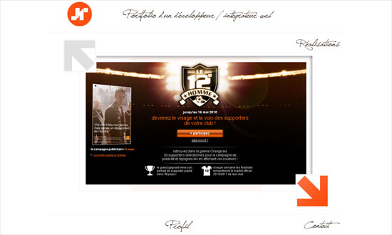
Interesting slideshow effect here: instead of the usual horizontal scrolling, this one goes diagonally. I wouldn’t say it’s more effective, but it certainly different.
Social Media Weekly
CSS – CSS Sprites w/out Using Background Images
JavaScript – Inline Expansion – Why And Where To Use It
