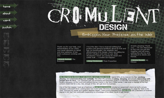
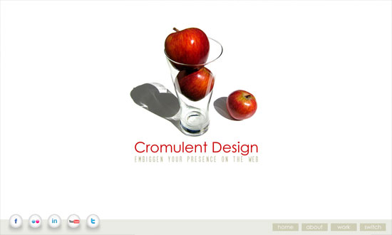
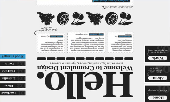
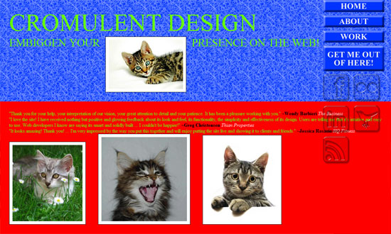
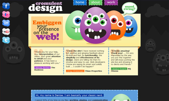
I’m doing something different this week on Friday Focus. I found one site with ten different styles on the same content (plus one homepage). Each one tries to match the visitor’s mood for the day. It’s also a good way to showcase one’s design repertoire. The designer also employs many interesting techniques into each style, so be sure to check all of them out!
(Disclaimer: This site uses tables for its layout, which I do not condone. I just thought it’d be a waste to not feature this idea.)
Designs of the Week
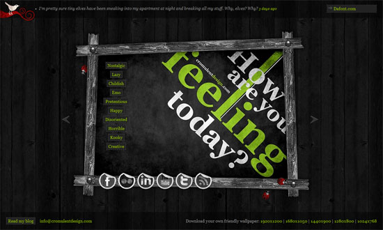
This is where the fun begins. I like the grungy photo frame effect.
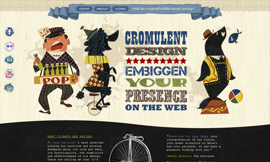
A circus of textures, and vintage text and illustrations. I’m loving the mood in here, except for one thing: Courier New!
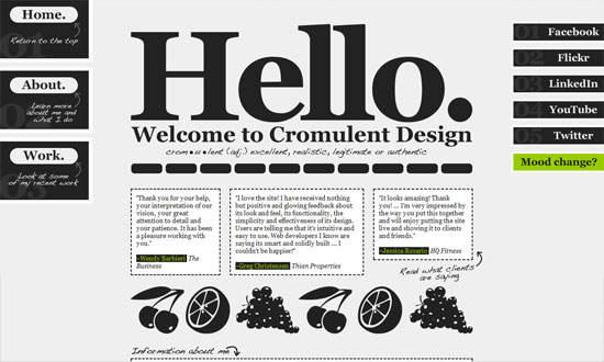
Big, bold, and black and white.
I would’ve liked the contact form to be a bit more “childish” too.
I like the multiple background effect going on here—one’s fixed, the other scrolls with the content.
Odd idea for the Work section to be just boxes of numbers, but that’s minimalism for you. Could have made thumbnails appear on hover, though!
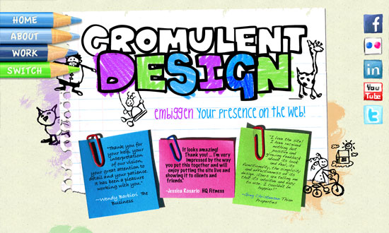
I think this is the most fun and well-designed of all. Another barrage of textures and bright colors.
Absolutely unusable! But a good idea!
And of course, how not to design a website. Wink.
Love the multiple-background scrolling effect again, and how the boxes slide into the top image.
Big, chunky fonts and cool hues, with a touch of texture.
Social Media Weekly
Usability – 15 Helpful Website Usability Facts & Guidelines
“Web site usability is the quality of a user’s interaction with a web site or, in other words, how usable a web site is to the user. Ultimately, users want to be able to easily access a web site and determine how to use it within seconds.”
Design – Interactivity in Web Design: A Beginner’s Guide
“Interactivity is a giant leap from the traditional form of web user interfaces seen earlier. Adding interactivity to a web site attracts user attention and tends to brings them to the website again. They add a good amount of visual interest and attract users to visit your site again and again. The main idea of a website is to convey a message effectively.”
Webmastering – 101 Five-Minute Fixes to Incrementally Improve Your Web Site
“A webmaster’s work is never done. What may have worked a few years ago when could be outdated today, so it’s important to constantly improve your Web site. However, a massive overhaul is just too much work to undertake at one time. Instead, tackle these quick fixes over time, and you’ll be able to improve your Web site with minimal pain.”
