It may be April Fools’ today but we’re completely serious about turning the spotlight on worldwide causes dedicated towards Japan relief. Get inspired by these beautiful and thoughtful websites.
Designs of the Week
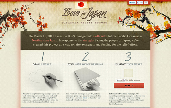
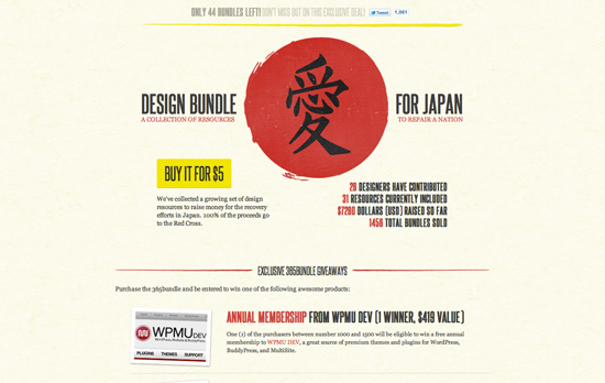
Beautiful textures and illustrations everywhere for that warm, comforting feeling. I like the subtle translucency and the way the shadows blend in.
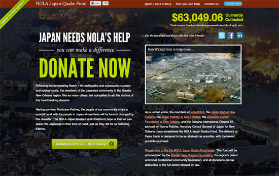
Relatively simple setup here, but striking and effective.
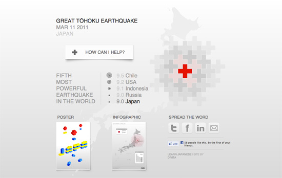
A Swiss design approach combined with a focus on infographics and geometric forms.
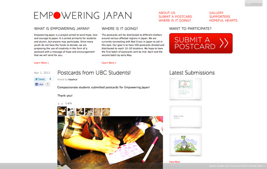
Another minimal site with one big red button for maximum impact.
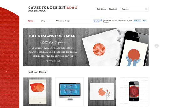
Using red (because of Japan and the message of urgency and aid) and yellow, textures, and uppercase letters seems to be a running theme. Here it’s a contrast between light grungy, textured elements and something modern.
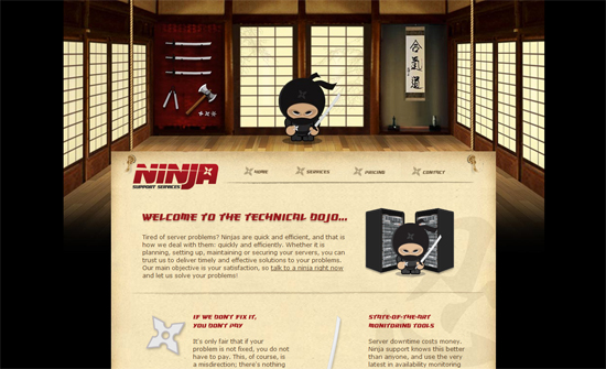
There’s a nice big red sun in the background although it only works well for wide screens.
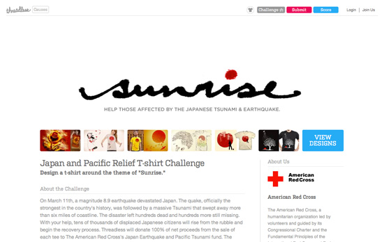
I like the negative space in the header. Everything’s grayed out except for the colorful Threadless buttons and the shirt designs.
Social Media Weekly
CSS – CSSPrefixer & prefixMyCSS
CSS – The CSS3 Flexible Box Layout Module (flexbox)
User Experience – Web Forms that Don’t Make People Angry
CSS – How to avoid common CSS3 mistakes
Mobile – Mobile Form Design Strategies
Accessibility – Why we should support users with no Javascript
CSS – text-align: centaur;
